I’d been opening a lot of hockey and I had to take a break from posting it. But I still have two more wax boxes that I opened and I had to get back to it some time. So here’s the next installment with something a little bit different. Or rather, maybe it’s not a little bit different.
In the previous boxes I opened I felt like things were getting a bit stale as I moved through what I opened. Then I got to 1990-91 Upper Deck and I think I was refreshed a bit with what I was looking at. But 1991-92 Bowman is kind of going backwards a bit. It just might be for other reasons than I thought the others were.
When companies release things for lots of different sports you have to wonder where they put their effort. In case of the Bowman releases, they seemed to settle for more of the same that they could apply to all the sports. If you want to look at that from the boring side of things, you could say that they just rolled out the same design. If you want to look at it from a more interesting (yes, I might be stretching that a bit) side, what if you combined all of the releases with the same design into an interesting multi-sport release?
Have you ever seen anyone do a franken-set? Some people do it with Allen & Ginter by combining releases from multiple years and keeping their favorite cards. For instance, you keep Babe Ruth as card #1 from one year and then Jeter as a card #2 from another year and then someone else as card #3. Other folks do it with multiple sets and releases and years. It’s definitely something interesting.
So in this case what if you decided your favorite card #1 from all the sports, then #2, etc.? I think that actually might be a fun concept. I think the only thing that might stop people from doing it would be that you kind of need to collect all the sports, or at least all of the releases with that same design.
In the end, franken-sets are what you want them to be. I was just trying to think of a way to make the design consistent among them. Maybe that’s something I can try for another day.
On to the cards!
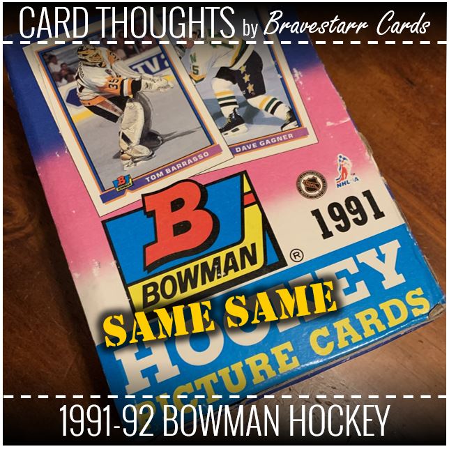
1991-92 Bowman Hockey
Bowman was not a particularly exciting design in these years. If I said that this was one of the more exciting that kind of tells you something right there. But taking that thought, this is my favorite Bowman design of that era. I would also say that two other things picked up with Bowman in this year. The first would be the images. Sure, that’s only slightly better. But I would say even more is the consistency in the image quality. Not the subject of the image, but there was less poor quality of cards (like shifted colors).
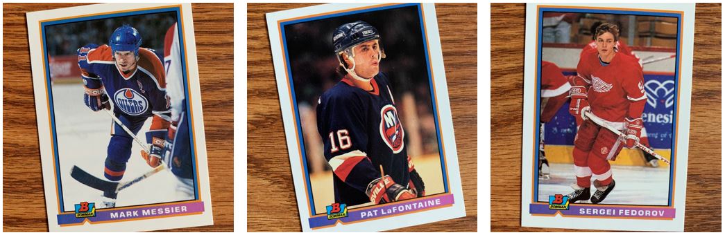
As for these cards, you can see that there’s a bit of a mix of images from actions to not much action. But I think in general they tended to be less action overall. When you think about how Bowman baseball was brought back, that was a lot of still/posed images. But for these specifically, I love seeing Messier as an Oiler (and that’s from a Ranger fan), I always remember Pat LaFontaine (being from Long Island), and a young Sergei Fedorov was just exciting.
In the Range
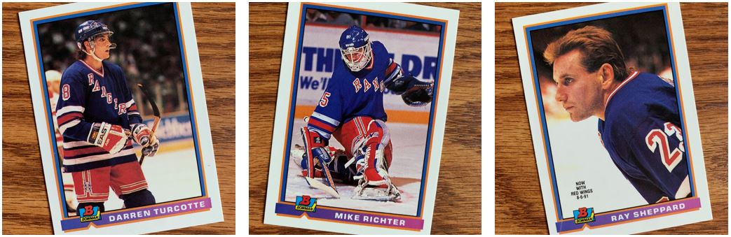
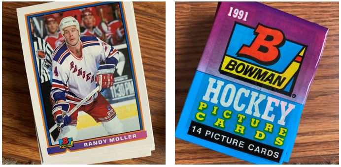
I have to post some Rangers and I tried to mix it up from guys that I’ve posted in other hockey-related card thoughts posts. Unfortunately when they are boxes from the same range, that’s a little bit hard to do. That Mike Richter shot is one of the most action shots you’ll see in this release. I also thought about the Ray Sheppard card because of the way they detailed that he is no longer with the Rangers. So, maybe that makes that not a Rangers card?
Something else I took from these… I looked at my 1990-91 Upper Deck hockey post and you can feel how much brighter and vibrant those cards were than these. I think some of that has to do with the card stock. The Mike Richter card might have the best shot at comparing, but the other too are a bit dark and dull color-wise.
Goalie Gear
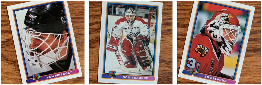
Look at all that different goalie gear. I feel like this is a spectrum of Bowman to Upper Deck. Ken Wregget appears to represent the Bowman side of design while Ed Belfour represents the Upper Deck side. Goalie helmets are so crazy these days and I love that. Ed Belfour’s helmet is really great and it’s cool to see how far those designs have come.
But let’s not forget Don Beaupre in the middle there. While I’m no Caps fan, I do live in Northern Virginia and I love the DC imagery on his mask.
We’ll Take Whatever
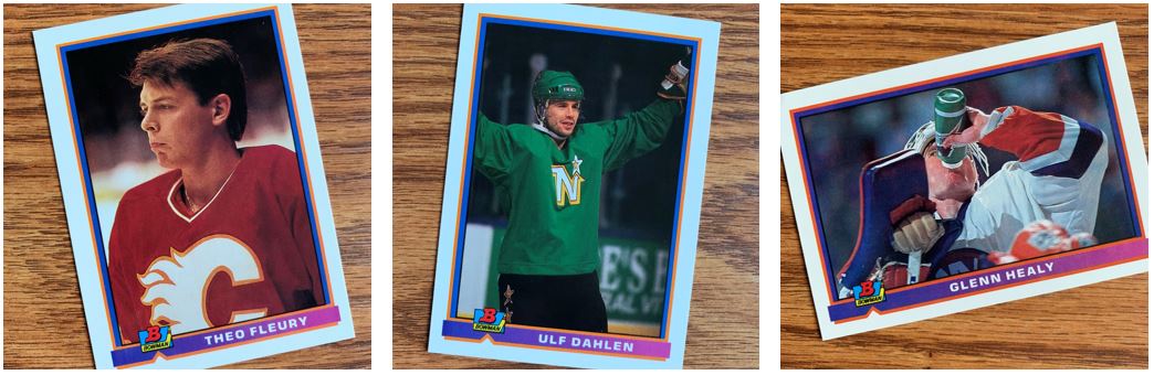
These are some good examples of just meh… which is kind of what you can find in Bowman from those days. Theo Fluery is kind of a pose that isn’t a pose. There’s just a lot of jersey on that. And speaking of a lot of jersey, and green, Ulf Dahlen has what I think is a practice jersey on maybe. Well, either way it’s a lot of green on that one. And how dark is it in the background?
As for the Glenn Healy card, that’s kind of an odd angle don’t you think? Glenn doesn’t get a lot of face time on that card as much as he gets chin time. I don’t mind a concept of an image with that, because goalies turn around for a drink a lot. It’s just an odd angle that probably isn’t the most flattering.
The Other Bits…
As you know I keep some packs and set aside cards for TTM. I was hoping this would be a good design for TTM and so far it’s been pretty good. The kind of dull cards work out well generally. But hockey cards tend to have a lot going on. I think the best part though is this is still the old card stock that takes the ink pretty well.
Overall, I had fun opening up hockey, but it did start to get repetitive since I opened so much for the same years. Of the releases that I opened and posted in the last several months (1990-91 Pro Set, 1990-91 Score, 1990-91 Topps, and 1990-91 Upper Deck) this one ranks towards the bottom from an excitement perspective. Honestly the most exciting thing is what I get out of it for a TTM stack.