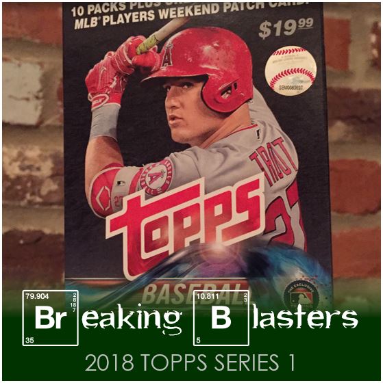
This year Topps Series 1 took forever to hit the shelves in my area. I don’t mean that I felt that way, I mean it actually did. Of the three Targets I know if in my general area, only one had it out on the day it was scheduled to hit the shelves. And when it did come out there weren’t any blasters to be found. It wasn’t that anyone took them either. No empty spots on the shelves where they would have been. There were jumbo backs and hanger boxes and that was it. So I got a few of those to help calm the urge to open packs.
Then finally I saw them on the shelves and picked up two. Ten packs with ten cards per, plus Player’s Weekend card makes for a 101 card box for $20. I noticed the normal collation issues that seems to cause the same runs of cards in a few packs. That seems like it will always be that way because of the robots taking over. But I’ll quit my blabbing’ get to the cards!
2018 Topps Series 1 Base
 I have to admit, when I first saw the 2018 Topps design I was disappointed. I’m always going to buy the flagship, but it seems that they’ve been going on these “runs” design-wise. 2011-2014 were all pretty similar. 2015 bled into 2016, then 2017 and now 2018 with some more “modern” and “futuristic” designs. They’ve been full bleed for a while with no borders in site. But as I open packs I am liking this design more and more.
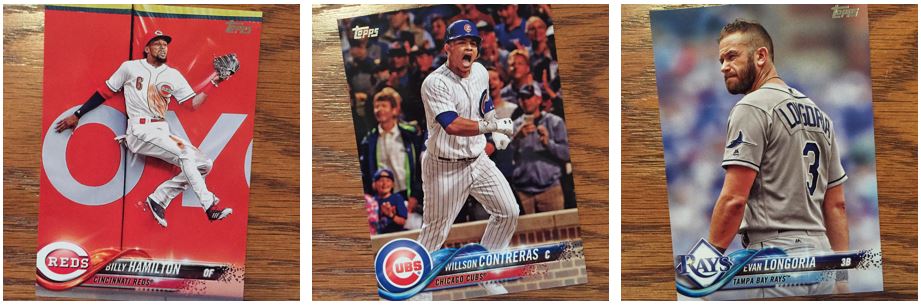
Don’t get me wrong, there’s a lot I can pick on…. I don’t like the first name hiding under the wave. I don’t like how it feels like some of what you would think would be clear crisp graphics has a blurry feel to it (like how the position has a glow that makes it look blurry and the little fading squares look blurry). And finally I feel like the name of the player and the position are on two different lines (like a grade schooler learning to write). But with all that, what really makes Topps 2018 work is the photography and the color. I’ve seen others say that it’s very “Stadium Club lite” and I wholeheartedly agree.
Let’s take the three pictures above. The Hamilton photo is just a masterpiece in red. The Contreras is a great example of how many pictures there are of players celebrating (which I love). Then there is that badass photo of Longoria. Wait, is that Evan Longoria or Tom Hardy as Mad Max? He looks like he’s turning around to beat someone who’s talkin’ ’bout his Mama.
Celebrate The Photo Quality
I told you about the celebration shots didn’t I?
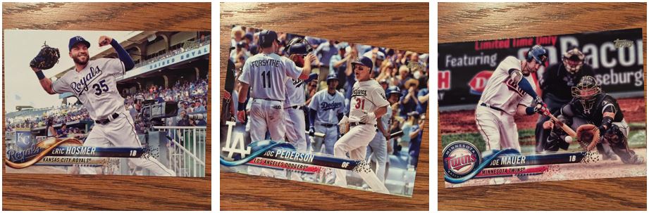
The Pederson card is a great example, but so is the Hosmer card. There are a ton more just like these. And they aren’t special cards either, it’s just their normal cards. The Mauer is another great example of the photo quality. I didn’t get a Byron Buxton in these blasters, but that card of Joe’s teammate is pretty dope.
Not every card can be amazing and you’ll find plenty of the standard action shots that you would in any other year. There are also some sort of “washed out” cards as well. But overall the quality of the photos and the colors are crazy good. That’s what really makes this grow on me.
Mariners are the Most
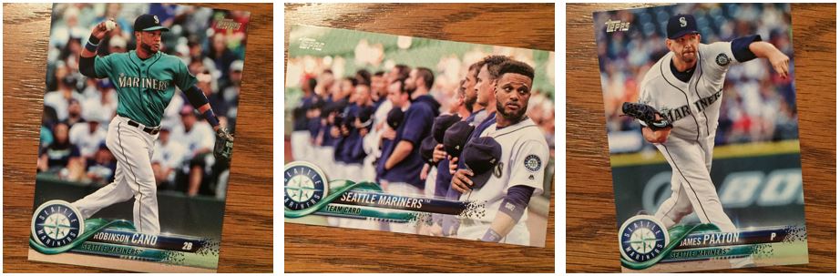
I think the absolute best cards, those that work with these design the best, are the cards for the Mariners. I love the green/blue that they use for the wave. The Cano card with jersey of the same color is amazing. I know the picture isn’t necessarily the best subject or action, but that’s one of my favorite cards of the set. There are a lot of good examples of the flood of color in these pictures. The Hamilton we saw earlier is another great of example of the red on red on red on… Reds.
Future Stars are Fading
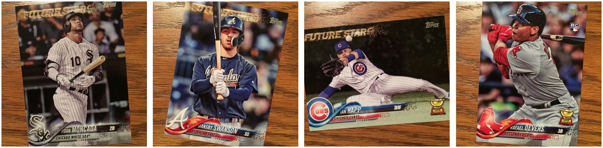
And with all those great photos and colors, what can we do, hmmm… I know, let’s throw a crappy brown (Go on, tell me that’s gold. Go ahead.) and blurry (to me anyway) new “Future Stars” logo on there. Honestly that is one of the worst of those that I remember. With the portrait style cards you don’t really notice that it’s left-aligned, but on that Ian Happ card you see it. I’m sorry, but that looks terrible. It looks like a kid laid it out. Why couldn’t we use something like what was on 2016 and 17? That was actually shiny.
The other problem with the futuristic design is that the old Rookie Cup logo looks really out of place. I don’t really want a new one though so I’ll take that. I don’t like being someone who complains and then doesn’t have a suggestion so I’ll just take that one. What are the rules on the Rookie Cup anyway? Devers has a rookie card and gets a cup, but Happ was a rookie and gets the cup. I guess I don’t pay enough attention. Is it if you are a current “All-Star” rookie or like the year after your rookie. I thought the later.
Give Me Some Mets!
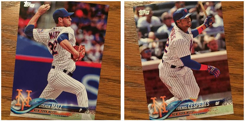
I almost got through these blasters without any Mets. I pulled four which seems wrong to me. It seems even more wrong when you consider that two of them were this Matz card. The fourth you’ll see later and its a Reyes rainbow foil. If I’m going to see 200 cards, about 180 would probably be base (two insert cards pack is what I think we normally see). 180 divided by 30 teams should mean for hopefully six cards for your team. I got three base cards. It just feels like with that many cards the law of averages would kick in.
Takin’ it Back to ’83
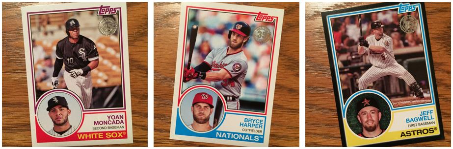
I love the throwback inserts Topps has been doing. The ’83 design is classic, but I haven’t checked to see if these colors are consistent with the colors they used for each team in that year. Obviously not all teams were around back then, but I’d like to know they made that consistent. I did see Night Owl wonder what happened to ’88. And like he pointed out, while I like the ’83 design, it looks odd with updated card quality. I still like it though.
The one thing that I wish that they did with these throwbacks is to tie the year of the cards to what players they use. So for ’83 I want Tony Gwynn, Cal Ripken, Jim Rice, and George Brett. Not Jeff Bagwell. Nothing against Jeff Bagwell, I just think that would maybe get us some cards that we don’t see as often. Why not use the All-Stars from that year? That’s almost 60 players I think. And wouldn’t you like to see a card for Al Oliver, Pascual Perez, Dan Quisenberry, and Gary Ward? I feel like we get the same old “stars” every year.
Good for You Jeter
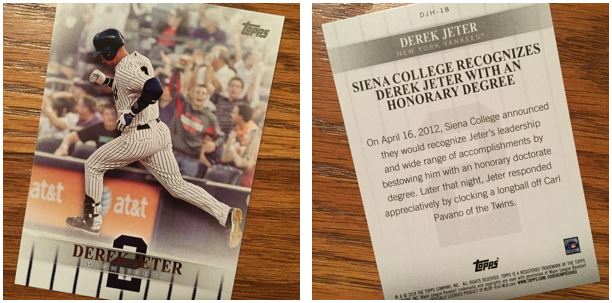 I don’t mind the Jeter insert. As a Mets fan I didn’t like the Yankees, but you had to respect #2. I wonder what this would be like every year. I don’t mean Jeter every year, but why not profile a player every year like this. Topps has kind of done that with players that have recently gotten 3,000 hits and things like that.
What I find hilarious is the subject matter of this card… Jeter homers for Siena College.
Home Run Derby
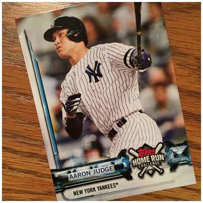
So I feel like I have like a 1 in 4 chance with this card. You figure if he’s going to hit 50 or so they aren’t all going to be single homer games. Let’s say he has 40 single homer games out of 162 right. I’ll probably forget about this anyway so I’m sure it won’t matter.
Fire in the Making
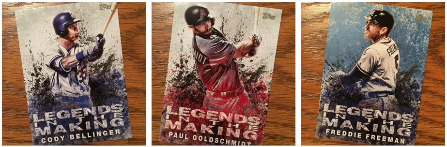
I don’t mind this insert. I like the look, but it has me thinking that there won’t be a Topps Fire this year. There probably will, but these look like a poor man’s version of those. What I don’t like is that I got a bunch of these at this point and I must have 40 Paul Goldschmidts and Yoan Moncadas. I know all the have parallels, but I don’t like how they aren’t always obvious. These are OK and the Freeman is some sort of blue parallel but haven’t I haven’t check for what they are calling it.
Award Season
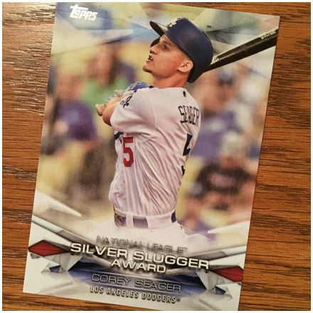
These are the inserts that make the most sense to me. I like the idea of chronicling the awards from the year before. The design is somewhat simple in the end, but I like that they offer this and that it’s been a consistent insert in recent years. I feel like they could do a little more fluctuation with the design for each award. I’m not suggesting to change it, but to make each award have a tweak.
Just the Way Playa’s Play
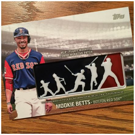
These are the standard “large” card that gets put in blasters these days. In the end it’s not from anything particular so it’s not special other than that you get one a pack. I’m not usually interested in these, but I do like them this year. I like the Player’s Weekend they did last year so doing this to commemorate it is up my alley. I feel like they could have done something like put the nickname that was used on the player’s jersey instead of their name or something like that.
I feel like the quality of the “patch” is OK on this one, but in the other one I got it had dings in it. Maybe that’s normal on these. I only have two so…. But this Betts one is not really centered. Seems like these require a lot of construction to make them work so maybe that’s just something we deal with.
Opening Day
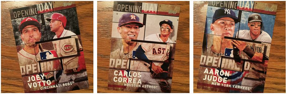
In the blasters you get a lot of these Opening Day inserts. I can’t remember if I saw any in a non-blaster pack. I need to figure out if I got two parallel inserts. This is what I hate about parallels sometimes. I didn’t notice the Votto had a black background. I noticed the Judge. I shouldn’t need to think about it that much. Honestly this kills me mostly from an organization perspective. I miss these the things all the time and don’t realize it until later.
Other Days Besides Opening Day
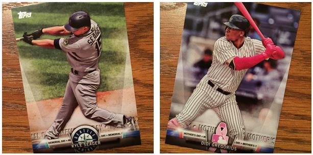
I can do without these Topps Salute inserts. What’s so different about Memorial day? Father’s Day, Mother’s Day, Jackie Robinson Day, all have something different with uniforms and colors, but I can’t remember (or see in this card) what’s done for Memorial Day. I feel like the designs could go more with what day it is if they are going to do it. But I’m not a big fan of this insert.
More Rookies / People I’ve Never Heard Of
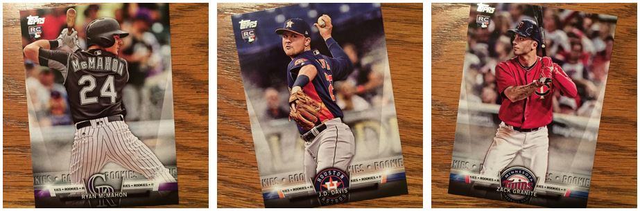
These are even worse to me. Don’t we have rookie cards for a reason? This is just a chance to get a rookie card for guys that already have rookie cards in the set.
As I get older I feel like I can pay attention to all of baseball less. Or maybe I just concentrate on my team more so that it pushes out other teams in my mind. I have no idea who most of these rookies are.
Supa Star
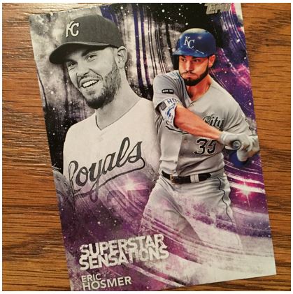
Another rejected Fire design? I like these better than the Legends in the Making. You definitely get less of these than the LotM cards.
Rainbows and Unicorns
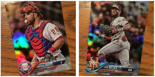
The rainbow parallels look really good with this design. I like it much better than the gold parallels I’ve seen (which are a good bit of a step down from recent years). I think the rainbow parallels look great because of the futuristic design and because these are full bleed. I don’t know that borderd cards (like say 2011) would make this work as well.
If you stuck around for this whole post, thanks! I hope you get what you want out of your blasters!