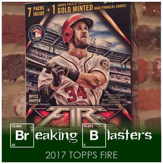
I popped open two blasters worth of the Target-exclusive 2017 Topps Fire. I hadn’t really paid attention to it that much when it came out, but now that I opened it and got a good look, I dig it. It’s not a big set at 200 cards, but I like the ideas for the inserts and with the way the cards are designed, the effects on the parallels really work. That isn’t to say there’s things I question about it, but I was interested in what I was opening.
2017 Topps Fire Base Cards
The base cards come in three different styles. I think they work most of the time, but are times when it seems like a certain card could have been pulled off a bit better. The other thing I don’t like is the rhyme and reason for the different styles. By that I mean I couldn’t find one.
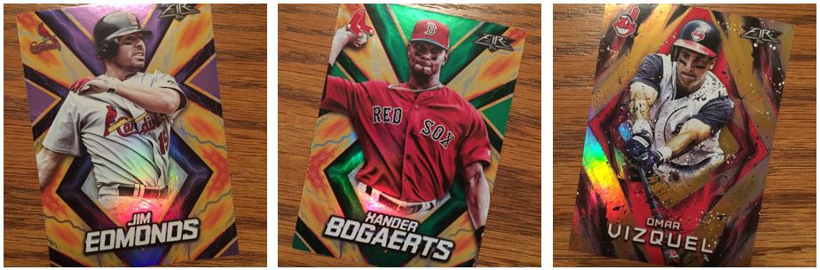
Lightning Style
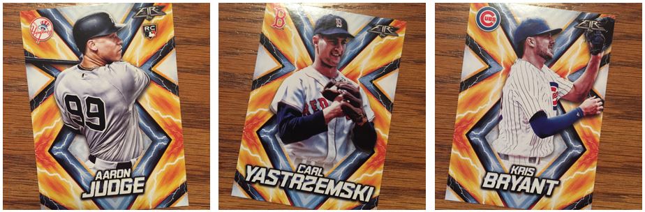
This is the style that was pulled off the most consistently. For the most part it works for all of the new and old players alike as you can see from the Yaz card. That said, if the player is from too long ago the color might not work that well. And while this is the one was consistent, it is not my favorite. I know they are all cartoon-like, but these feels like Ironman should be on the card and not a ball player.
I do like this style for the TTM factor though. Its bright and in general while its busy I still think a good signature could come off well.
Ash Style
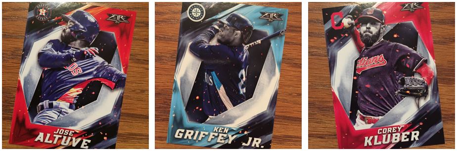
I’m a big fan of this style of photo and I don’t know what to call it. I’m calling this Ash style because it looks like thee are ashes floating around. It’s basically selectively coloring black and while. Because of that some of the older players come out really well on this card. But they kind of have to be colorized a bit to make it work. The Griffey, Jr. is almost a good example. There’s that bright blue on there that you can pick out and use as the accent. But I also saw a Randy Johnson that was almost black and navy blue. Not a bad card, but it doesn’t have that pop to it. The Altuve and the Kluber with the red and orange really show how this style can work.
Paint Style
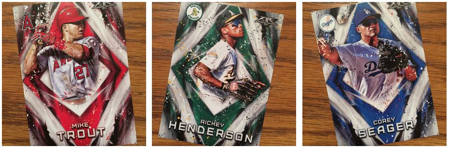
This one is my absolute favorite. With the right pictures you can pull off any player. I’m a big fan of the team colors on the card so this checks that box. I think this style would be my second favorite to try to get a TTM on. The Ash style is much too dark for it. I just like how it looks like the picture is splashing paint.
I like all of these styles but like I said, I can’t make sense of them. Having one style would definitely be boring. I was kind of thinking something like: star in one style, rookies in another style, old-timers in the third style. But I can’t figure it out. I don’t have enough of the set to see if it rotates by number at all of if its random. I like them all, my brain just can’t wrap around them from an organization perspective.
2017 Topps Fire Autograph Hit
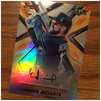
Out of the two boxes I got one hit. That shouldn’t be too bad for a blaster. And I’m not mad at Ender Inciarte. I’ll always remember that insane catch he had at the wall in Queens to end the game. That games was going one way or the other, and he was the one to decide how it went with an amazing wall climb and catch.
Yeah… Mets Inserts
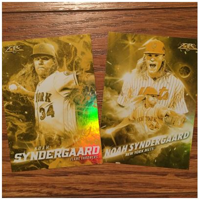
I love an insert when its my boys. I find it kind of funny that they are both for Thor. The Flame Throwers one is perfect for him and on the back it lists miles per hour. The other is the Fire Up insert. I don’t think of Syndergaard as a celebration guy so it seems odd. I got a Harper for that too and the picture is really of him being fired up. There’s plenty of those around so I don’t know how you can find a good one.
Something to note on these is that they are gold. I don’t know if all the inserts for these are gold or what. I feel like I’ve seen them not be. But for all the inserts I got, they were gold.
2017 Topps Fire Moniker Insert
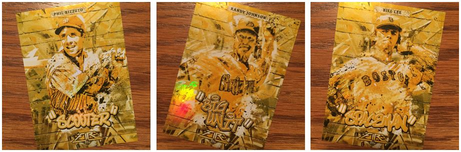
See… all the inserts I got are gold. Maybe that’s a blaster thing.
I like this insert but what I really like is that this gold version could work well for a TTM. I might send the Bill Lee out because I think he signs. I would imagine if you have a nickname worth being in this insert you might not be a TTM guy though.
Parallels from 2017 Topps Fire
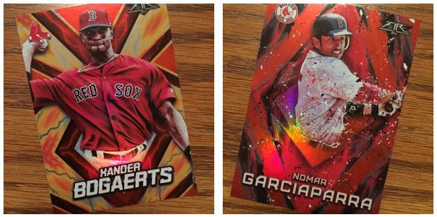
These are the standard, unnumbered parallels and I think they call it Flame. These work even better for those Lightning style cards. And the rainbow foil makes these cards work even more in my opinion.
The other parallels below are number: Purple (/99), Green (/199), Orange (/299). I’m never a fan of these because they always interfere with the team color stuff that I like.
Gold Minted Parallels
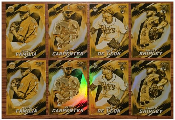
In the blaster only you get a separate pack with just the Gold Minted parallel cards. The interesting thing about these blasters… THEY HAD THE SAME CARDS IN EACH! While frustrating, if I could get them signed it would make it all worth while. These are worth sending.
I would say these were pretty fun to open in general. They are pretty different from your standard card so there’s about each one. The backs are completely text-based with no stats. For a the non-flagship run I am fine with that. Plus the inserts are pretty interesting to me too. I felt like I was examining them more than I do other cards. I like them and it was a good time opening them.