I’ve been really missing my morning walk lately. It’s no one’s fault but mine. Not initially though as a few months ago I came down with Shingles (yikes – an old man’s disease) and I felt terrible so I stopped walking. Then the weather started getting colder and wetter and the longer you go without activity, the harder it is to go back to doing it. I just need to whip myself back into shape and get back on top of it rain or shine.
One of the things I like best about my walk, aside from using it as time to catch up on my baseball podcasts, is to see some amazing colors. I walk REALLY early in the morning, so the winter is not the time for color. I pretty much start and finish while it’s dark out. But in a lot of the year I’m walking around sunrise and there are some amazing colors. There tends to be a lot of orange and purple and the other day I noticed the sky was completely purple. But in the next few months with Spring I’ll miss some of my neighbor’s amazing flowers.
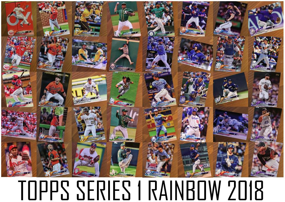
But what’s holding me over right now? If I said 2018 Topps would you be surprised?
As I said before when I broke some of these blasters, when the design for 2018 Topps was announce I didn’t dig it. But after seeing these in-person and going through them they keep looking better and better. There’s some amazing photography and I noticed that there are so many cards that are maybe not monotone, but really speak a color to me.
I tried to pick out the cards that spoke colors the best that I had pulled so far. Now of course, jersey’s have a lot to do with it, but so do backgrounds and the logos. Here’s what I found.
Red Red Wine
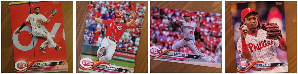
What’s going to represent red better than the Reds?
A lot of people were talking about the first card they pulled from a pack this year. Mine was Miguel Cabrera. That’s a sort of ho-hum / normal card. But in that first pack was Billy Hamilton. BAM! RED! Right in your face. I think when the MLS referees pull out red cards this year they might be pulling this card out of their pockets. I’m definitely going to look closely to see.
The Scooter Gennett jersey is amazing on his card, but what I like best about his card and Brandon Finnegan’s is the background. Scooter’s background looks a bit more filled with people, but so many are wearing team colors. Finnegan’s card is a lot of empty seats, but they sure are red. Then I had to get that Franco card in there because of the look on his face.
The Hamilton card and the Gennett card also show some big themes in pictures. Hamilton is a defensive photo, but more specifically a catch at the wall of which there are a few in the set. And the Gennett card is a slide and there are a few of those too.
Orange Crush
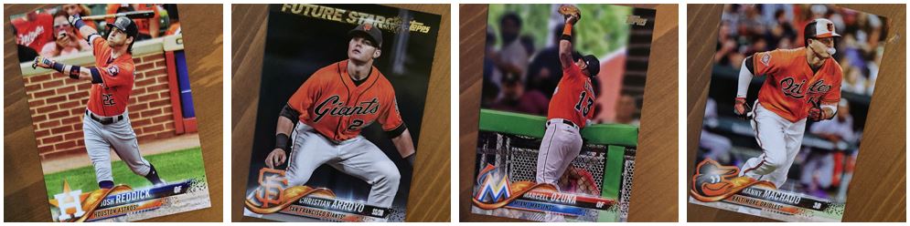
Orange is pretty much all about the jerseys. The exception to that I think is Josh Reddick. He has that nice terra cotta color in the bricks that gives a strong orange vibe. And of all the colors, this one was the hardest to make it work in the theme. Not to say that these didn’t, but some of the other colors were super easy.
I like the Machado card because of his bubble blowing while running. Is that not the best advertisement for his pending free agency? “Hey, I can hit and blow bubbles at the same time not just walk and chew gum.”
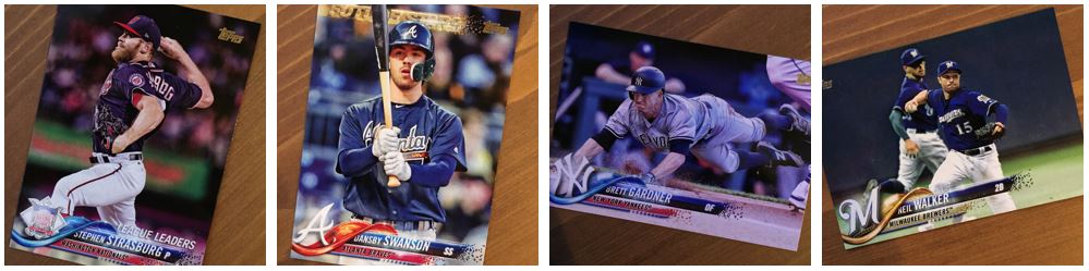
The other two are the disappointing part of any new Topps release. I really don’t like getting cards for players that are no longer on the teams pictured. I know there isn’t much you can do about a trade though. That I understand. The things I really don’t like to see are Jay Bruce in an Indians uniform or Neil Walker with the Brewers, or Greg Holland with the Rockies. I feel like those are all guys you could hold until Series 2 when they’re on their new teams.
Yellow Submarine
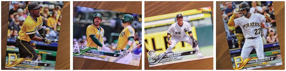
Yellow was another that stuck out. Thank god for the Pirates throwbacks and the A’s alternates. That Starling Marte card really sticks out. It helps that the wave on the Pirates cards is yellow though, like on that McCutchen. I don’t think that one would have worked as well without the yellow sleeve though.
Tyler Saladino has that great Stanley advertisement in the back. That has to be one of the brightest cards in the whole set. While it might be a tiny bit washed out, it still works for the theme.
It Ain’t Easy Being Green
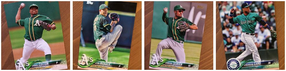
Green wasn’t too tough, but really you are stuck with one team. What made it easier to work with is that so many of these A’s cards include players in their green jerseys. But of course green outfield walls and the grass doesn’t hurt it either. I really like that Marcus Semien card because of that pose. Making a play and throwing from the knees is something that isn’t in a lot of pictures on cards.
I include Cano in here but it was really hard to find a spot for him (it’s green, but it’s blue, but it’s green). I think that is my favorite colored card in the set. That jersey color is amazing. When I put it in the picture of everything together I lined it up with light blue because it didn’t look green, but I think it might be more green. I just couldn’t leave that one out.
Tangled Up In Blue
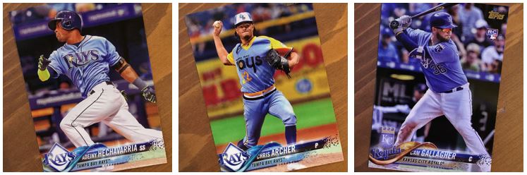
The Rays and the Royals really rule the light blue category. Can you imagine what this would have looked like with throwbacks? I’d probably find a lot of Cardinals, Phillies and Expos in this section.
I can’t say I’m a fan of the Rays uniform that Chris Archer has on. I think that was their player’s weekend get up. I like the color, but it’s a little too much… well, just a little too much for me. I love the Rays and Royals jersey on the other cards though. That light blue with the darker blue, especially the navy color for Adeiny Hechavarria is great.
As for the card design, the Royals “wave” might be my favorite. It’s like liquid gold. No not Velveeta Mac and Cheese (Yuck, I’m a Kraft Mac and Cheese man myself).
Behind Blue Eyes
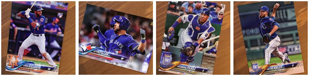
Like the Red section, this blue color is easy to find. What I’m kind of surprised at is that I didn’t find more Dodgers though. I included the Yasiel Puig card in my larger image, but I didn’t move it down into the post. I love the pose on that card. It’s a very Puig pose.
The Rosario is my favorite of these, but I’m biased as a Mets fan. That one almost crosses into a kind of purple because of the orange mixed into the photo. The Salvador Perez card probably wouldn’t have made it if he had any other type of catcher’s gear.
The Pillar is interesting. It’s almost the same pose he had on last year’s Stadium Club card but from a different angle. I don’t think it’s the same moment. It must just be something he does for his celebration or something.
In The Navy
Dark blue or navy is another easy color to find in the set, however, it’s one of the hardest to really “feel” in the cards. I think the brighter colors just have a better chance to stick out. There aren’t many things that help a color like this ticket out in the background. Sure there are dark blue outfield walls and dark blue seats, but those aren’t exciting and stick out like a bring color.
The one card above that really has a “feel” of a color is the Brett Gardner card. It almost has a sort of blue tint to it. And yet another example of the great sliding cards they have in the set. There are a few that catch players in mid-air like this.
Purple Rain
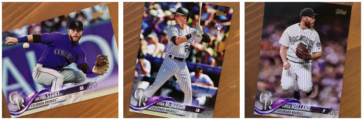
Purple is very much like green in that there aren’t many sources for it. In fact, it might be less because green you would at least have the grass or the outfield walls to help. Purple is pretty much the Rockies and that’s it.
Trevor Story is another of my favorite cards for the set. I can’t remember who referred to it as spilling grape juice recently in their blog, but someone did. The purple ad in the back with the purple jersey and the purple graphics – AAAAHHHH! Can we somehow get some purple drank in there. I love the card. One of the oddest cards in the set on the other hand his the Greg Holland card. I didn’t even pick up that he was jumping the first couple times it passed through my hand. It doesn’t appear to be a celebration, maybe jumping over a hard hit ball? It’s a mystery.
I hope you liked my rainbow. Maybe it helps you see these cards a little differently. I’m just really impressed with the colors in the set. I checked back to last years cards and they felt dull. 2016 Topps had a much more colorful feel to it than 2017 did in my opinion. I think that might have had to do with the amount of gray in the graphics used on the card.