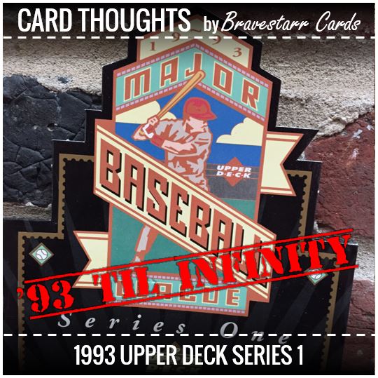
Whenever I think of 1993 I think of a song. So that’s how we’ll start this one off courtesy of Souls of Mischief…
I don’t think I’d describe 1993 Upper Deck as “chill” like how SOM are saying they will chill. I think with the border and bolded “Upper Deck” at the top its a little to hard-looking for that. However, 1993 Upper Deck is one of my favorite designs for a set. In the end it’s super simple. The photos are amazing, the colors come out great, and the sheen on the cards makes them seem so high end. The one thing that might be a little touch which I’ve always loved is how the picture floats between the border and the “Upper Deck” at the top of the card… how the image of the player sits on top of the word mark. The only thing I don’t like is the use of the cursive font for their names. Sometimes for the lesser known players it takes some looking to realize who it is.
I had a chance to pick up a box of it and had a great time opening these packs. And now that you had some music to put you in the mood, let’s see what we can find in this set.
Other ’93 Upper Deck Posts: Picture Day, Lurking Oddities, Finding Themes.
Hall of Fame Power
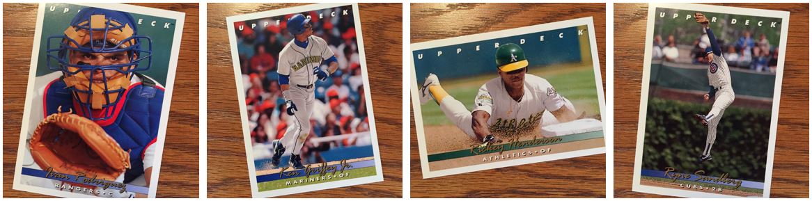
Pudge, The Kid, Ricky, Ryno… how could you go wrong?
The Pudge card is one of my favorites of all time. It’s got such bright colors! I normally am not a fan of the “pose” cards, but for some reason this one has always struck me about how the picture works with the design so well.
As for the others, they all seem like some perfect pictures to go with the player. Griffey captures the end of that sweet swing he had. He’s probably watching it fly over the fence. Rickey is of course stealing a base. This might even be third base based on the clues in picture. And Sandberg is snagging a ball. Not that he was known for his leaping ability but more the fact that he set an errorless streak so his defense was to be noted.
Great Pictures
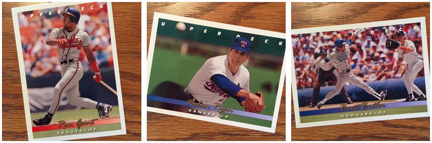
With so much talk lately about the quality of pictures in a base set (or saving interesting pictures for another set… ahem… Stadium Club), this set really shows that you can have great pictures in a base set. These cards really have pictures that spoke to me.
Again, I’ll point out the colors. The Gant card I especially like. That seems like some amazing day to be playing ball because the card is so bright. The way that they Ryan picture appears on the card is great to me. I love how that ball hides the “P” on the card, the angle they got this from and how certain things are in focus and certain things not. As for the Brett Butler card, I just like the subject matter. We don’t always get the pick off throw image. Not to say that it was never done but Brett was a base stealer so it fits for him.
Sets Inside the Set
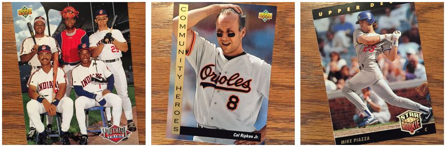
I am a big fan of a subset. They aren’t inserts because they are numbered within the base set, but they don’t look like the rest of the set design. They also usually have a theme to them. Think Diamond Kings, Rated Rookies, sometimes All-Stars,… anything that is numbered within the set. I think in most cases they are together as well.
My favorite of these are the pictures of the teams. Sometimes the poses are funny but I also like the cheezy names: Youthful Tribe, Latin Stars (Rangers), Strike Force (Braves), Lethal Lefties (Angels), etc.. The Community Heroes, while a good story, doesn’t make the best baseball card. It gives Upper Deck a chance to put more stars on cards though.
Of course the rookies in 1993 Upper Deck were pretty great. This is Series 1 with Piazza, Chipper Jones, Tim Salmon and some others. But Series 2 is where you find the crème de la crème wit Jeter.
More Than One Type of Insert
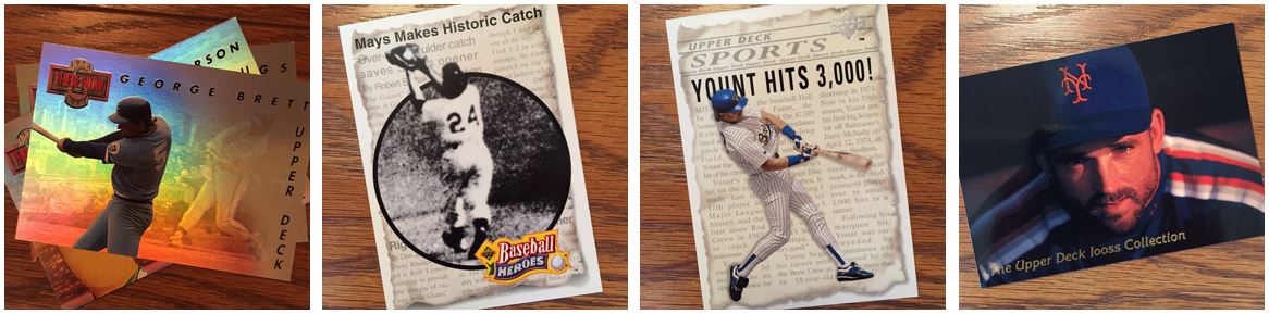
Inserts were being coming more and more prevalent in those days and these were part of what you could find, but it was no where near what you see these days. The most special of this group is the Robin Yount/George Brett (Brett on the back) SP card that was inserted into 1:72 packs. There was another of these for Nolan Ryan that was for Series 2.
Holograms were big for Upper Deck as it did the logo stickers in holograms for several years and it always had the holograms on the back of the cards. The think I don’t like about these is that they aren’t really easy to look at. It’s hard to see what’s in the hologram. You might actually get more from this picture than you do in-person.
Always the Same
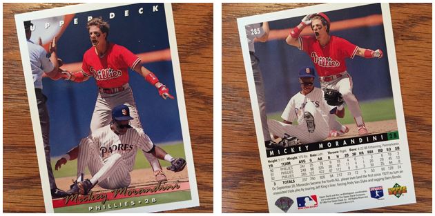
Sometimes you find a picture that’s so good you have to use it again. I mean, if you’re proud of it why not. I know I’ve seen a lot about using pictures over again (check out this year’s Topps Heritage and Archives for the most recent examples). I find this Mickey Morandini situation interesting though. This is almost like a flip book. You can get Mickey’s reaction… in action… by flipping it back and forth. I’m not sure when we’ve seen the same action shot on the same card, but I would bet this isn’t the only one out there.
1993 will always be one of my favorite designs and I’m always interested in the pictures on the cards. This box took me a bit further into completing Series 1 but I am still not quite there yet. It’s not a bad box to open and usually you can find it for a lot cheaper than Series 2. For a cheap box it’s worth the rip.
For more about 1993 Upper Deck, check out BaseballCardPedia.com.