One of the things I try to pride myself on at work is when to be different things. Sometimes that might be serious, sometimes that might be funny, sometimes that might mean to shut up. Not that I think I am the best at any of those things. But I will say that I think I am good at knowing when to be those things.
By knowing yourself and how you work in different ways for different audiences and situations, it can help you avoid being offensive, or inappropriate, or even just awkward. Trust me, I can toe the line sometimes. The key is knowing who you can toe a line with and who you can’t.
For instance, my boss talks like sailor. So when we are together I can have a mouth on me. I know other people who like my dumb jokes and will play along. But then I know when a joke might get me in trouble and I can keep it to myself.
You are probably asking yourself, “what does any of this have to do with cards?”
Well, all that made me think of ’93 Fleer. They seemed to be trying some different things in the mid-to-late 80’s. Most sets were pretty straightforward but there were a few, mostly because of some color choices (ahem, not naming years) that stick out… and not in a good way. To me though, a few sets stuck out not because they were crazy good, but because they were a return to normal.
Let’s see how ’93 Fleer could be one of those sets.
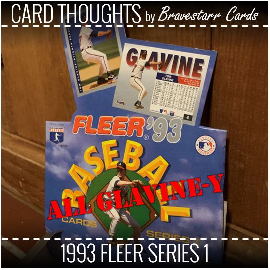
1993 Fleer Series 1
1993 Fleer Series 1 was a bit of a return to normal. I might even call it businesslike (which kind of goes with the idea I started all this off with. Yeah, it’s “silver,” but its gray too. There’s some color that ties it to teams (for the most part – that Griffey seems to go with their colors now but at least not with the uniform from year prior when the picture was taken).
I think the first key though is that the photography and photo quality are pretty damn good like a lot of the better sets at this time. There sure isn’t a whole lot of design and maybe that helps it be a return to normal. I wouldn’t necessarily argue with you if you said “boring.” But I also think after ’91 and ’92, boring ain’t so bad.
Picture Pages
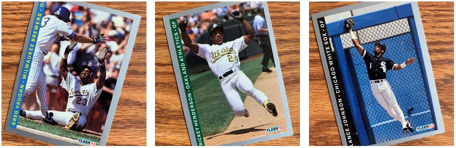
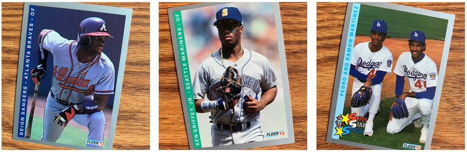
I always like to put a few interesting pictures in cards up and these were some of my favorites. The Greg Vaughn card is just a bit a whimsy on these businesslike cards. I can’t say I know what’s going on there, but since it looks like a high five I am guessing he scored. Speaking of scoring, Rickey sliding is always a score. And he’s probably scoring so…
Lance says “no chance” though and looks like he is robbing a hit (maybe it was a homer?). How long was a ton of chain link a thing by the way? We’ve seen that in other ’93 cards recently.
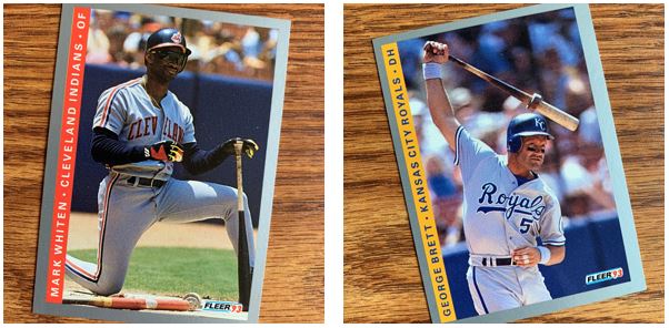
The expression on Whiten’s face, well, I just like it. As for the Brett, does that remind you of a picture from the ’88 Score days? It totally does for me. That set had a lot of pictures that were cropped to pick up people in some interesting motions.
X-Pose
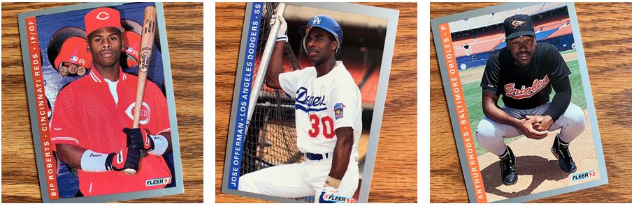
There are some school day post pictures too. Bip’s card is pretty damn red. It might as well be ’90 Donruss. Jose has that batting cage lean and is deep in thought. But I feel bad for Arthur Rhodes. He’s just squatting and look a that boring background. A boring, empty stadium and he’s sitting in the middle of it. Sorry Arthur, they can’t all be gold.
All-Star Beauties
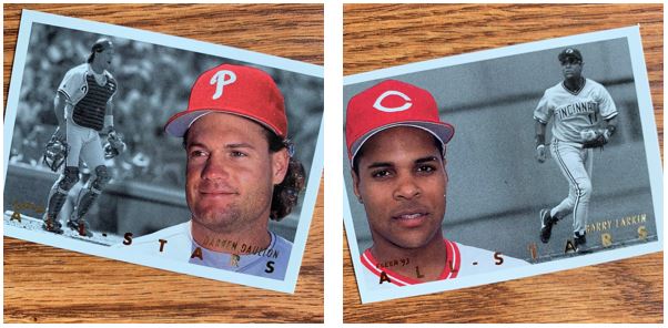
This are some of my favorite cards ever. First off they are reminiscent of 1956 Topps. I don’t think you can go wrong there. Second, I always love a color picture over a black and white and this is one of the best pulled off versions of that. Even the gold on the front of it is good. That’s just a classy card.
I Said About Glavine
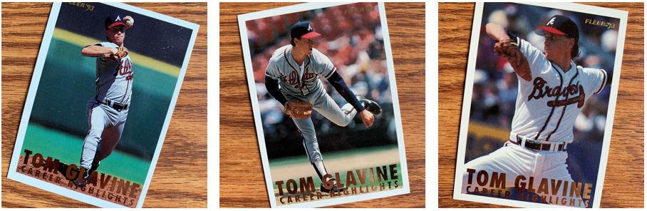
Just like these days, someone was getting highlighted. In 1993 Fleer Series 1, it was Tommy Boy. These are in some ways like those All-Stars inserts. Actually they are almost a combo of the base and those inserts in a why. They are just OK and really not exciting enough for an insert for my taste.
Prospectus
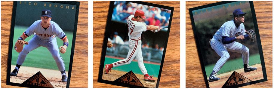
These were the three “prospects” cards I got. I only really recognized Brogna out of these. I like the design. The black certainly looks pretty sharp as the border. But… the triangle feels at a minimum, awkwardly placed. I think Rico got the worst of it.
I like opening these and I got a ton of new TTM cards. These old sets have been giving stacks of good stuff. The one caution I have about these is that when I was opening they were sticking together a little. So some of them might have been damaged in pulling them apart. I don’t know that there’s a way to help that, but you should watch out for it.
For more about 1993 Fleer, check out BaseballCardPedia.com.