Remember that old site Hot or Not? It was a site where you rated people by pictures that were posted up there. I think it actually pitted two people together on the page and you picked which was hotter possibly. Now that I’m thinking about it, maybe there were several sites like this in different versions.
I remember them being girls, but that’s just because I’m not of the inclination to rate guys… not that there’s anything wrong with that. I think actually if I remember the movie The Social Network, that might be how Facebook started in a way.
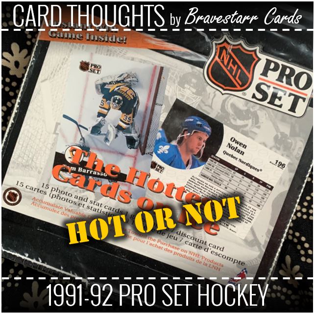
Anyway, 20-odd years later I’m embarrassed to say that I even know about them. It’s a dumbass thing you do no matter who you are and the sites are stupid, but it was a different time, or at least a different time in my life. “The Hottest Cards on Ice” tag line just made me think about it going into this post.
The internet was just a different place prior to social media sites really. It was driven by totally different urges and psychology back then. I think the way phones work now and apps have changed the way things are too. The ideas of those sites are certainly still out there, but they have different forms nowadays I guess. Now that I am older and have kids and I see this from different angles, the thought of those old things just gives me the shivers.
Speaking of shivers, and ice, and hockey… let’s look at these cards!
1991-92 Pro Set Hockey
So are they hot or not? I say not. They aren’t the worst in the world they are just… meh.
And isn’t that maybe worse than being the worst or the best? The worst and the best get talked about the most. It’s almost like the idea of saying there’s no such thing as bad publicity (or something around those lines – though I don’t want to test that out myself, LOL!). At least then people talk about you I guess is the theory. When you fall in the middle you get ignored.
So what’s to like about these… team logos, mostly image, not bad photography.
What’s to dislike… that black bar, no real design concept, big “pro set” logo.
I think the no design concept is the fact that it’s only that black bar. It’s kind of two big and just floats out of nowhere. I don’t mind simplicity, but maybe that’s too simple. I think that all builds to the “meh” feeling I have for it.
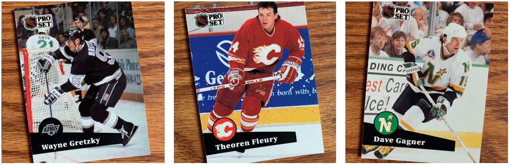
Matchy Matchy
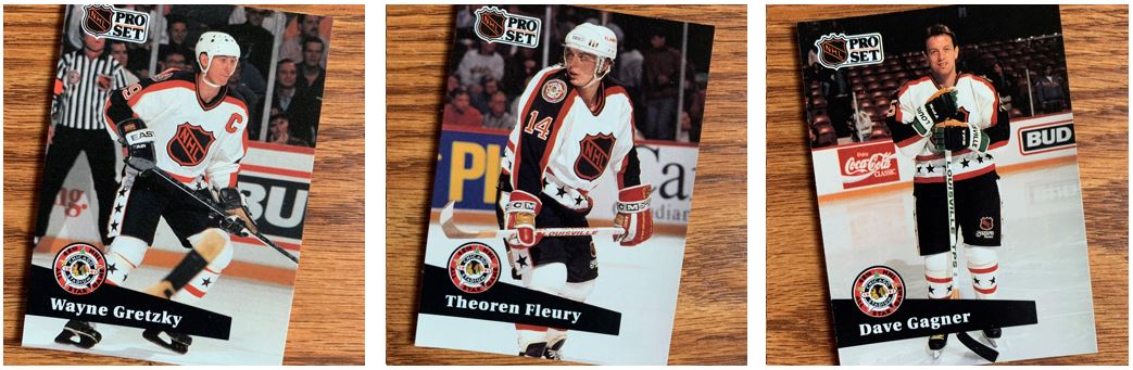
As I was going through the cards I realized that there wasn’t a whole lot of difference when it came to the All-Star cards other than the uniforms and the fact that everything went black and orange. Then it made me think, doesn’t every other logo have red, white and blue? I don’t even think I know why the NHL is black and orange. Maybe they like Halloweeen?
This lack of difference between these and the main cards builds to that lack of design concept, or at least the fact that there’s not much of a design. It also made me realize that while the images are big and the photography is good, it isn’t necessarily exciting. It kind of repeats the same types of images through the cards. I think the way they could have varied some things is with how zoomed or not they are on the players. But everything image seems to try to capture the whole player on the ice, and that’s it.
Home on the Range
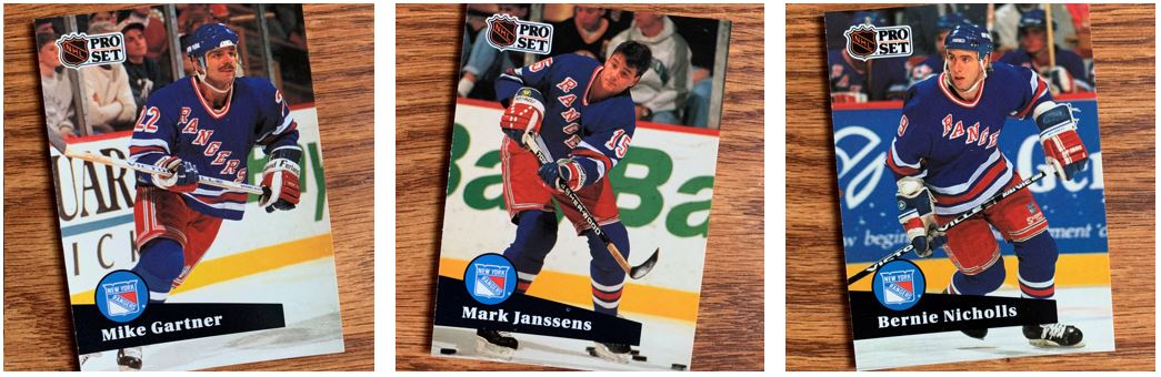
More Rangers. In sticking with the theme, don’t all these look pretty much like the same picture. It’s a good thing they have numbers… and that Mike has that mustache.
Traded
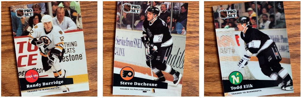
Not unlike the 1991-92 Bowman set I posted about, the traded versions of these just mention that the players were traded right on the cards. I think this design actually lends to one of the least disruptive ways to do that. And really hockey, with the white ice, helps with that because you can see that all of the bottoms of the cards are white.
Now part of that is because all of the images are the same with the same poses on the cards, but I guess it’s a positive with this “Traded” part.
I always have a question on these… are these a card for the team they were traded to, or the team they are pictured with? I think the answer is who they were traded to. Or another way to think about it, they go with the logo (or name of the team if no logo) on the card now, not the uniform they are in.
And the Award Goes To…
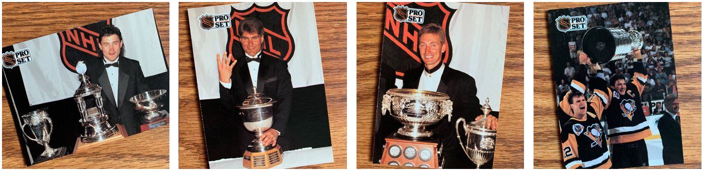
Aside from the Stanley Cup card, this is just driving home the point on these cards. The images are all the same. And with guys in tuxedos, at least back them, they were all about the same. Wayne has a different style on, but guys in tuxedos are generally all the same. It’s not like a lot of hockey players are going to the Met Gala.
Sepia Tone
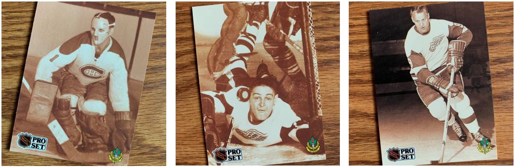
I did get a kick out of going through these cards. Not as much for the fronts, except for that one in the middle, as for the backs. Again, I was never the biggest hockey fan, and I like my team, but I wasn’t as into the history aside from some huge name that lots of people know. But this gave me a little more interest.
…And Another One (or Two)
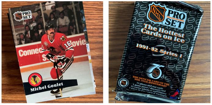
As always, the TTM and unopened pack stack is there. I definitely love getting the TTM stacks out of all of these sets that I’ve been opening. That’s the best part, how much more I’ve re-learned about hockey through this and the TTMing of hockey players.
I feel like I’ve had a lot to say about a set that I said was “meh”. But I had to write something. I think my overall feeling on this one is that I wouldn’t come back to it. And I think that’s the answer why it’s just in the black hole of the middle. There’s no reason to come back to it… good or bad.
I have had fun opening up hockey regardless of how this one went. This is another that’s on the less exciting side of what I’ve opened recently (1990-91 Pro Set, 1990-91 Score, 1990-91 Topps, 1990-91 Upper Deck, and 1991-92 Bowman). I think if I opened more, especially more from this era, I will just have to space it out more so it isn’t as repetitive to me.