Yes, I’m continuing on the hockey kick. Look you’re just going to have to deal with it. I bought a bunch of hockey boxes so that I could start sending out hockey TTMs this year. I opened them all a while back and I’m working on posting them once a week. Maybe you’ll get a break in the coming weeks and see something else. You’re here already, so just read OK… Geez!
I’m not going to lie. Getting like 6-7 boxes of different hockey offerings at the time felt really good. I mean, who doesn’t like to get stuff in the mail first of all. Then who doesn’t like to open cards. Well, lots of people but you know where I’m going. If you are reading this you probably like to do it.
We’re talking very first world problems here but I think when I got to this point in the boxes my interest was waning. All of the boxes were from the 1990-92 season and it was a lot of the same names. I’m not going to say I wasn’t enjoying it, but I maybe wasn’t taking my time and paying attention as much. But then there was this box of 1990-91 Upper Deck and I think I felt refreshed.
Let’s find out why…
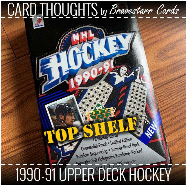
1990-91 Upper Deck Hockey
That is a damn good looking card design right there. Team logo, team colors, even team text in a way at the bottom of the card. But it’s also not in your face with the different colors. The player name and position are really clear at the top and of course the photos are really good and the images really pop on the cards.
Comparing this design to say 1990-91 Topps is like night and day. These cards are so crisp. Is it odd for me to say that they look like they even FEEL cold? They look like ice don’t they? This is just a really smart design for me.
When you think about Upper Deck at the time these fit right in with the baseball, football and basketball designs of this era. It’s different but along the same theme as those but also it’s own theme for the sport.
Something’s Missing
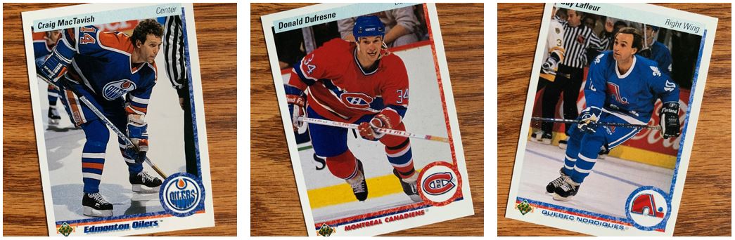
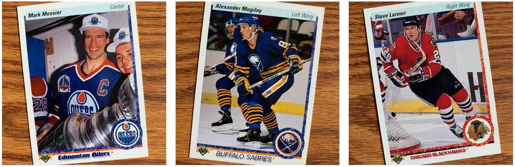
So I noticed some things missing with these guys. It’s at least one thing on each card and it’s two different things in total… I know easy right… helmets and teeth.
If I remember correctly they either were at the end of not enforcing players wearing helmets OR they were enforcing it but they had grandfathered some players in so that they didn’t have to wear one. To add to that, I think Craig MacTavish might have been the last player to play without a helmet. I’m not the hockey historian so I could be wrong on that. That said, how Slapshot of him.
As for old Donald D. there, he seems to have a gap happening in the mouth there. I know, common among hockey players, but I don’t remember seeing it one cards of this era. I guess they weren’t enforcing the teeth rules either. Maybe he was grandfathered in too.
They’ve Got Range
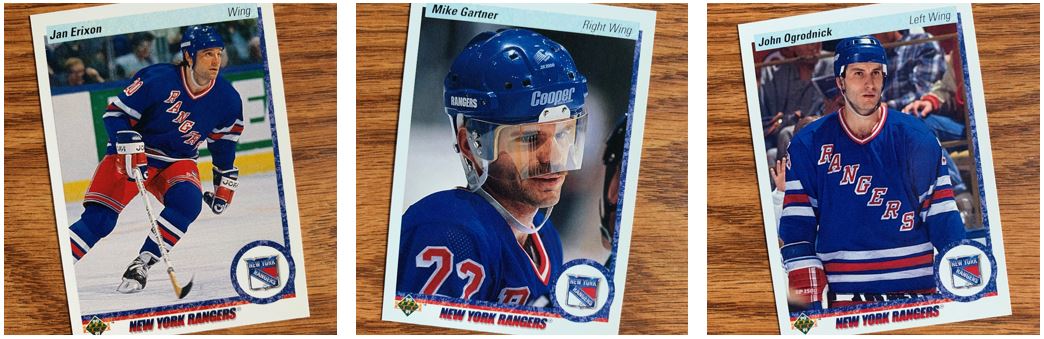
As always, a few cards from my favorite team. Damn those Blueshirts look good no? I think I prefer the jerseys without the color like these have. You know, like with the tie at the the neck. Or even just without that colored collar. But I think looking at these cards, it was a time for collars.
The other thing I’m noticing is that Mike Gartner has that shields and he might need some anti-glare coating or something. Maybe a visit to Warby Parker? I haven’t noticed a lot of face shields on cards, but I do wonder how that impacted images for cards though. It probably makes it pretty tough.
The Early Years
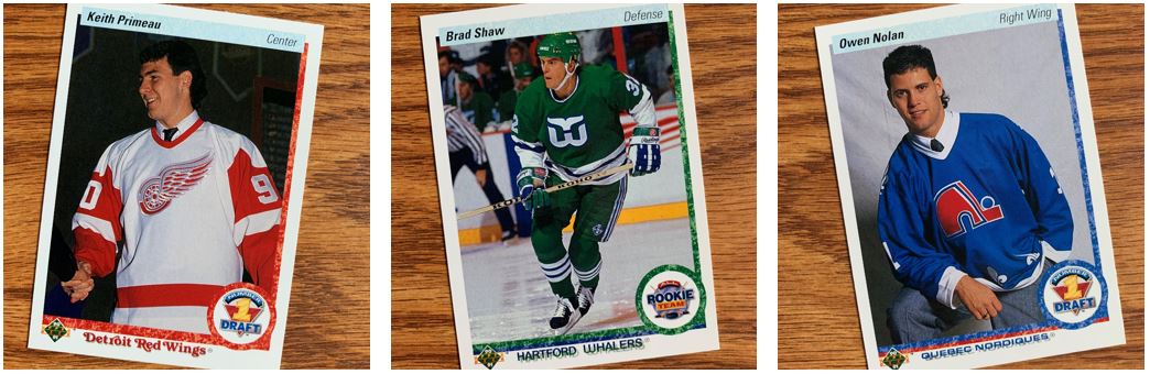
Look at these youngins. They don’t get the team logos (although they do have them on their jerseys) but they do get something a little special in the corner. I thought there was one more kind but I might have pulled a wrong card in here. I was expecting that there was Draft, Rookie, and All-Rookie Team. It looks like I am either missing the middle designation there OR there wasn’t one and I’m not remembering it right.
Either way, I like how they colors on these stick with the team colors and they aren’t something different or their own design. Not saying I don’t want that from other designs, but on these I feel like if you put a team together it would look cool that way.
Artsy Fartsy
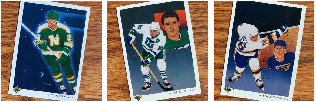
I don’t know if we truly would call these “art cards”. At least not the way we see folks who create “art cards” these days. But they are at least art on cards. I always like these from Upper Deck, but I will say that all of these types of cards from these days are similar. I mean within and across the sports. I think I prefer the ones with only the action and not the portrait as well. Like the Brian Bellows card.
It’s funny on these because I really like the concept of trying to get them signed, however, usually they are not great for signing. These are all pretty dark. They just don’t have a great place to show off a signature.
Photo (Not) Bombing
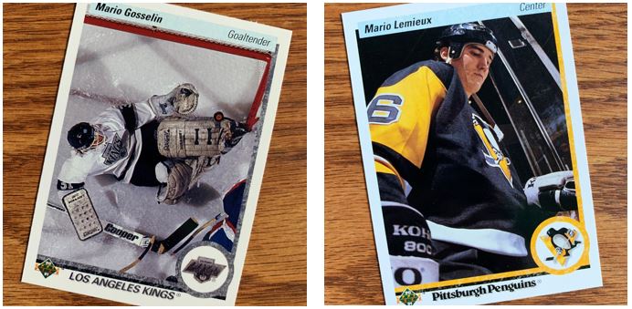
As I mentioned earlier, Upper Deck was known for the images they used and how well they showed up on the cards. In these cases they are of great quality but they are also interesting in more ways than that.
I love when they use different angles for photos or they play with the composition of the photo. The Mario Lemieux is a pretty cool shot. They are definitely taking a hero and playing that up with the low angle to make him look larger than life. As for the other Mario (kind of funny this is two Marios), isn’t that a crazy shot for a goalie? I would think he would want to know this is a save, but it kind of seems like it might not be. That’s not good for him but that picture is awesome.
And as Always…
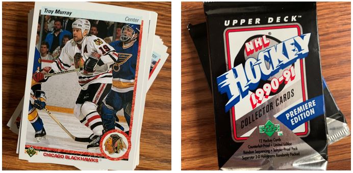
I know I probably don’t need to explain this like I always do. The one thing I thought to mention here is how odd it is to open Upper Deck packs from back then. The packs still feel different, because they were different than everything else at the time. They didn’t feel cheap like everything else at the time. And they still don’t feel cheap.
This was really fun to open and kind of welcome as I opened it in the middle of a lot of other hockey boxes at the time. There’s more to look at and study on the fronts AND the backs of these. For me there’s no comparison to the 1990-91 Pro Set, 1990-91 Score, and 1990-91 Topps that I’ve opened recently from that season’s offerings.