What are the important things that you look for in a card design? There are so many things that can be part of what you like in so many combinations.
Do you prefer borders or borderless? Do like the use of a logo or team-specific element? Are you down with something specific to the sport? Do you like a specific design that involves a color or team colors?
That last question appears to be the major one that was addressed by Fleer in their first foray into football. After going a little back and forth on it in their baseball offerings, they went whole hog into it for football. We should note though that they did this a bit in baseball for 1990 too.
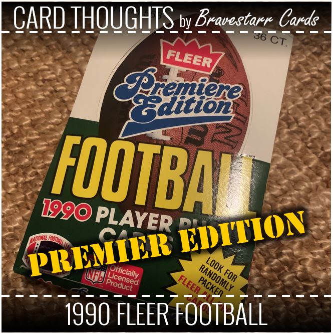
You don’t always get things right the first time you try them, but I think Fleer did a pretty good job with the “Premiere Edition” of their football cards.
1990 Fleer Football
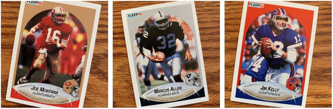
We’ve got borders, we’ve got football specific elements, we’ve got team specific elements with the helmets… and my favorite part, we’ve got TEAM COLORS! Fleer brought the thunder with regard to color in this set. The colors of the cards and the uniforms and everything all make a great card.
The text is really clear inside that shiny little football on the cards. That silver football is a little cheesy even if it does possibly represent the Lombardi Trophy. But hey, first try and all that. Of course it isn’t there first effort ever, just their first football effort.
One complaint I have about the cards are that the pictures are on the dark side. I think in general that doesn’t matter that much. But as a TTMer it makes it hard for a signature to come out great on the cards. The other element, if I’m going to nit pick, is the way that arch creates a second border inside the border on the sides. It’s fine, but it’s one of those things that once I noticed it it got to me.
Back to Basics
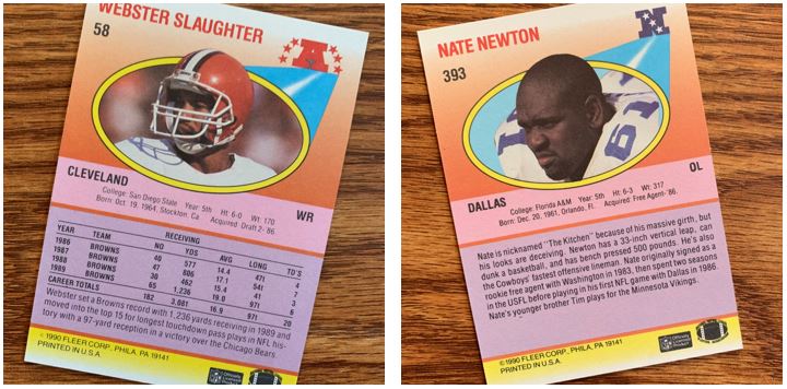
The backs are a lot different than the baseball versions. They have several different colors and gradients. And those are full color pictures there. This was definitely a step up in certain ways from the baseball versions.
While I’ll say that baseball is more of a stat heavy sport historically, I think the gap to football was bigger back then. In 2021, football is just as stat heavy with it really taking over the “fantasy” side of things over a lot of other sports. But again we see, just like the 1991 Fleer Ultra post, the O-lineman don’t have much by way of stats.
Big Blue (and Red)
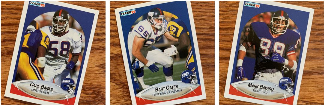
Big Blue is actually blue, and a whole lot of it too. I love, love, love the team colors on these. Actually what these are reminding me of are the color differences of the Giants. I always thought it odd that the helmets were so dark and the jerseys were much more of a bright blue. When they moved to the older logo that kind of went away.
But in reality that wasn’t a Giants-only thing. The Vikings always had dark helmets compared to their uniforms too. But the worst to me was always the Cowboys (probably worse to me because I am a Giants fan). It felt like none of their blue’s matched. Their pants, their jerseys, their helmets nothing. Which do you pick for a team color?
Pow! Bam! Draft Choice!
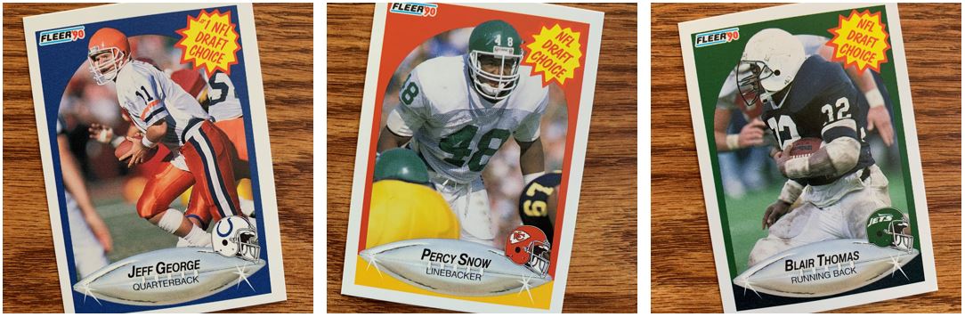
Do those Draft Choice cards remind you of an episode of the old Batman TV show? If not, do they remind you of some new-and-improved dishwashing detergent?
Either way this might be one of the odd parts of this set. That just doesn’t go with anything else related to the design of these cards. I think I would like that with a different design, but with this one it just seems a bit out of place. That said, I don’t have a constructive way to say to do it differently with this design.
All-Pro Silver
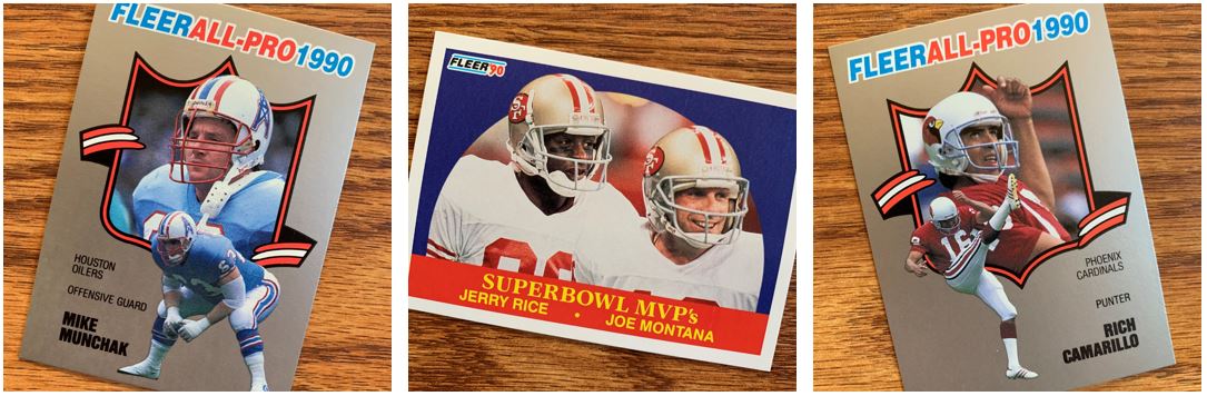
I dig the All-Pro card inserts. The thing they actually remind me of are the backs of the 1991 Fleer Ultra cards. It’s a large picture of the players “bust” and then a little in action shot. I’d love to try to TTM some of these. I know Camarillo signs so I will try that one out sometime.
Other Stuff
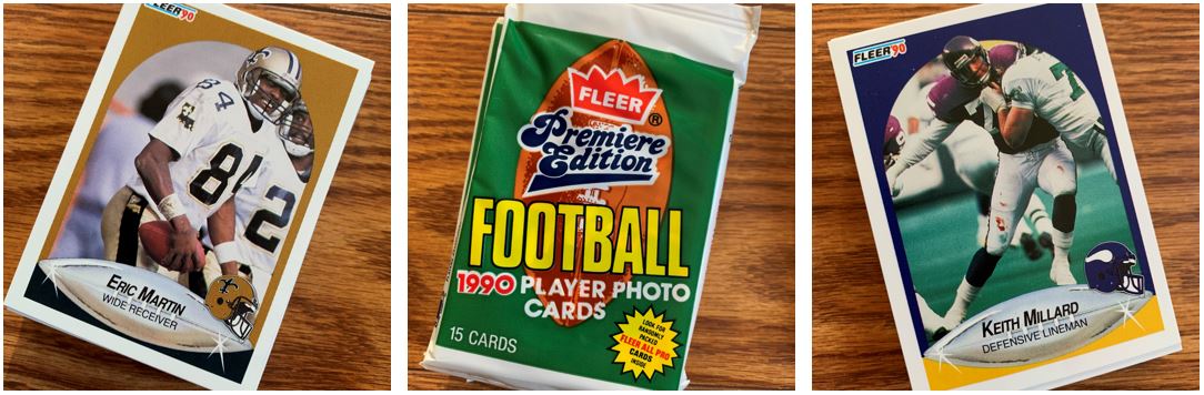
Yep, the TTM cards and the packs I’m saving. Nothing new there.
I like this set a lot. I like it a lot more than the set from the following year. But I think maybe the 1991 Fleer flagship was very one-color focused no matter what the sport was. This was fun to open. Given I’m not sure how much more football I’ll be opening coming up, maybe that will make the next football thing I find just as fun and I can keep it fresh.