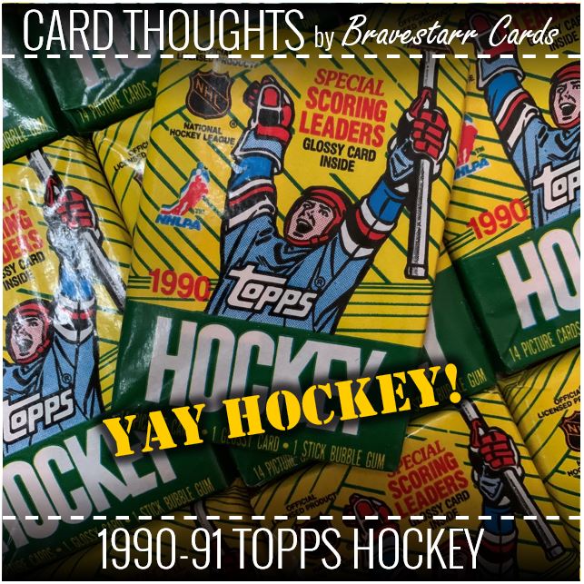
“Yay Hockey!” I say… “Yay Hockey!” says the guy on the front of the pack. Now you all say it…
I know you are saying it because hockey season is back in the swing of things. I will fully admit (and if you’ve ready some other hockey posts of mine I think I already did) that I am not the biggest hockey fan in the world. But that doesn’t mean I don’t find the sport exciting and fun to watch. It just happens that I never was fully 100% invested in it, save for maybe a few times in my life.
I love the Rangers, but since I am not always following, to others I might be a bit of a bandwagon fan. I’ll watch them whenever I can catch them pretty much. But obviously the playoffs are the most exciting times and those are the times that I find myself focusing on them. So to that end, I follow them more and more closely when they are playing well which they seem to be doing these days.
So let’s just celebrate some hockey with the guy on the front of the pack and jump into this box of 1990-91 Topps Hockey.
1990-91 Topps Hockey
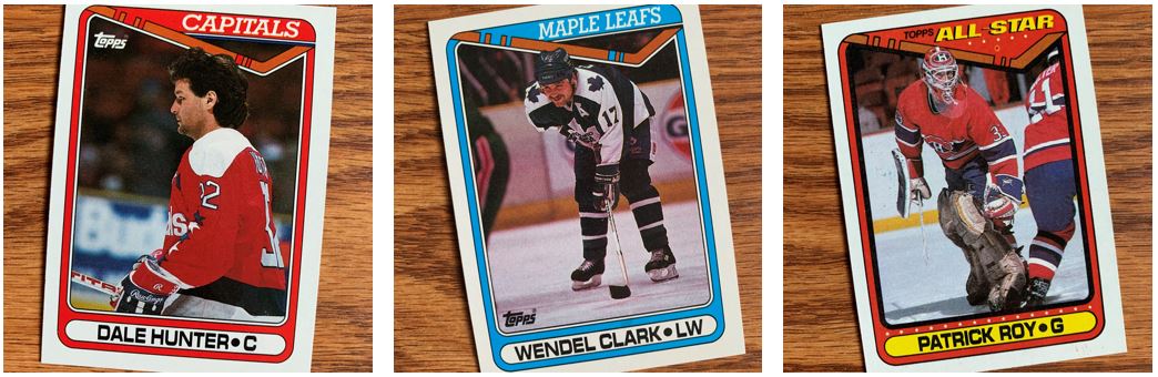
I decided to focus on guys that I thought I remembered as tough dudes in the sport. And really is there any other sport that you can say that in the same way you can for hockey. I mean, there’s the joke about “went to the boxing match and a hockey game broke out” right? A fight in any other sport is ended IMMEDIATELY (or there’s an attempt to end it). No such thing with these guys though.
And really as heavy a hit there is in football, it’s supposed to be that way. I’m not saying it’s not supposed to be in hockey, but it just feels like extra aggressiveness. And you gotta love it!
I feel like these guys represent the toughness in hockey, especially back in the time of these cards.
Stick With It!
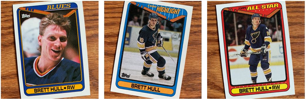
Let’s take a look at the design with these cards of Brett Hull. You can see the obvious hockey element… the STICK!
I really like how they did that. I like how the player can go over that design element like they did in all three of these cards. I don’t think I realized that right away even though it pretty much literally happens on every card.
I think from a positives perspective of the design I like the colors used. They use team colors for the most part on the regular card designs. While I like those best, I like how it changes for the “Highlight” and “All-Star” versions of the card. One thing that I notice on these that I like better on the special cards is that I like the part above the stick filled in. You can see they didn’t do that with the regular cards.
For what I don’t like as much, I think the design is great on the top, but kind of boring at the bottom where the name and position are. It goes with the design, but I feel like its just a bit chunky too. The other thing I would say is that the images are a bit dull. I don’t know if that’s because of that old school card stock, but I’d have to say no because of what Topps did with baseball even before this. But the images are dark and dull across the board for my taste. There’s so much color in hockey, and in the design of these cards that it’s hard to say that.
Home of the Range
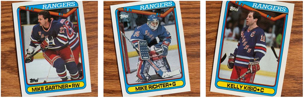
Like I said, the Rangers are my favorite. These are three guys I really remember for those first years I started following. Mike Richter just felt like a guy you wanted to really root for back then. And I think I’ve talked previously about how Gartner’s speed was just so amazing.
I think as a Ranger fan, I am a bit disappointed in the choice of blue. That’s not the team color blue but some other odd shade. They used the right red and it doesn’t seem to go with the blue they chose. I know Topps did this for other teams and even in other sports, it just seems like an odd choice. Like what about the blue they used for the Blues? I know I complained about the images being dark and dull, maybe that would add to it. I will say though that that picture of Richter is pretty good.
Shiny (With a Side of Flames)
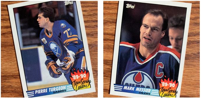
This little “Team Scoring Leaders” insert set is… fine. Again, kind of boring don’t you think? Sure it’s got cartoon fire on it and the cards are shiny and all but….
This is back when really there was one “insert” in packs. Not like today. But today the card companies take the inserts in all sorts of places. Not that those places are always good. But I guess back in 1990 they had to start someplace. The kind boring and dullness stuck around for these though.
…and the Other Stuff
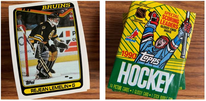
As I always do, I kept some for TTM and I’ve already been getting those back. I also kept a few unopened packs which I may (or may not) enjoy later.
While I think the guy on the cover is excited for hockey, and we are excited for hockey, these don’t help. I’ve checked out 1990-91 Score and 1990-91 Pro Set recently and while I could definitely see someone having a take that this design is more fun, I think those others were so much more bright and exciting than these. The design is admirable, but I think ultimately there’s a little bit of a let down when it comes to the images. Still a good time to open as always.