With this being my first foray into really looking at hockey cards, I figured I would give you a little background on where I fall with the sport. I’ve followed it at different levels since the late 80’s as a kid but overall, I’m really just a casual fan. I like to watch just about any sport on TV and I love to watch hockey, but it definitely isn’t the top dog in my sports rankings.
As a kid growing up in New York (on Long Island specifically), I learned to root against teams just as much as I learned to root for teams. There’s basically two teams in almost every sport and if you root for one you can’t (or at least shouldn’t) root for the other. In fact, if I haven’t talked about it before, I definitely am a schadenfreude practitioner when it comes to the teams I don’t root for.
But in the end baseball, football, and basketball really were at the forefront of my sports interests. But I will say that since the mid to early ’00s, I think that hockey has passed basketball. That might be more because of who my basketball team is than who my hockey team is. Hockey is so much more exciting to me to watch though and I feel a lot more on edge than I do throughout a game… even more than my favorite sport of baseball. I just don’t think I’ve been completely entrenched in the tactics and game play as I am in other sports.
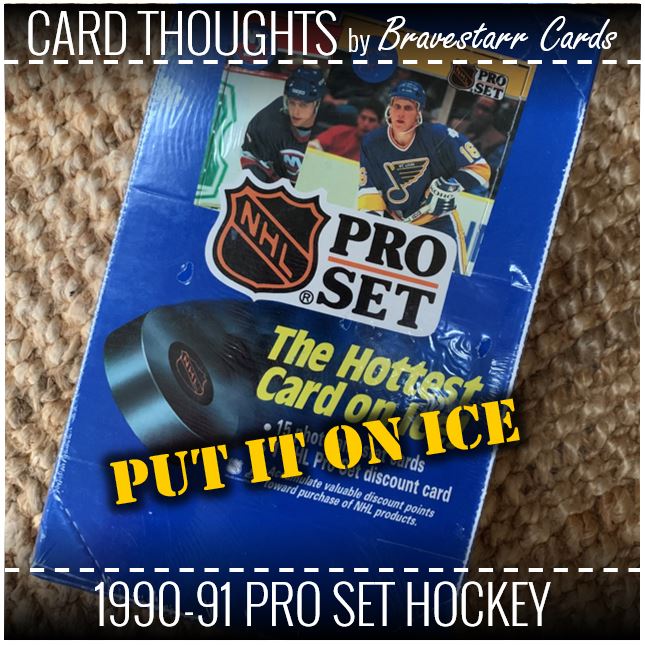
I realize the title of “Put It On Ice” seems like I am not a fan of this set, but really I am. I was trying to joke about “The Hottest Card on Ice” tag line.
1990-91 Pro Set Hockey
When Pro Set started with football in 1989, it was good, but that’s definitely not my favorite set. I like team colored cards and when it came to 1990 football really got that going. Hockey it seems by these cards took it even further. The cards are so vibrant, even when they are in black and white. You can read everything clearly, there are large logos and the pictures are pretty darn good too.
If there was a negative I’d have to say it’s the logo of the card set. That NHL/Pro Set logo is absolutely huge. It also seems to sit in an awkward position when it comes to the to of the card. But then again the team logo is spaced a good bit away from the top and sides. But at least that is split by that white line.
The other good part I love about these are the minimalist things they did to the design to change it just enough to look like a hockey rink. Or at least themed like a hockey rink. Sure that would mean it’s mostly white, and there are no red and blue lines, but the blocks, lines and curves all make it feel rink-ish.
On The Move
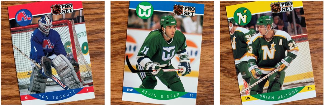
As I opened the cards I was thinking about this time in the NHL and where we would be headed not that long after this. These are all teams that don’t exist anymore. Or at least, they don’t exist in the cities they are pictured in above. The Nordiques went to Colorado, the Whalers to North Carolina, and the North Stars to Dallas. They all ended up finding success in those cities. That kind of makes me feel bad for where they were.
Again, hockey hasn’t been my most favorite sport and I don’t want to mis-remember things, but I know these were not powerhouses of the NHL when I was following the game back then.
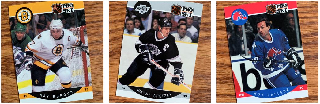
Ranger Danger
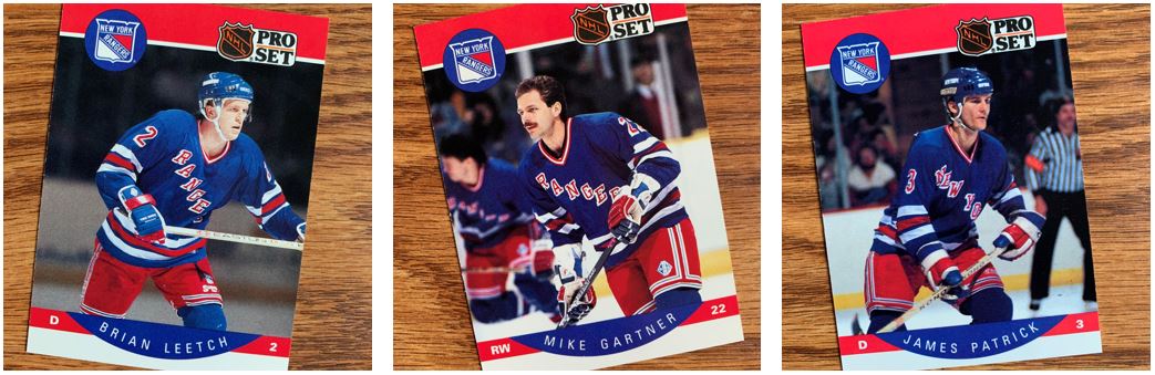
My fandom in the Rangers has a little to do with success and a little to do with the schadenfreude I mentioned earlier. When I was much younger I had a friend in elementary school that introduced me to hockey cards. At that point I don’t think I remember knowing that anything other than baseball and maybe football cards existed. But he had hockey cards and that was awesome. It was a pretty mysterious sport to me. I just didn’t have experience with it at all. The cards even had scratch off pucks which was so different.
Well, he rooted for the Islanders. The one thing I remember about this kid is that looking back, I didn’t like the way he said Mike Bossy. Yeah, it can be that simple, but that set me off. Now, I didn’t gravitate towards the Rangers yet. That happened several years later in middle school. The friends I had then were Ranger fans and I just started getting into watching them. Of course players like Mike Gartner, Brian Leetch and Mike Richter helped solidify my fandom. A little later on it was Messier, Graves, and others that help lock it down when they helped the team with the Cup.
I think of the players that are pictured above, Brian Leetch is ultimately my favorite Ranger. But around this specific time it might have actually been Mike Gartner. I just remember how fast he was. I also remember that he never really won anything but was part of that 1994 team up until the deadline.
Leaders, Greats, All-Stars and Trophies
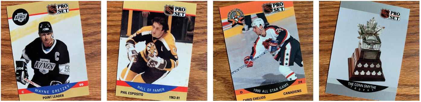
I always like to show off different cards within the set or inserts. There weren’t really many inserts back then, especially for a new hockey set. And if we look above, you can see there there weren’t really many differences from the standard cards. The Leaders, Hall of Famers, All-Stars, and Award cards all had the same design as the base cards in the set. But these are all technically base cards too.
I think two things struck me about these. The first is that the All-Star cards focus on that black and orange color scheme. It made me realize that the NHL logo was always the one that didn’t have a red, white, and blue scheme. I guess that was because it was for team in the U.S. and Canada, but I’m really not sure if there’s a reason behind it. Second, is that awards were sort of a big thing in a lot of hockey cards sets, at least for this time. The hockey awards are always important, but this really drove that home.
Other Stuff
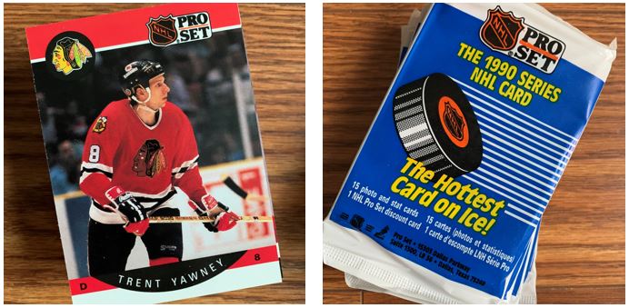
As always, I kept several packs and I pulled out cards for TTMing. There was a pretty good stack for TTMs (which you might be able to tell by that shadow in the picture). With this being my first foray into sending out hockey cards, I really had to pretty methodical about figuring out which ones I needed to pull. I sorted the players in alpha order so that I would be able to go through lists quicker. Then I really had to look things up. But the problem is that I’m not sending to Canada, at least not yet, so I had to be careful about what address was successful.
This was really fun to open because of the colors. I liked seeing the old teams and this is a good design for me. It’s definitely along the same lines as the Pro Set Football cards for this time and I felt pretty similar about those with the team colors and all. I generally like how signatures come out on these cards too but we’ll have to see where hockey fits with being too dark or busy. You would think the white of the ice and boards might be helpful though.