In my last couple posts I highlighted sets that I preferred a lot when I was younger, but don’t really like today. That’s at least from a design perspective. 1989 Donruss and 1990 Score are still fun, they just aren’t something I would choose among other things these days. But for some reason, 1987 Donruss is the opposite.
I don’t remember seeing it much as a kid. But remember this is 1987 and there was another set that was dominating even back then. 1987 Topps was such a strong card from front to back. It was all over the place (it still is) but even then it seemed cooler than this.
But since I’ve been getting back into TTMs, I’ve discovered a little more of an appreciation for this set. Even more so recently. These cards look really good signed. The picture quality is always pretty good for those days even though maybe the design itself isn’t the most exciting.
Let’s see what we can find in this bad boy of a box.
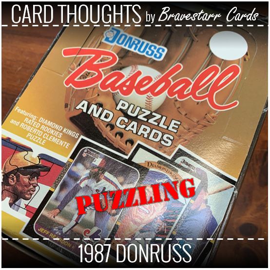
1987 Donruss
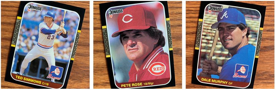
Sometimes I pick out my cards for these posts and I get my pictures ready and I don’t write the post until later. I honest don’t know what possessed me to pick out two Braves. I have a feeling the “recent Hall of Famer” tag for Ted Simmons contrasting with the surprisingly (for me) not a Hall of Famer for Dale Murphy was probably part of it.
The Pete Rose card I definitely remember. I honestly can think of another card that is a position/manager card. Any thoughts? Maybe a Frank Robinson card of some kind? It just appeared odd to me.
DKs
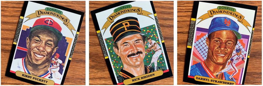
As we look at specific cards we’ll start with the Diamond Kings subset because that’s what the set starts out with. I thought these were interesting for two reasons. First, what kind of drugs was Dick Perez on when deciding on the backgrounds? Second, how much do these actually look like the player?
I’m no artist so I can’t do much better, but I feel like later Diamond Kings (or at least different ones) have been better. One a scale of one to ten with 1 being “not resembling” and 10 being “spitting image” of the player, I see these as:
- Kirby: 4
- Rick: 9
- Darryl: 3
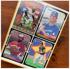
Rated Rookies
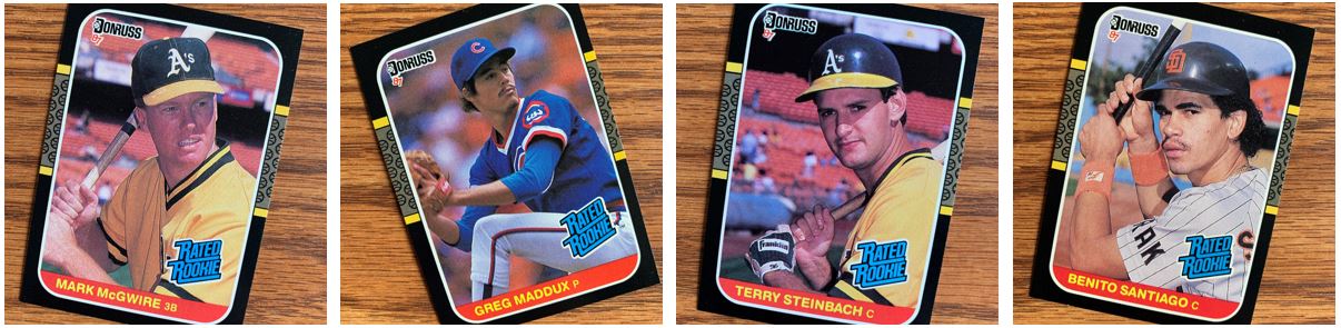
We’ll pull out the good Rated Rookies next because those are always the next subset to start off the set. I got a bunch of good ones. With boxes like this you never really know if you have truly unsearched packs, even when its a sealed box. But the fact that McGwire and Maddux were in there I think is a pretty good sign.
Style Gurus
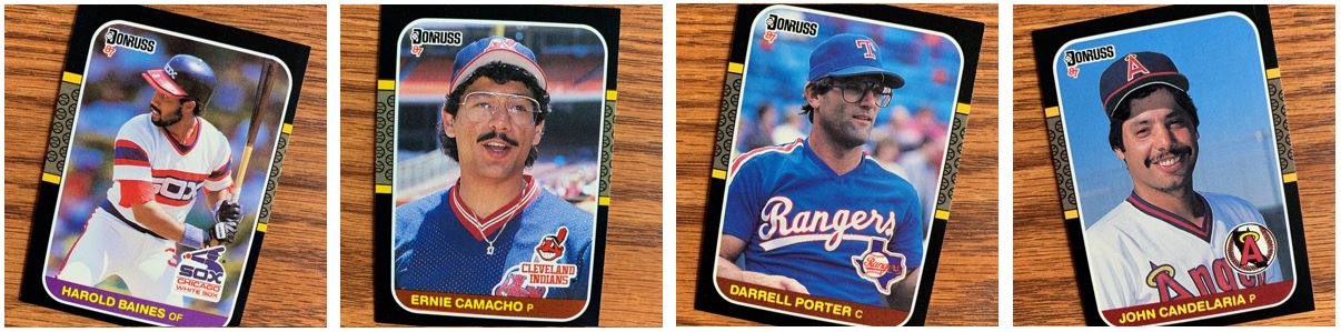
We talked about it in the 1989 Donruss post for Brian Downing, but Harold Baines is rocking the two-hat look. I remember doing that back in little league (that would be before ’87), but I don’t remember it being to replicate what players were doing at the time. Maybe it was but all that wasn’t as prevalent as it is now with video games and social media.
Ernie Camacho and John Candelaria also have their cap game set to 11. It looks like they prefer to sit it right on top and show a little of their bangs up there. Then Ernie and Darrell Porter and showing off some super big specks. They might as well be protective goggles from biology class.
Back Checking
I can’t remember how many of these cards were out there. But it is interesting that you can see that Dale Murphy has a different image for his “card”. I never really cut cards out of the back of a box because who ever got a box back then. You only ever got packs. These days it’s a bit different but I will say I bought some cards off Craigslist about a year or two ago and there were a lot of Wax Box cards in there.
Puzzler
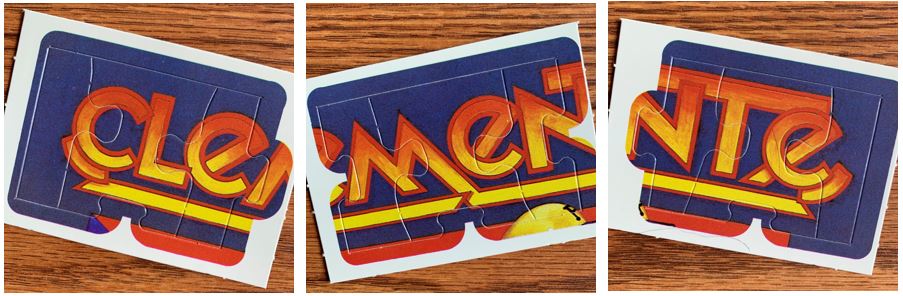
Roberto Clemente was the subject of the puzzle for 1987. Honestly for Donruss puzzles, the only one I ever remember the right year for is Warren Spahn in 1989.
Stacks and Packs
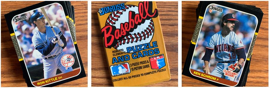
There were some really great TTM cards that came out of this box and I am really excited to get them out into requests. As I said earlier I’ve been liking them signed and I’ve had more going out and coming back recently.
This was a fun open for me. One thing I noticed was that while maybe the design wasn’t as good, the picture/image quality for Donruss products back then was way better than Topps. At least it was more consistent than Topps. Topps usually has some shifted images or dull images. These are always pretty crisp and its a noticeable difference in consistency.
For more about 1987 Donruss, check out BaseballCardPedia.com.