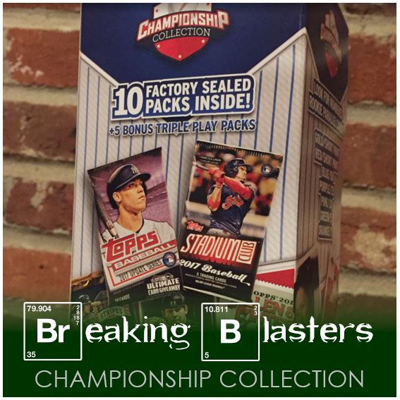
I can’t even remember which Topps release I was actually looking for when I found these re-pack blasters. There were so many that all the trips run together. But when you get to the store and you’re looking for cards then dammit, you’re gonna get some cards.
I’d never seen these Championship Collections re-packs before. They boasted 10 factory-sealed packs, plus five bonus Triple Play packs (the 2012 variety, not the old school variety). They also boasted some Shohei Ohtani cards. While the Ohtani cards might be the bonus for some, I knew they weren’t going to be anything special. I’m not on the Ohtani search like others are.
Opening the two boxes up was deja vu. Both blasters were almost exactly the same. I don’t know if that’s because I bought two from the same Walmart or because that’s the way they all are. A lot of times in blasters like this I like to save a pack or two for my unopened pack collection but there really wasn’t anything worthwhile for that. Now, I said almost the same. That’s because one blaster was a pack short. Here’s the rundown on the packs in each:
- 2012 Triple Play (5 packs)
- 2013 Panini Cooperstown (1)
- 2014 Panini Prizm (2)
- 2015 Panini Team USA Stars and Stripes (1)
- 2016 Topps Series 2 (1)
- 2016 HBP Honus Bonus Fantasy Baseball (2)
- 2017 Topps Series 1 (3) – In the box that was short a pack I only had two of these
I think everyone is familiar with most of these products. I’m going to take a closer look at the ones I’m less familiar with and the “special” cards I got out of each.
2013 Cooperstown
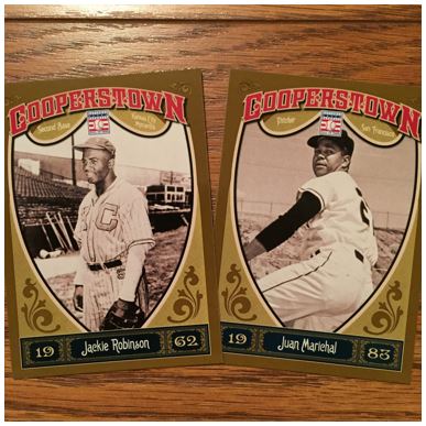
Normally I’m not a fan of cards that look modern, for lack of a better word, with a black and white photo. But after looking through these a couple times I’ve come to like them more. I like the “Cooperstown” at the top with the HOF logo, but the bottom isn’t my cup of tea because of the font. The election year and the name are just in a kind of cheezy font to me.
For the Jackie Robinson card I really like that they didn’t choose a Dodgers picture. But, I can’t give too much credit for that because I would best that’s because this is not a licensed product. They picked a great way to block out the logo for Marichal… “just move him around until the logo covers his head and the logo.” The other thing I like on the backs they give career stats, but also a specific game box score. For instance, Marichal’s is the no-hitter he pitched on June 15, 1963.
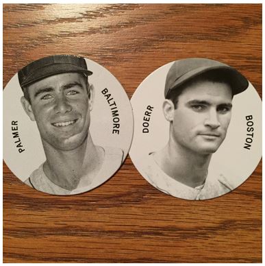
These discs are great. They are about the size of pogs. As Milhouse would say, “They’re baseball cards,… in pog form.” So they are a little smaller than the width of a card. While I like them, the first thing I always think of with these is “how do I store these correctly?” I’m more of a box than a binder guy, but both of those would still have their challenges I assume. I don’t know that there is a perfect solution. But at least they fit the same place normal cards would. These specifically have “Colgan’s Violet Chips and Mint Chips” on the back.
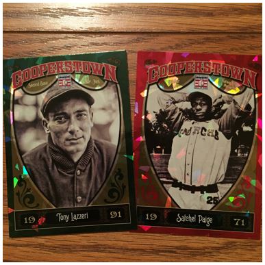
So if I normally don’t like “modern” cards with black & white photos, these really put that to the test. Can’t say I have many (maybe one) Satchel Paige cards in my collection. This one is numbered to 99 which is a bonus.
2014 Panini Prizm
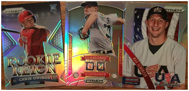
Normally in the Fairfield re-packs (those light blue ones from Target), you get the 2014 Panini Prizm Perennial Draft Picks cards. These are more of the base cards related to that product. They look and feel the same. That includes the mystery dust you can feel on them. You can actually see it in the Scherzer Team USA card at the top. It’s so odd.
There was a pack in each box and it’s crazy that I got a Scherzer insert in each. The Team USA card is funning because it’s him on the Collegiate National Team. That would have been several years before this set though. I guess he had one his first Cy in 2013 so maybe they had more of him in packs because of that.
2015 Panini Team USA Stars & Stripes
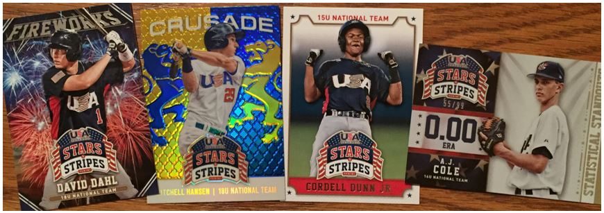
I really had a good time opening these Team USA Stars & Stripes packs. The base cards have a good look to them as you can see with the Cordell Dunn Jr. card, but there are two negatives for me. The first is that the logo is HUGE for all the cards, even the inserts. The second is that it seems a little bit “cradle robby” to me. That’s a 15U card. I’m sure your family signs it’s life away for pictures when you play for the National Team, and I know that getting your own baseball card is probably super awesome, but it just makes me think that’s a little early for a card.
I really like all of the inserts. I have no idea behind the Crusade insert and it’s purpose, but I really like the logo in the background. Plus is has a Chrome feel to it. That A.J. Cole card is numbered to 99 which is cool. But again, that’s a 16U card.
2017 HBP Honus Bonus Fantasy Baseball
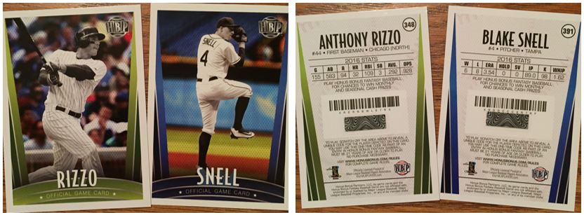
This was a game you could play online where you would scratch off the area in the middle of the card on the back and reveal a code. Each would be unique and allow you to play the player online in a fantasy baseball entry. I get the messaging on the back, but it tells you how things have changed with both fantasy baseball and baseball cards in that you have to be “21 years of age or older to play.”
The cards are odd with color everywhere EXCEPT the player. Originally I was wondering why that was because normally you would think the opposite. However, without the MLB license I guess it makes it easier to make the cards for generic uniforms.
2017 Topps Series 1
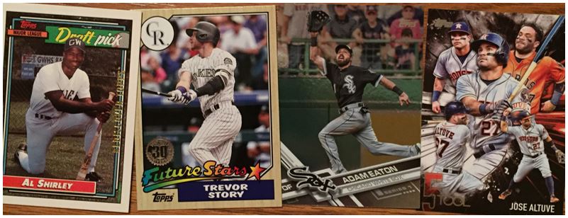
We’ve all seen these so I won’t dwell on them. These are the inserts and parallels that came out. The Eaton card is a rainbow foil parallel. I actually like those in this set better than the regular set which kind of got boring after a while. The “5 Tool” insert is one of my favorite insert sets in recent years. You couldn’t get too many out of packs but they look really fun.
Leaf Shohei Ohtani Cards
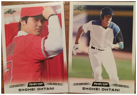
The last cards were not in packs and were in penny sleeves. Just another way to try to slip some Ohtani’s into a product. There’s supposed to be parallels of different colors… whatever. The picture on the front is cropped on the back. Both of these cards say the exact same thing so I assume they all say that. Pretty boring honestly.
As with any unopened packs, these were fun to open. I wish I only got one since they were both the same packs in each. I’m not going to recommend it but I won’t say to avoid it if you are in the mood to open some packs. Just buy one though or know going in that you might get the same packs in both.