So in my previous Breaking Blasters post for the 2021-22 O-Pee-Chee cards that I opened, I told you that Target was kind of hard to follow with what they’ve been putting on the shelves. This is another example of that.
Like the other box I opened I got this one several months ago, but not 2020 or 2021 several months ago. I guess it was just not something that rolled off the shelves. I actually think that when I opened it I didn’t even realize that it was for the previous season. I was just looking for some interesting hockey to open at the time. But no matter what the reason…
Let’s get a-rippin’!
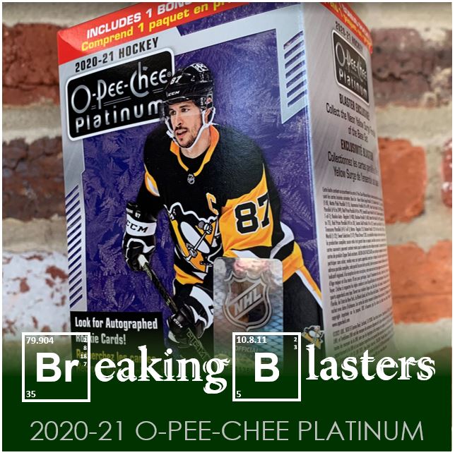
2020-21 O-Pee-Chee Platinum
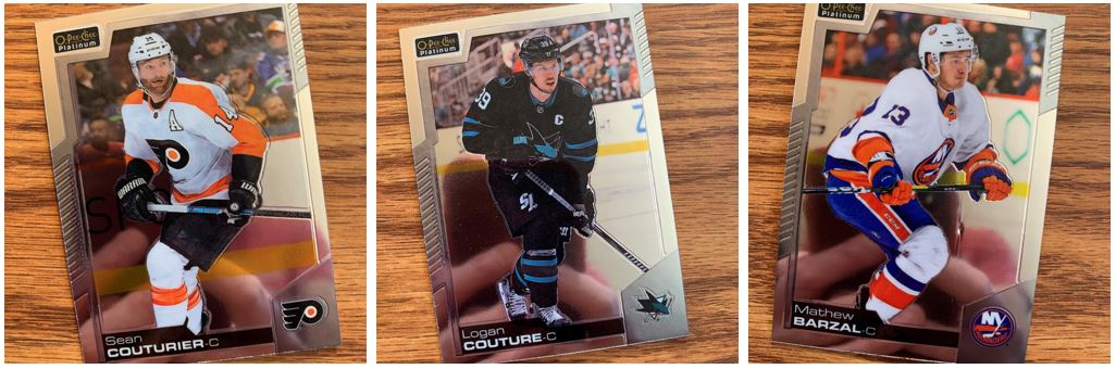
I am not a shiny card fan. In particular I am not really a chrome card fan. These remind me a lot of the Panini Prizm cards from maybe like 2012-2014 or something like that for baseball. They are kind of boring from a design perspective. They almost feel a little like Donruss football without the color. But I think the images on these feel a lot better than those old Panini cards.
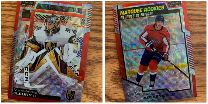
I swear I didn’t do this on purpose in pulling Couturier and Couture, those names are just so close together. And how could I pull an Islander for the top here? Well, there just aren’t a lot of cards in these blasters and there were no Rangers, so I was just looking for something interesting.
Yeah, you are going to see me in virtually all these pictures. Well, you’ll see my fingers and my phone.
Recrues de Renom
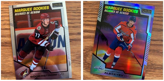
These are not just rookies but some version of rookies. As always, you’ll get the French lesson for free with O-Pee-Chee. At least a hockey/cards French lesson. I think the version above is the Sunset parallel and that’s the most common. I don’t know how much a palm tree goes with the hockey feel though. Sunset maybe, but palm tree I question.
One thing I do like though is how the Sunset image goes all the way to the ends to show more of the background in the border design. That gives it a total different feel than the standard version which can’t really show that effect.
Images On Top of Images
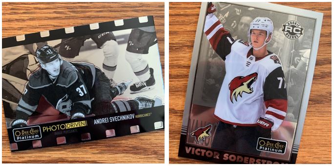
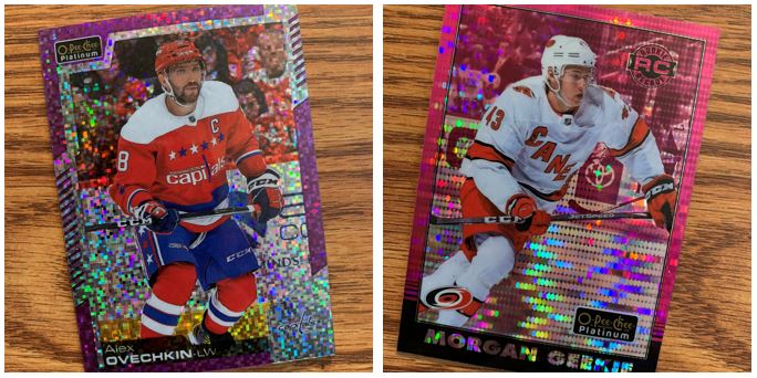
If you read this blog with any regularity I think you know that I like the color image on top of the black and white image. These mostly fit that. But the Photo Driven card is like black and white on top of black and white… interesting. I REALLY love that design though and the addition of the gold text.
A Different Kind of Shiny
This is where chrome cards are a little bit crazy for me. What the heck is this one called. I’m guessing it some standard type of parallel because this is a blaster and it can’t get that special. This is the part I hate about parallels in general but especially with chrome.
Wowzers!
OK, so I know I just said I don’t tend to like them… but these are pretty cool. Trust me, I ain’t going out to grab them up. And I’m not going to heap praise on them, but they are pretty cool.
Now normally I would close out with a picture of a pack to tell you I saved it. But with this being a pack with not a lot of cards and not a lot of packs, I didn’t keep anything this time around. Something fun to open, but not something I’m going out and looking for much more than a hear and there thing.