How many times have you had a great idea, but for some reason you couldn’t pull it off just right? I was talking with my daughter the other day and she was frustrated that she wasn’t drawing what was in her head. She had this great idea in her head, but when it came to the way she wanted it to look on the paper it ended up in lots of crumpled up paper.
That made me think of when I was little and went through the same thing. I was pretty good artist when I was a kid, but when it came to some things I just couldn’t pull it off. What I had in my head definitely wasn’t what I had on the page. It isn’t just a kid thing either. I’ve had ideas at work that for whatever reason look good, but then in practice they just don’t come off exactly how you want them too. It happens to everyone.
I keep getting this feeling with the 2019 Topps flagship. On the positive side, I appreciate the design and a lot of it’s elements. I think it’s a fresh take while still a “tribute” and fits with some of the latest designs. But on the negative side, I’ve seen a lot of elements that show flaws in execution. After spending a few weeks with it, seeing some other feedback about it, and then just comparing card to card, things just jump out that frustrate me.
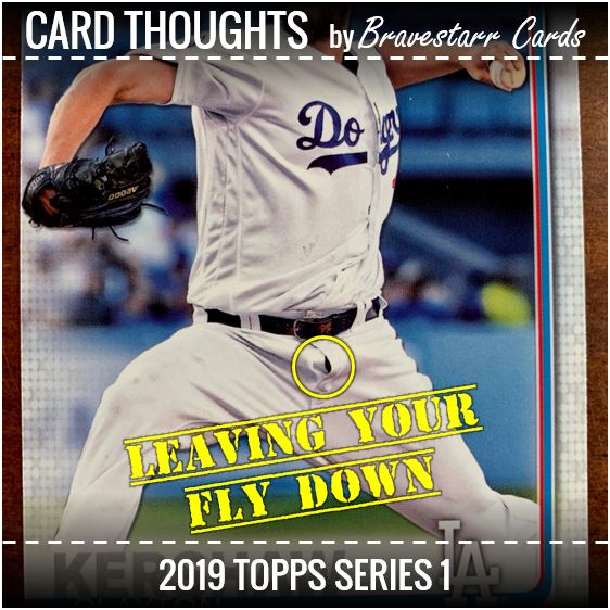
I keep comparing it to the idea of getting dressed up to go to a special event (like a red carpet event) and then leaving your fly down.
The Good, The Bad
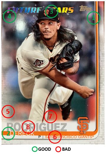
I’m going to use this Dereck Rodriguez card as the model for what I like and don’t like. Some of it is design-related and some you’ll see come back later related to execution. I just wanted to highlight a few on either side.
The Good:
- Throwback Reverse Hockey Stick (1) – I like the design. It’s a throwback to ’82, but modern at the same time. Plus they use it (see #3) in a modern way.
- Name Design (2) – I love how the first name covers the full “hockey stick” and is almost cut out from it.
- Overlap (3) – This was done here and there and not the same in each case, but I love it when the picture overlaps the design and feels like it’s interacting with it.
- Future Stars (4) – The rainbow “Future Stars” logo is great, and with the stars even.
The Bad:
- Digital Smoke (5) – I’m OK with this in general. It’s something Topps has done since maybe 2016 in various ways (except for maybe 2018). They go through these trends in styles and I like that. What I don’t like is where the last name is. The white line with the short fade at the top is so drastic and doesn’t seem to go with the hockey stick.
- Team/Position Alignment (6) – While I liked the way that the first name went from top to bottom of the hockey stick, this doesn’t. It buts up against the top awkwardly leaving an odd amount of space below it from the next part of the design. And the pike that splits the position and team, it’s not evenly spaced between the element it sits on. Everything just seems to be aligned awkwardly here.
- Picture FX (7) – Just stop with the picture effects. STOP!
- Name Execution (8) – Good god could you please print something properly and consistently! More on this later….
Things That Work
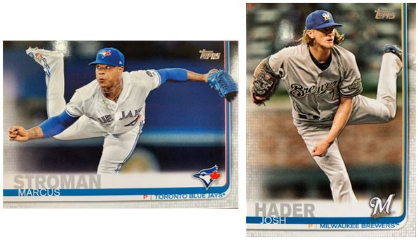
Here are some great examples of some of the things that I like about the design. Check out Stroman’s glove and Hader’s foot. Sometimes it overlaps and sometimes it doesn’t. I actually like that it’s not all or one. And it really works for both.
I also like how there’s the spot that you can see Hader’s foot behind the design on the other side of the “hockey stick.” It wouldn’t be as interesting if it was the digital effect up that whole right side. (Side Note: I think there is one card that I noticed that doesn’t do this – Trea Turner.) It’s this modern “half the card has a border” type of thing. That just comes off as another way they are modernizing ’82’s design.
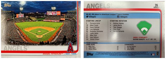
Like most others, I LOVE the backs. I feel like they are informative and I like how the design is still carried through to the back. The type is small, but that’s bothersome when you get old. I think it looks better that way even though it’s a pain in the ass to read. I would always go with the smaller if left up to me.
I also like the inclusion of the ballpark cards. I think these look great. I took a little baseball road trip with my brother last year and these remind me of that. We tried to take pictures from different angles in the parks we saw.
Things That Don’t Work
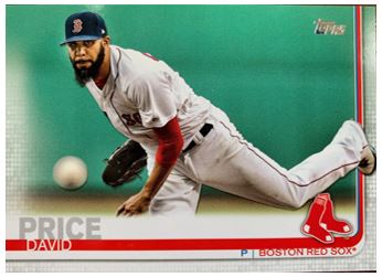
Stop the picture effect you are doing right now! Why do we need to put a shadow or glow effect from Powerpoint on the player?
This is an example of taking that idea too far. Look at the ball. The blurry ball has a freaking shadow. It looks so awkward to me.
Another thing I’d like to point out in the design is that white bar behind the last name. I feel like it either needs to not be faded at the top and/or needs to be curled to go with the curl of the hockey stick (in the bottom right). The way it’s laid out on there now it feels really forced.
I think I get why it’s needed. They need a place to put the last name. So let’s look at that shall we?
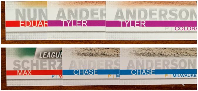
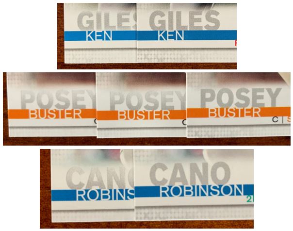
I tried to layout some cards together so you can see how terrible the execution is on this. Is there a problem printing gray?
Sometimes they are faded at the top (Cano, Posey), sometimes they are faded at the top and bottom (Giles, T. Anderson), and then sometimes the whole name is faded (C. Anderson). I really can’t understand why this would have been such a hard thing to get right, especially when there’s evidence (like Cano, Posey, and Giles) where they did get it right.
One of my problems with this is that while sorting and getting new packs, I have to look at the back to sort and if I have doubles I have to look and see which one came out better on the front before I decide which is the one that should be in “the set” that I’m keeping.
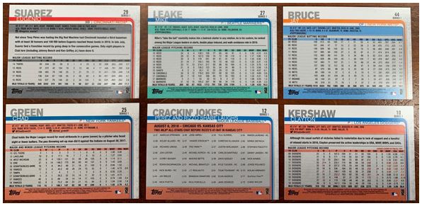
While I love the design of the backs, I question some of the color schemes. Since when have the Yankees and Dodgers been blue and orange (I’m sure the Yankees love that combo considering their city neighbors). I found plenty of teams that had their normal color scheme or a version that went with it. But I’m sorry, a few of those that should be red are actually orange.
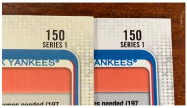
To be honest this last picture was a one off, but who wants brand new yellowing cards?
Transaction Issues
This next bit of feedback isn’t really specific to this year’s set as it’s been something that’s always happened. It just seems so much more pronounced than it ever was in more recent years. And I’m only looking at this based on the cards I have so this is not a complete list.
I was trying to figure out when Topps has to lock down who will be in Series 1 by looking at what team a guy showed up on for their card. I always kind of question when a free agent shows up on their old team on a recent card and they sign someplace else. Couldn’t that wait until Series 2 if we know they are a free agent? We know there will be a Series 2.
So far, I see Adam Jones (Orioles) and Logan Morrison (Twins) who still aren’t on a team as I write this (Jones is now on the DBacks). I think we knew Jones wouldn’t be an Oriole. Could we have a back-up for cards like this and put a different player in.
In addition, guys who signed prior to the release date like Adam Ottavino (1/24/19), Andrew Miller (12/21/18), Jonathan Schoop (12/6/18), and Josh Donaldson (11/26/18) all changed teams prior to the release date. We didn’t know what team they would be on right? But they get a card in Series 1? So we know that as of the end of November (Josh Donaldson), nothing was going to change.
Trades are a different story entirely. There’s no way to predict them so you can’t fault Topps for that (i.e., J.T. Realmuto traded after release date on 2/7/19). But we can use it to figure out the checklist set up and when they have to get to printing. We can still see when Topps has to lock it down. I’ll go in reverse order.
- Sonny Gray – 1/21/19 – 9 days before release – OK, duh, I get it.
- Yasiel Puig – 12/21/18 – 40 days before release, completely understandable – its a lot of cards to print and collate terribly.
- Yonder Alonso – 12/15/18
- Edwin Encarnacion – 12/13/18
- Paul Goldschmidt / Luke Weaver – 12/5/18
- Robinson Cano / Jay Bruce – 12/3/18
- Yan Gomes – 11/30/18 – 2 months before release date. Wow, that’s a like a lot of logistics to plan for.
- James Paxton / Justus Sheffield – 11/19/18
- Mike Zunino – 11/8/18
- Kyle Barraclough – 10/10/18 – Almost three months before.
I’m not pretending to know the logistics on all this at all. But because of the 1/30 release date for Series 1, Topps looks like they have to lock it all down before the end of the prior season. What was the release date like years ago?
I know Topps needs to get the big names on cards and make some cash. I just hate getting a card and seeing that it’s kind of already wrong before Spring Training started. This happened years ago too, but it feels worse.
A Picture Speaks
I’m really not this much of an old man. I’m not trying to tell you to get off my lawn. I promise I like more than I don’t about the set. I’ve just been looking a lot at the cards and wanted to get it out.
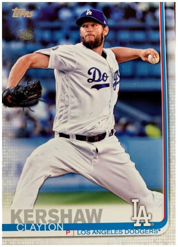
So after all that, let’s check out this great card. I love the colors in the picture because it all helps enhance the “Dodgerness” of the card with that blue background. The “hockey stick” or swoop is great and the last name is actually printed correctly. Since he has his home uniform on it hides the forced nature of where that white line behind the last name doesn’t swoop with the design in the bottom right.
And then, it hits you. Mr. Kershaw… XYZ PDQ.