Could we consider cards like a mood ring? I wonder if that would make us feel differently about the cards and if it would go with the year. Hmmm, let’s see…
- Red – Energy / Excited / Adventurous – 1990 Donruss would cover the red. While I don’t know if I would consider it “Adventurous,” but it certainly does stick out.
- Yellow Orange – Unsettled / Mixed Emotions
- Orange – Daring / Stimulating
- Lavender – Clarity / Sensual – Not exactly what I think of when I think of cards.
- Black – Stressed / Nervous / Tense – 1971 Topps would be my first thought here, but I feel more relaxed by it rather than stressed.
- Gray – Very Nervous / Anxious – 1989 Fleer or 1970 Topps would work for this. 1989 Fleer would more business like because it has pinstripes in my opinion.
- Brown – Restless
- Green – Normal / Average – 1992 Fleer is green, but not normal or average in my book.
- Blue – Calm / Relaxed / Loveable
- Pink – Fear / Uncertain
- Yellow – Imaginative – 1991 Fleer is the obvious choice. First, why have I picked so much Fleer? Second, I should stop before I piss off @CardsFromAttic?
- White – Bored / Frustrated – Unfortunately this is a lot of cards.
Well, that experiment didn’t go well. But I think we proved the negative hypothesis in that cards are not like mood rings.
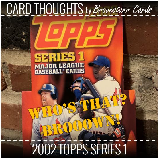
But that still doesn’t mean that cards with a non-neutral color background don’t make you feel a certain way. And since 2002 Topps is brown, there’s probably a lot of ways I could take that. Not many of them are good when that color runs through my head though.
2002 Topps Series 1
So, yeah, Brown…
Go ahead and tell me it’s “gold.” Try and convince me its some kind of “orange.” I’ll wait…
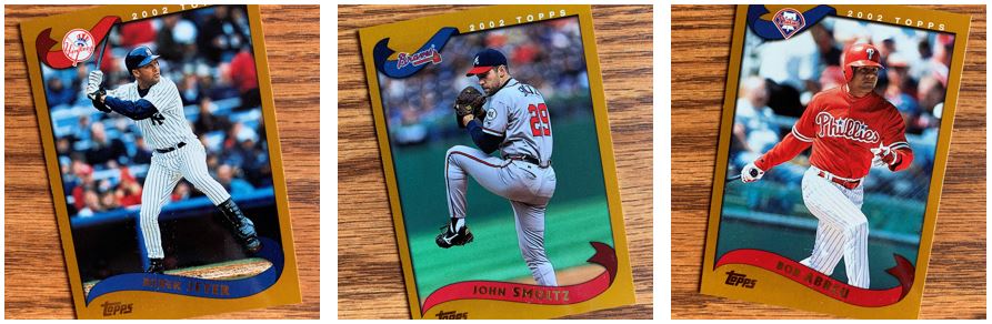
It’s brown. That’s it. It does have team colors and I like that. But couldn’t we have it be white? That might have been A LOT of white, and maybe it would be too predictable. But brown? What about black? I think that could have looked pretty sharp. Pictures are solid, cards feel good,… but brown?
I like that I got a Jeter and a Smoltz and others, but the brown just puts a damper on everything.
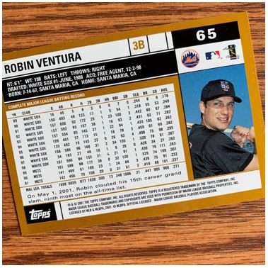
Now when you look at the back it almost doesn’t matter. The brown is just part of the design/outline of everyting and it does kind of look more gold on the back if I’m honest. This totally looks like a classic Topps back too. That card number is fabulous by the way.
Cup-le of Rookies
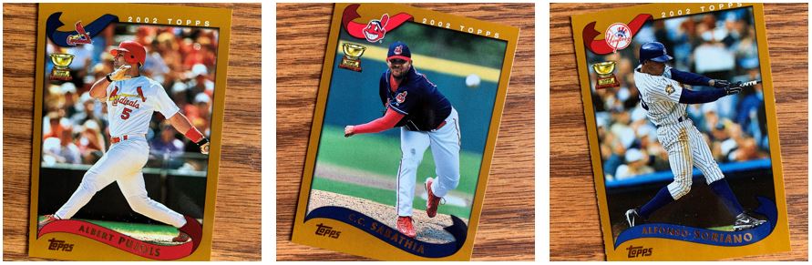
I did like seeing that gold little cup. I think the one of these that I was happiest to get is the Pujols. I know these aren’t rookies (which were not very plentiful or exciting) but since I was out of collecting in these days, that is one guy that I only really have more recent cards of. I loved seeing him in a Cards jersey too.
Shiners
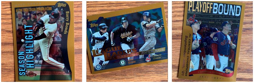
These shiny cards were pretty interesting. They came at the back end of the numbered cards in Series 1. I like that these were the cards that told the story of the year before. Obviously the season highlights did that, but I like all the Postseason and League Leaders in one spot too. The effect on these cards was slightly off though. Maybe its just my old man eyes though.
The Special for Today are…
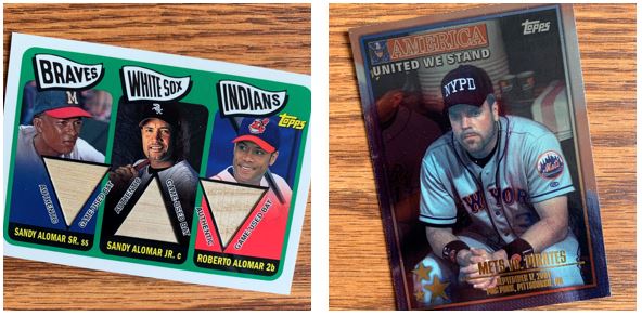
These were my favorite cards out of the bunch. The obvious one from a hit perspective is the Alomars’ card. I feel like that one could be pretty special to a lot of people. I which that Sandy was in an Indians uniform instead of a White Sox uniform, but beggars can’t be choosey.
The Piazza card resonates for many different reasons for me. Of course those games after 9/11 have a special feeling to them. This isn’t the first game back in New York, but it still has that legend to it. Something interesting is the NYPD hat for me. For years the Mets have been trying to wear those again in a game and it hasn’t happened.
Insert Comments Here
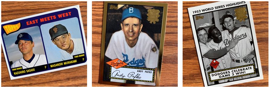
These first inserts show you that throwing back to old cards isn’t as recent a thing as we think. They are certainly Dodger heavy with that one set about ’52, but that kind of makes sense. It’s actually interesting that it’s exactly 50 years here because I always feel like Topps is off with their years in tributes (i.e., like Heritage being 51 years).
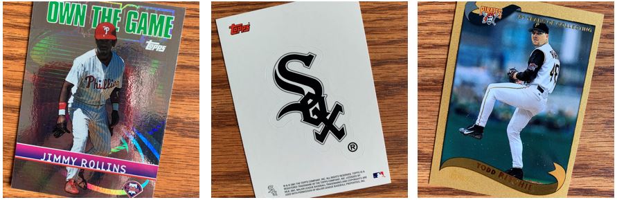
Now there’s a gold card. The gold card is basically glitter which I almost didn’t want to touch because it made me think of art project my kids did when they were kids. I just new that stuff would get all over everything. Somehow though it’s not as shiny as the Own the Game card though. The sticker card kind of felt like a throwback to late 80’s / early 90’s Fleer and Upper Deck cards.
The TTM Pile
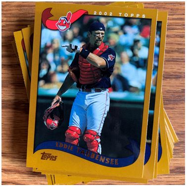
Last but not least is the TTM pile. I think the Eddie Taubensee card is good for the top of this pile because it represents what I found. I got a lot that I have one or maybe two cards of someone, but not necessarily enough for me to send something to then yet. It was a good stack of cards though.
I was not as thrilled opening this one as other things I’ve opened recently. It was just that brown killing the mood man.
For more about 2002 Topps Series 1, check out BaseballCardPedia.com.