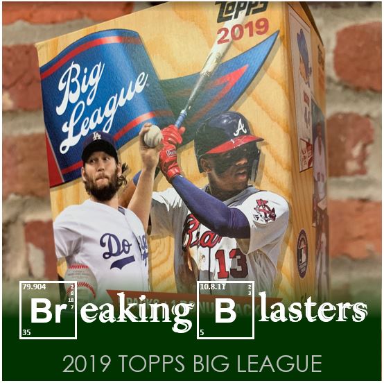
I saw folks posting about 2019 Topps Big League when it came out and I kind of liked the design. But while I liked it just a little last year, it wasn’t something I was itching to go out and get. Well, I liked the idea of it this year just enough to get some while I was a bit bored with other cards.
It gives me pretty much the same feeling as last year. I dig the design enough, I like some of the inserts, etc.. But then the quality of the cards are a little flimsy and some of the pictures are a bit dark and dull. That said, for the price it’s essentially a hit. Especially when you get that urge to open some cards, but you don’t necessarily want to spend on the same products you’ve pumped enough money into already.
So let’s find out what we can get in a blaster.
2019 Topps Big League

I like Big League’s 2019 style. The pictures can get pretty interesting. Not Stadium Club interesting, but interesting none-the-less. But there is a lot of standard fare from that perspective too.
The one thing that irks me a little bit design-wise is within the layout and composition. I feel like there’s a lot of empty space wasted at the bottom of the card. I like the flag and where the name is, but it seems to be set up high enough that it’s too empty at the bottom. The top and sides are off the edge of the page, but not at the bottom which just seems a bit off to me. When I first saw them I almost thought they were miscut until I saw enough of them.
And while I’m not trying to say that the way I usually take pictures of cards is original or copyrighted or anything like that… does the layout of the picture on the card with the wood background look like every picture I take. Again, I am not saying Topps is biting my style, but these are like pictures, within pictures on this page.

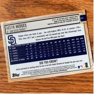
I will say that I love the backs. They are pretty old school with the “Did You Know?” section and all that. Of course, they don’t have career stats which is what I would rather see, but I love their layout and the colors.
Something I really love is the way the number of the card appears. For a righty and with the way I sort cards, it’s perfect. That is until you get to card 300 something… the “Highlights”. When you get up there the numbers were printed upside down. Kind of dumb quality control.
My Muts

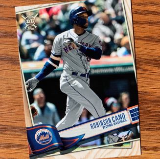
The only Met in the whole blaster was Robbie Cano (don’t cha know – had to go there). Interesting given this is probably photoshopped. I’m never going to understand how they decide who gets on cards and who they are going to put photoshop work into. I feel like the Mets have plenty of players that could be on these cards that don’t require it.
I think this is a good example of how dark/dull some cards can be. I don’t know that the picture does it justice but sometimes the picture quality is just meh.
TTM Cards

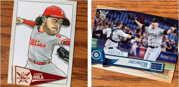
One thing I felt like I got some good stuff for is TTMs. With two Paxton cards I should definitely get these out. I would especially like the Highlights card signed as I love those kind of “moment in time” cards signed.

The Nola is one of my favorites because I love those inserts (more later) but that would be amazing with some ink from him on there.
Insertables

I like that there’s not too many inserts in this set. I don’t necessarily love them all, but they are on the fun side. If I had to rank them it would be the Caricatures, Nicknames, Blast Off and then Wall Climbers.
That Caricatures card of Snell will be another great one for TTM. With it being so bright it will be great to show off his signature. As for the Nicknames insert I love the colorful Players’ Weekend jerseys they showcase on there. The others are pretty standard inserts to me.
Big League Parallels

The parallels are fine with these being Blue, Gold and Rainbow. I did get a numbered Black and White type of parallel in a different pack that looked cool. Of all these I dig the rainbow the most though.
This was a fun blaster to open and I am liking Big League more and more. I’ll definitely give it a chance again next year if the design is good, but I’ll probably wait on it and use it as some cheap stuff when it’s in between other sets I’m more interested in.