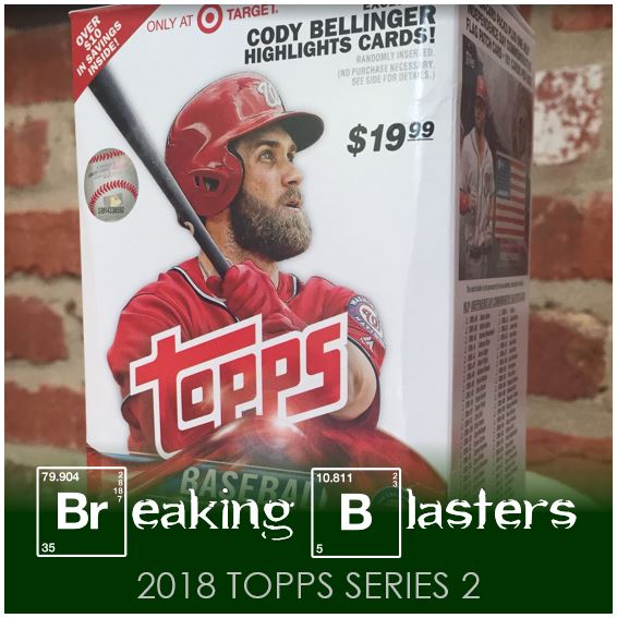
On the day Series 2 released I did my usually check of the most reliable stores with cards. Well, it’s one store with multiple locations… Target. I can hit three of them from my work location to home and came up with zippy in each one. The next day it was the same, and the next day, and… it was becoming some card collecting hell / groundhog day situation.
Finally it was the fourth or fifth day before I had success. It was the most reliable of all the Targets and when the hit the shelves they really hit the shelves. I loaded up on some blasters, hangers, fat packs and singles and there was still plenty more for others to take. But the funny part is, only that one of the four Targets in my area still have it. I got sick of running around looking so I might be a bit frustrated with Series 2 at this point. I only wonder what the future will old when Stadium Club and Allen & Ginter come out. My guess is they either won’t – OR – I will miss it because I can’t get there in time.
On to the cards….
2018 Topps Series 2 Review

I like Topps flagship this year so let’s get beyond that. You can check out the Series 1 Breaking Blasters post or my Rainbow post about Series 1 if you want more on that. It’s not like the design changes. What I’ve noticed in recent years, and it’s really coming across this year again, is the consistency in image quality and ideas with Series 1 isn’t there. I feel like this happens in a few ways.
First, I felt like Series 1 had a lot of interesting photos. I’m not saying Stadium Club, but definitely closer to that style. I did notice a few cards like that. There’s a Kurt Suzuki card in Series 2 that looks great but I didn’t get it in this blaster. I would say that the pictures run a little more standard. OK, so that’s a point, but it’s a bit nit picky.
Second, and I feel like this is a little more important, I felt like Series 1 was so colorful. The pictures above are some good ones in Series 2, but a lot of them feel gray or hazy. I don’t know what it is that causes that, but they don’t feel as powerful in color as Series 1 does (actually the DeGrom card below is a good example). Third, and I will get to this more later, I hate the airbrushing.
The 2018 New York Muts

I love my team but they are so frustrating to follow. Really for the last two years it’s been that way. I think they should rename themselves the MASH unit for how much they are injured. But I digress…
Four cards in the blaster is OK, but I really liked the cards I got. First off, I got the card of the best player on the team (DeGrom) so that’s awesome. Then I got Seth Lugo, one of my favorite guys on the team and who really was performing so well despite the way the team as a whole played. The Conforto Future Stars insert is a good one too. So while it might not be volume, they are still some good cards.
Interesting about the Lugo and DeGrom cards, that’s the way you will get them in a pack… Lugo then DeGrom. Wonderfully repetitive collation that Topps as become known for.
Air It Out

Series 2 should really focus on guys that changed teams in the offseason, rookies that need to be picked up for the set and then those who didn’t make Series 1. Now not all the guys above changed in the offseason, but some did. Yonder looks normal (except for his uncovered arm for some reason). This has to be airbrushed though so someone did a good job. Wade Davis feel like he is a little less successfully done, but do we not have a picture from Spring Training?
Sam Dyson, who was actually on the Giants last year, looks horrible. I don’t know if this picture really does that sentiment justice, but it verges on being an art card for Topps Gallery. Airbrushing is something I hate and I don’t even think this one is airbrushed, I just think it looks like it. But this speaks to some of the quality of image issues that I was referring to earlier.
I get that Topps needs to make money, and to do that they need to get cards that people want and are waiting for and what they are going to chase. I would rather see flagship Series 1 and 2 be more of a chronicle of the season.
Inserts Old and New

Series 2 always continues some inserts and then brings in some new ones. So far I like what I am seeing. They continued the “Legends in the Making” insert and numbered them this time instead of lettering them. I wish they would keep that consistent. Just continue the numbering. But I like this insert and the Blue and Black versions of it.
The Future Stars is new as is the Longball Legends. I don’t mind the Future Stars cards, they’re fine. I feel like they have a Bowman insert feel from a few years back. The Longball Legends inserts I like and they remind me of a Score football card insert from last year. I like them all being landscaped oriented. As for the Jon Gray specific card, I find it funny to have a pitcher be a Longball Legend (unless it’s Mad Bum).
More Old and New

Series 2 keeps the ’83 inserts going. I love the ’83 set but I’m not liking the parallel colors and it just doesn’t come off the same on the higher gloss cards. While I’m not necessarily a Cody Bellinger fan (I’m not not a fan though) these are the kinds of insert sets I like. Although I am really surprised this isn’t Judge because, well, the Yankees.
Manufactured patch cards are meh, but this one is for Harper. I just wish the patch wasn’t damaged. That white you see on the right side of the blue on the flag is a scratch and not glare.
The Captain and the Judge

There you go! Now the box is stuffed with Yankees new and old. Gotta squeeze those guys in there.
Make it Parallel

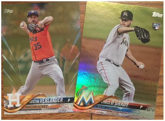
There was a discussion on Twitter the other day about parallels and some folks didn’t like the Rainbow. I actually prefer it to the Gold this year. I can notice the Rainbow, but the gold is for one an odd pattern to me. But also, it’s not gold. It’s gold like but gold is supposed to be shiny right? I like the way they did it the last few years better.
Overall, I like Series 2 because I liked Series 1. This wasn’t too bad of a blaster and I had fun opening it which is probably the most important part.