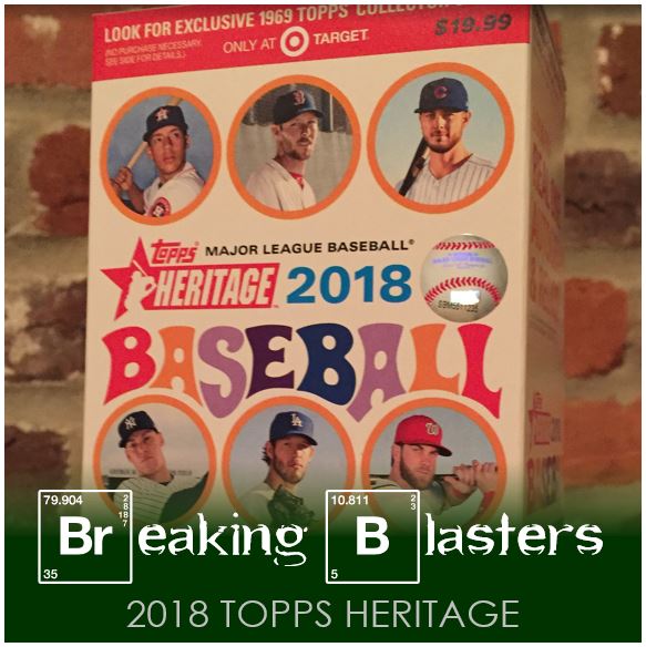
When I got to Target on Day One of Heritage I was really hoping I could find something on the shelves. From a distance it looked like I was out of luck. But I did find one lonely blaster laying on it’s side with it’s back facing out. I’m imagining someone just running through with their arm on the shelf and a bin to collect whatever falls off. Then this lonely little box hid and waited for me. There were plenty of hangers and packs, but I’m a blaster man.
This is really similar to what happened last year. High Number I had no trouble finding, but the initial release of Heritage was really hard to find in my area. So on day one I was itching to find something so I wouldn’t miss out. First, the packaging is pretty cool. I don’t remember when they did so much of a throwback (but I also have a terrible memory).
2018 Topps Heritage Base Cards
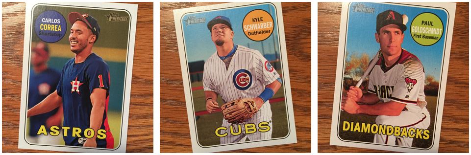
This year’s throwing back to 1969. When you talk about Heritage you’re really are talking about the sets that they represent. 1969 isn’t a terribly exciting design. But to have today’s players in yesterday’s card definitely adds intrigue. It’s not a terrible design, but it’s solid. It’s so great to see the backs and the cartoons on the back and everything. Even the backgrounds feel like they are a bit of throwback in most cases. A lot of the pictures are a little more posed than back in the day. That certainly makes for some interesting cards.
The cardstock is thick and as a TTMer, these are always great for taking an autograph. A bonus with 1969 is it was a year without a signature already on the card. It never looks good when you have a signature on top of a signature.
Lite Brite!
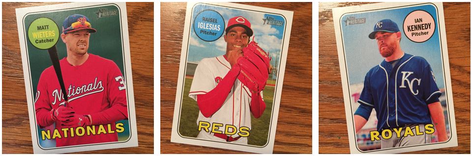
One of the things that Topps does with the photos (thankfully) is to treat the photos a little different than normal to add to that vintage feel. If they didn’t treat them that way they would look really awkward. But with these it really makes some of these colors bright. That Wieters card is crazy bright, and crazy red. The colors almost bleed into each other. Raisel Iglesias’ arm almost looks like part of the glove, or vice versa.
I don’t remember this in the ’69 cards, but the font on the Nationals and Royals is different than the Reds (or the Cubs and the Mets). If that was like ’69 it’s a great added touch. For now it’s kind of annoying me slightly.
The ’69 Mets
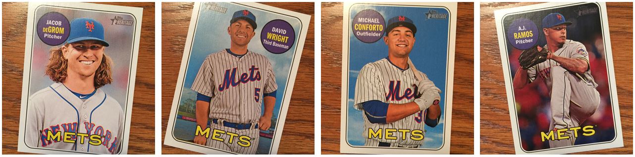 Four cards for the blaster feels OK for the amount of cards in the blaster. The one things that I notice here is how odd cards like the AJ Ramos look in the set. All of the other cards are posed or candid shots that are almost posed. Then you come across the action cards and it looks awkward. In 1969 they weren’t really doing action shots yet. I like them, they just appear strange when you see them. I know they have action short prints, but I didn’t think this was one of those.
One thing that I actually hate seeing these days are David Wright cards. Don’t get me wrong, he’s one of my favorite players and he’s just a good dude, but it makes me feel terrible. All the guy wants to do is play baseball again. He has no reason that he has to come back, but the guys loves the game and he can’t let it go. I hope for the best for him, but at the same time I don’t want baseball to ruin it.
Strike A Pose
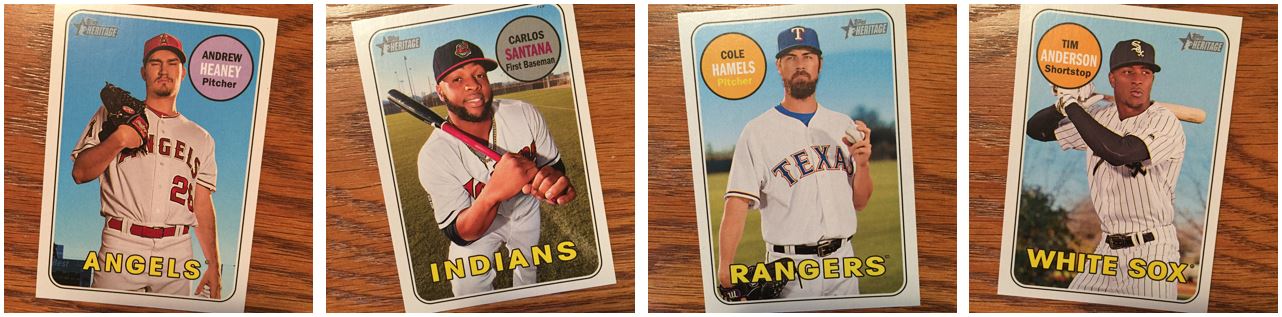
Something I’m really enjoying in this set are the poses. But not just the poses, the faces guys make and the fun it kind of seems they had with it. This blaster didn’t have all the ones I really enjoy, but there were a few. Andrew Heaney is on here because he seems to be making a bit a funny face (of course maybe that is his face). Carlos looks like he’s having a good time. That kneeling pose is pretty popular and is one of the poses that comes off pretty well.
I don’t think of Cole Hamels as a thinker, but that picture sure says that to me. I can imagine him deciding his pitch that way. A little look up to the sky, squint of the eye, jiggle of the ball in his fingers, and then hurl it in. Tim Anderson look as if he’s either trying to make a kissy face or say something like “Why am I doing this?”
Big Heads
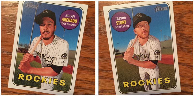
Here are some more of those kneeling poses again. But whoever took them of the Rockies did something to mess up the perspective. I can’t say I’m a photographer, but the angle or the lens they used make their heads look huge.
What the…?
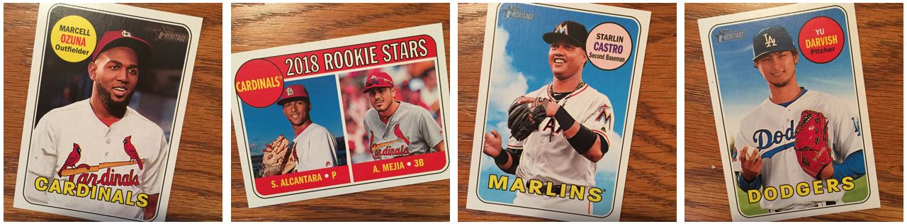
This is the stuff I hate about these first sets. The movement of players is never treated consistently. It doesn’t matter if it’s free agents or trades. And we know they are going to come out with a “high number” set so why not deal with it there. Trust me, I know cramming Stanton, Darvish, and all those guys in is just better for Topps, I just would think it could wait.
So let’s look at Ozuna. He’s in a Cardinals uniform. Well, I guess pictured in a Cardinals uniform because he wasn’t wearing that. But let’s not forget to photoshop the undershirt. Apparently he still like the orange shirts the Marlins had. But Alcantara is just not important. He was in the same trade but we can’t get another guy for that shot. He’s not a Cardinals rookie star at this point. And that was the same point that Ozuna was a Cardinal. Why can’t we treat them the same way.
Starlin Castro is a Marlin, and even though I Stanton is a Yankee. Of course he is because you have to get a guy in a Yankee uniform if you can. That was one trade all treated the same. But the other argument I would have is why should we worry about Starlin Castro at all until High Number?
And Yu Darvish, he was a free agent that could have gone a lot of places. Could we just wait on him?
Love Those Added Touches
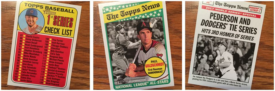 These three pictures are a great example of why I love Heritage. I love seeing these little touches that make the set feel like the old one. I mean I know they aren’t little, but it’s these things that help you get a more “authentic” throwback.
First, they checklist. Hey, I got a Kris Bryant card. We all hate getting checklists, but this is what adds to the feel of the set. Maybe I’ll actually check some boxes off with pen and make it feel really authentic. Nah, I have enough of those in my set. I think the All-Stars are some of my favorites. The All-Stars from the 60’s are by far some of my favorites from over the years. I like that they have the two colors for each league and I’m always a fan of the color picture on top of the black-and-white. What I’m not a huge fan of is the fact that this is basically the same picture of Paul that’s in his card.
The newspaper cards for the World Series recap are AWESOME! If they did this today I would love it. And I don’t mean using the newspaper idea. I just mean making those cards different than your standard base cared, but still be numbers within the set. I would like that so much better than how it’s covered today.
2018 Topps Heritage Inserts
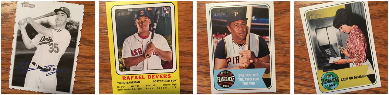
I’m never a huge fan of the inserts in these sets. I don’t know what we’re calling the black-and-white with the die-cut edge, but those are my favorite. Those have the best feel for something that you’d see in those days. I could do without the blue (I think I also have a black) signature. I would rather it be all black-and white.
The Devers card, meh. That’s just something you get at Target I think though.
I don’t mind the baseball flashback and the news flashbacks from a concept perspective. Seeing the old pictures are great with the fashion and all that. They also have New Age Performers and things like that and while I didn’t pull any of those in this blaster, I really like them because of the nice 60’s styles font they use.
Overall, I really like this years heritage. It even starts with the packaging and the old fonts they use. I can’t say I like it more than ’69 Topps, because it should be the same (aside from the card stock). But I like the feel, and the feeling, of seeing players from today set in this old theme.