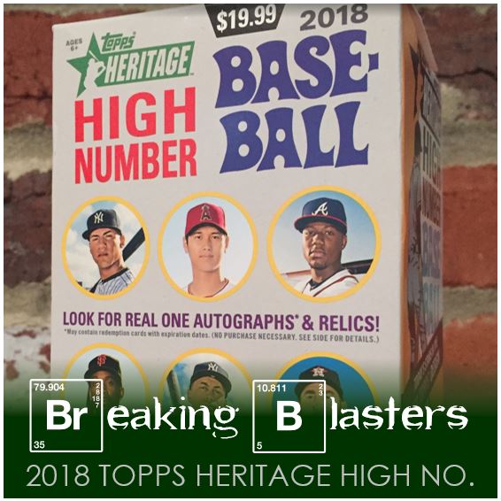
A couple weeks ago I picked up some 2018 Topps Heritage High Number and I finally got around to opening the blaster. I always get a little of each: a pack, a fat pack, and a blaster. It’s good to see what each offers. Sometimes just a pack can “scratch the itch” but usually with Heritage there isn’t always something super-exciting in the packs.
Something that struck me in this blaster is a bit how much of the “old-meets-new” came out in this. That’s always there in Heritage and I guess it always will be when the design is 50 years behind the player. But for some reason, it stuck out a little more this year. Maybe not even this year, but in this blaster it did.
If you want a look back at some earlier Heritage from this year you can check out these two posts:
Old Meets New

So Daniel Mengden, that’s not old-meets-new, that’s old-meets-old. I’m still not decided whether that style of ‘stache is gutsy, old school, odd, or what. He could play Doc Holliday in Tombstone immediately with that thing on his lip (plus the soul patch on his bottom lip). I know one of the complaints that always pops up about Topps is using the same pictures, or pictures from the same photo shoot. If you don’t like that then don’t go find his card in 2018 Topps Archives.
Now the Fernando Rodney is old-meets-new for sure. Not that Fernando Rodney is new, but the style he wears is hat in sure is. This is one of those cards that makes the old-style photo effects stick out. Is that red dirt? Wow! That picture makes the field look like the Boise State football version of Spring Training fields. I kind of wish that Jose Martinez had the sleeve with the colors of his country on that he wore sometimes this year. That would have helped my theme. But instead, just keep reading and you’ll see how old met new on another version of this card.
The Rooks

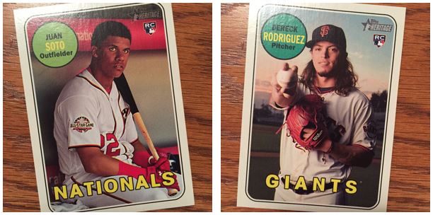
There weren’t too many great rookies in my packs this time around. But I think I got what a lot are considering one of the gems in this set – Juan Soto. I don’t know if he’ll win Rookie of the Year (my vote would be for Acuna), but he certainly was impressive. He had some really amazing hot streaks. I got to see him play a lot this year being in DC and the hype was definitely off the charts. With he and Robles being so promising, the Nats sure have a little insurance if they lose Harper.
Dereck Rodriguez certainly give us some old-meets-new flavor on a rookie card. That long hair! As a Mets fan I should know long hair with Syndergaard, Gsellman and what used to be DeGrom’s mop. Rodriguez’s coif is certainly of that nature. Could you imagine seeing that on an actual 1969 Topps card? Hippie!
My New York Flavor

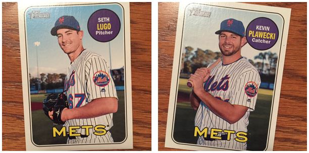
I was lucky enough (for me anyway) to pull a couple Mets. I like that I got the Plawecki because I know I have a double and this will definitely be going out for TTM in the spring. He’s a pretty good signer from what I’ve see so far. Lugo not so much.
With the poses of these two being so much alike it gives you the feel of the assembly line they must have in place when they took these in Port St. Lucie. Either there’s just a line of guys rotating in or they just line them up and snap, snap, snap,….
Heritage Inserts

I’m usually a fan of these inserts for Heritage. My favorite are the Rookie Performer style cards. They really look 60’s themed. When you think of how much of a departure that is from the original card it makes it so quirky. Take the Bellinger Award Winner card for instance. That is way more in line with the blandness of the original design (not that I don’t like it, that’s just what it is/was).
Deckled and Yeller

When my wife saw the “Charm City Sluggers” card she loved it. Being close to Baltimore we do like the “Charm City” name. But then you think about who is actually on the card. I had to point out to her that Chris Davis wasn’t so much of a “slugger” this year as much as a “swinger and misser” or even a “no get a hitter.” Then you have the exact opposite in Adam Jones on the same card. Love that guy!
I like the deckle edge cards a lot, but I’m not a fan of the autograph on it. The blue seems awkward to me. But I love actually seeing them piled up so you can see the difference were the deckle edge sticks out.
A Last Look

There were a few Short Prints in there and then this Chrome Jose Martinez. This is where the old meets new comes in with one of the cards at the top of the post. The Chrome treatment to Heritage cards always gives you that “what if?” idea of how it would have been back then if they did the same thing to cards today. I actually really like the Chrome on this year’s Heritage. I like it way better than last year anyway.
Well, as always with “update” sort of sets, if you like the original design then you’ll like the same one with new players (or same players with new uniforms). This was fun to open and I always like the feel of Heritage when going through them in my hands. I’ll be searching through the for some TTM fodder too.
Check out more about 2018 Topps Heritage and 2018 Topps Heritage High Number on BaseballCardPedia.