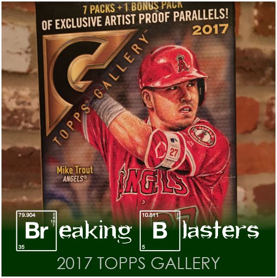
While on my quest to find some 2018 Topps Series 1, I found something I had found at all when it came out in 2017. Series 1 wasn’t anywhere on the shelves and when you have the urge for cards you gotta do something… so I picked up two blasters of gallery. The blasters are a lot less exciting than the packs you can get. The packs will give you a much better chance at parallels and inserts. The blasters included a lot of base and a surprising amount of doubles. That was disappointing since I didn’t have anything of this set thus far.
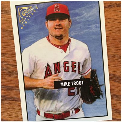
2017 Topps Gallery Base
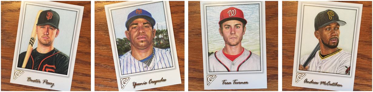
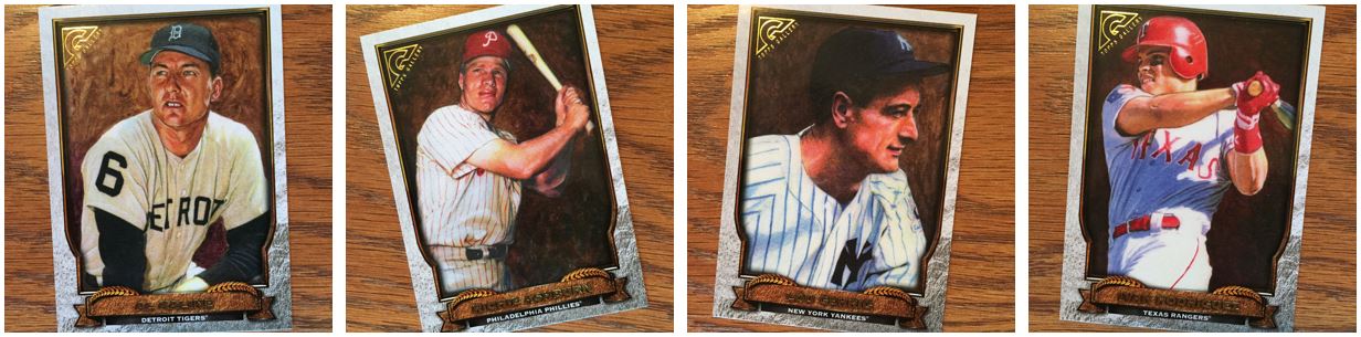
Some of the art was great. The portraits were what came out the best. The above examples are just some of my favorites. They were detailed enough and colorful enough. They almost looked real, but there were always a few parts that made you realize it’s art. I think if I had to suggest anything it would have been to stick with this style – a portrait – over anything else.
2017 Topps Gall… Wait… What?
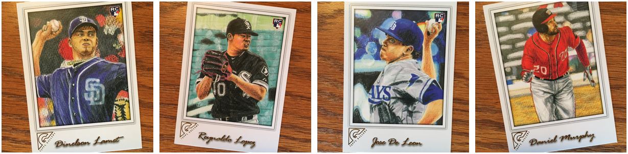
The action shots lent themselves to looking awkward. What’s funny is it was all the same artist. I really don’t want to knock the art because I definitely can’t do it. But the above examples are how the action shots just got weird. Some appear maybe to be trying to much in maybe a small space, like the Lopez. Or maybe the head and had are at odd angles, like the Lamet and De Leon. No matter what the reason, the portraits would be what I would stick with in the future (as if anyone listens to me).
A Different Back
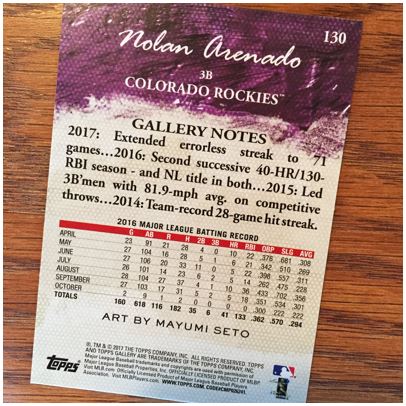
I dig the backs. First, the art theme sticks around with the canvas feel and the paint at the top. I like the paint color going with the team that it’s for and all that. Second, I like that they put the last year and split it up by month. There are so many sets out there and you might as well do something interesting/different on the back of the card.
Topps Gallery Artist Proof – Only a Slight Difference
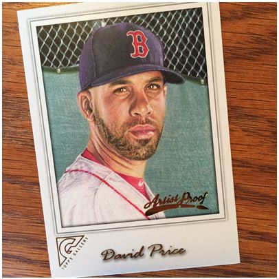
When you get a blaster you get “Artist Proof” parallels with it. I really don’t understand the significance of these, but I know Donruss (and maybe Score?) does it with football in their “Press Proof” parallels. At least I think that’s the same concept. The problem is that you run the risk of missing these. I had them sorted out, then when I went to order them again I mixed them back in and had to dig around and find them. Ugh, I hate that.
I really like this Price card by the way.
Topps Gallery Inserts
I like this insert. I don’t know if its art or a picture effect. I like it no matter what though. I wish I got more of them, but this is a lightly seen insert.
Hall of Fame Inserts
The Hall of Fame really fit the “art” style. The old pictures just lend themselves to looking cool. I mean that Gehrig looks Rembrandt-ish. Even the newer Pudge artworks looks great.
Masterpieces of an Insert
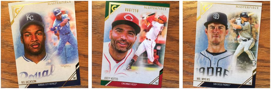
These are my favorite inserts of the set. I like the portrait and the action shot. And the action shot looks great on these – at least for the ones I got. That Votto is a parallel and numbered on the front, but I didn’t even notice that as I was opening them up. I like the Jackson the best though. Bo in that old light blue uniform is so classic.
Overall I like Gallery, but there’s a lot of inconsistency in the base artwork. Plus I got so many doubles that I wouldn’t want to get another blaster. I think if I found packs I’d take a chance, but at this point I feel like I have better stuff to go after.
You can find out more details about 2017 Topps Gallery on Baseball Cardpedia.