1990 was the second year for Upper Deck, the upstart of the sports trading card industry. Their approach was to deliver a higher end card than the Topps, Donruss, and Fleer. They used white card stock, included high quality photos on the front AND back of the cards and included a hologram on each card to prevent counterfeiting. But with pictures on both sides of the cards in an 800 card set, there’s bound to be some oddities. This is first installment in a series of four examining the beauty and quirks of ’90 Upper Deck, baseball and the ’90s. (#2 – I’m Too Sexy, #3 – Epic Fails, #4 – WTF)
_______________________________________________________________________
A few weeks back I picked up a retail box of 1990 Upper Deck. As I went through pack by pack, I was picking up some themes in the pictures on the cards. First off, they were high quality as Upper Deck came to be known for, but the subject matter of the pictures sometimes missed the mark. Or did it.
Cards shouldn’t just be generic to baseball. They should represent the era they were produced in. While a lot of that is determined by the design on the card, the pictures also help with that. In this case, I noticed some of the fashion of the early 90’s was brought to bear on these cardboard beauties.
#1 – Sign of the Times
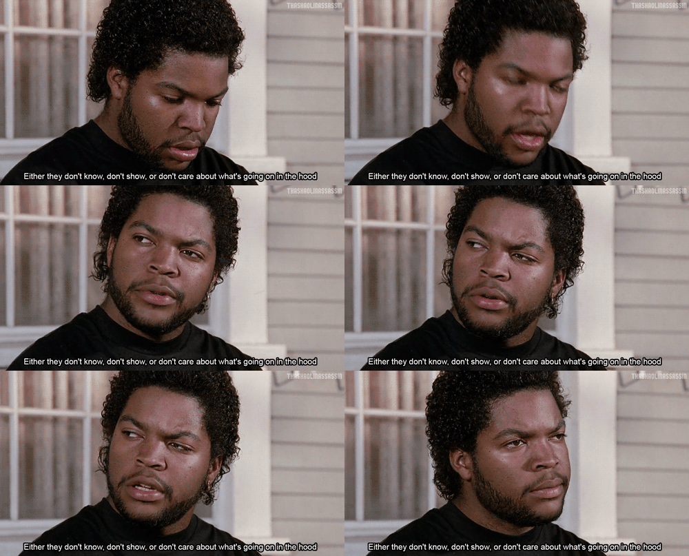
Technically the Jheri Curl is probably more 80’s than 90’s, but this is the early 90’s and the style was sticking around in some pretty popular places. NWA had some members rockin’ it (Easy E and Ice Cube) and Cube definitely had the look in Boys N The Hood.
 If you are familiar with baseball for the years prior to this, you know that Pascual Perez was a disciple of the that wet curly look. And 1990 Upper Deck didn’t disappoint when you flipped over the card.
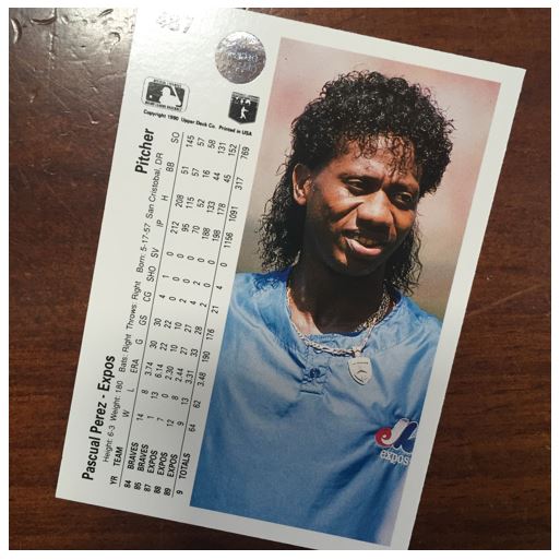 I gotta say, there’s a little bit of Rock n Roll going on with that ‘do. I see a little Uncle Jesse from Full House and maybe you could mix Pascual up with a member of Cinderella.
#2 – Spandex Lookin’ Toit!
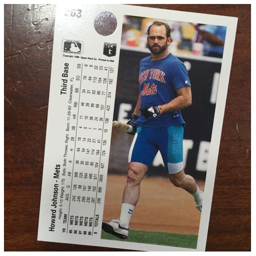
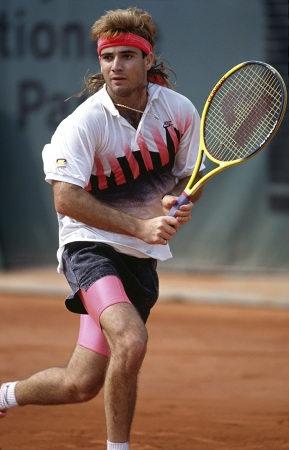
You didn’t have to be a wrestler or a rocker to get down with the spandex. Athletes have been using something like this under there gear for a while probably, but it seemed to be more acceptable to just wear it out and about. Of course when you did it had to be bright. You NEEDED to call attention to it. I mean you were wearing spandex for god’s sake.
Most athletes would use the “bike shorts” and let them stick a bit below their shorts. It was a great way to get your accent color out there.
But you know that HoJo don’t go halfway. If HoJo’s gonna warm-up, he’s not going to be hindered by two pairs of shorts over him. And he certainly isn’t limited to the color palette of his team. Sure the Mets are blue and orange, but who says what blue.
#3 – This is Almost Too Much
Before you could even complain about Griffey, Jr. and wearing his hat backwards there was Mark Portugal. Mark is showing a hat style that back in the day we me and my friends used to call the tool. This was the style where you would cock the hat back and show a little hair in front.
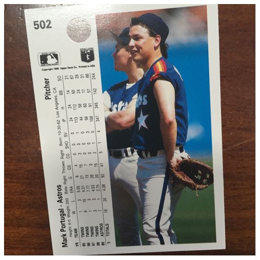 We used to tease this kid around this time and call him saddle. You see when you put your hat back like that you get an interestingly shaped hairdo. We like to call it the saddle because it put a nice dip in your hair like a saddle. Mark better watch out or he’ll have the same fate.
