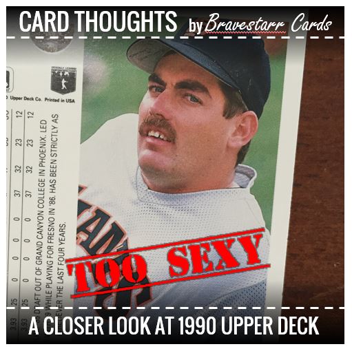
1990 was the second year for Upper Deck, the upstart of the sports trading card industry. Their approach was to deliver a higher end card than the Topps, Donruss, and Fleer. They used white card stock, included high quality photos on the front AND back of the cards and included a hologram on each card to prevent counterfeiting. But with pictures on both sides of the cards in an 800 card set, there’s bound to be some oddities. This is second installment in a series of four examining the beauty and quirks of ’90 Upper Deck, baseball and the ’90s. (#1 – The Fashion, #3 – Epic Fails, #4 – WTF)
_______________________________________________________________________
In our first installment we talked about the fashion of the 1990 Upper Deck set. This time we are going to look at, well, I guess we’ll say the poses. There are certainly some oddities in there. As you read this article I think you’ll notice an “escalation” to the pictures you’ll see. I’ll let you decide how it’s escalating for yourself. Remember that this is Upper Deck’s second year of cards. I’d wonder if they were toying with us, but if they weren’t established yet, why would they.
But I think it’s fair to say, these guys were all toying with us.
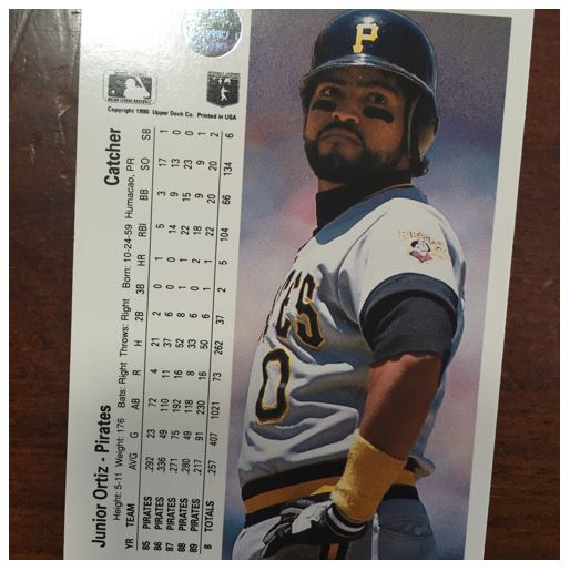
#1 – Kick Out That Hip
When Junior Ortiz stand on first, he really stands on first. Put those hands on your hips Junior and kick out that hip! Junior is WORKING IT! Ready for the runway.

So where do you think he’s looking? Maybe he’s looking for a little help from his first base coach…
Junior: Hey Coach, where did that Upper Deck photo man say he was going to sit today.
Coach: Junior I got not idea what in tarnation yer talkin’ ’bout.
Junior: I think he said over there. So glad I didn’t slid and get all messy. Do you think this looks good?
Coach: Listen just pay attention to the game and don’t go and get picked off.
Junior: Coach, why would I go anywhere that would make it harder for the photo man.
Coach: *facepalm*
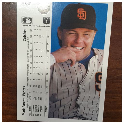
#2 – Yes, Yes, Yes, No, No, No
Mark Parent is a playful fella ain’t he? Was this the day they put a cozy little chair in the dugout and he was just relaxing?

Photographer: OK Mark, we’ve gotta make this look like it’s candid. You got it?
Mark: I’m not really sure what to do, lets see… How’s this?
Photographer: You sure you haven’t done this before Mark?
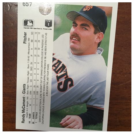
#3 – The Money Shot
Now this one is the crown jewel of these shots hands down. The thing is, this is only the back of the card. The front put’s up some pretty good competition too.

Photographer: We’re gonna take some stretching shots fellas. Don’t mind us.
Randy: Oh, this’ll be great. How many times do you get a stretching shot on a ball card?
Photographer: Well, Randy, that’s what we at Upper Deck are aiming for. We’re looking to make things interesting, to stand out.
Randy: I definitely want to stand out.
Several months later…
Randy’s Wife: Well, honey, you certainly stand out *stifles laugh*