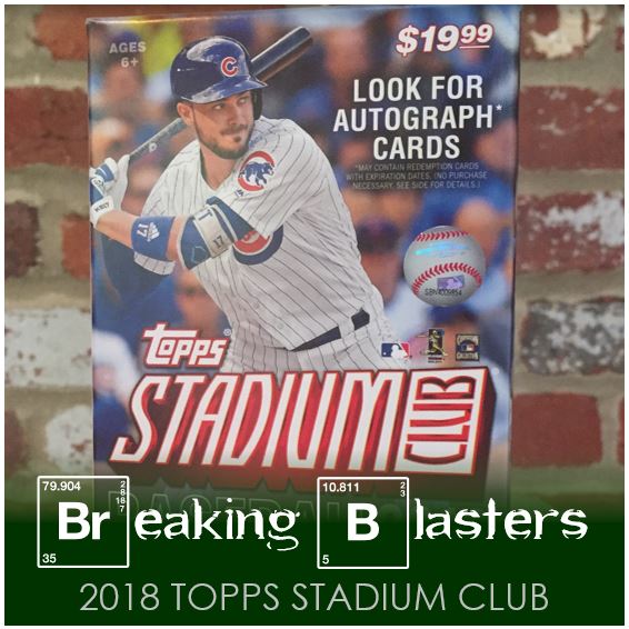
Finding Stadium Club was a lot like finding Series 2. Or, I guess I should say not finding Stadium Club was a lot like not finding Series 2. I checked different Targets so many times and instead of being too late for it like I thought I would be, it just took me forever to see it hit the shelves. I don’t know if it’s Target’s changing how and what the order and put on the shelves or something else. I will say that I used to like going to Target, but these days I feel more and more disappointed by not finding cards. I guess I find plenty of cards, but it’s mainly football, basketball and hockey that stay on the shelves forever.
I can find Series 1 still and Series 2, but generally it feels like there’s no evidence that a lot of releases even make the shelves at all.
2018 Topps Stadium Club

2018 Topps Stadium Club this year is pretty much more of the same as last year. That’s a good thing and a bad thing. The card quality is great and the pictures are amazing. I actually prefer the design last year to this year’s even though I thought it was a little bit of a ripoff of a Fleer Ultra set from 10 or so years ago. But that isn’t to say I don’t like the idea behind this. The best part of the idea behind the design of Stadium Club in any year is that Topps seems to want to but as little on the front of the cards to make sure that nothing gets in the way of or distracts from the picture. However, I’ll argue that I don’t need positions to be that big on the cards and it can be tough to read the text at time, especially names as I’ve seen some folks point out.
The card backs are a bit cheezy to me. It was the same way last year too. They are fine I guess, but I think the background image just doesn’t do it for me. I know it’s a stadium and this is Stadium Club, but to me they just seem… well, meh.
I can’t believe I ended up choosing two Cubs for my first pictures. I thought the Lester was interesting considering he’s hitting. In all honesty, the Bryant card is a pretty standard picture, but again the quality seems amazing. Greinke is one of my favorites that I got in this blaster though. The composition and the zoom on this one is awesome.
More Great Shots

Geez… another Cub! Well, it’s a damn good picture is all I can say. A lot of times it’s not just the quality, but the idea of the picture. I like the Chapman picture because of where they caught him in his windup. While in some ways it’s a classic card picture these days for a pitcher, it also feels like they caught it in the perfect position to make it a great photo.
The Joey Gallo card on the other hand is a good example of a different way of thinking about the picture. The standard card picture would crop out probably 40-50% of this card and you’d just see the feet of one of the folks in the background. But by zooming out to show the Ranger hype team carrying the flags in the back for what is obviously Joey’s home run trot is great. If I was a Ranger fan it would make this that much more of a good card because you not only caught the player but the feelings and the atmosphere of my team.
So there’s been a bunch of talk in the Twitter-verse about if you take these pics for Stadium Club, why can’t you take them for the flagship. I totally agree with that sentiment. I thought that the image quality in Series 1 at least was a lot more Stadium Club like than previous years, but there are other issues like reusing photos and things like that as well. It still doesn’t take away from the fact that Stadium Club has great photos though.
Kickin’ It Old School

I’m not always a fan of older player shots being in current sets. I guess I am more of a believer in a set being a chronicle of the game for the year the set is in. That definitely applies to the Topps flagship product, as well it should. But while I feel that way, these are still great photos.
Does that McGwire almost have the feeling of being a colorized photo to you? It certainly does to me. I also love the pose on the Will Clark card. What’s funny is that I never thought him to be the type of guy that would be caught posing for a card. A standard pose maybe, as in a portrait, but not like this.
Kickin’ It Older School

Is the Ted Williams cards one of the best of the set… quite possibly. The only thing I don’t like about the black and white is that when you first see it you wonder if it’s some kind of parallel. It’s not, but you don’t find that out until you go through some cards. So not only is that photo just great in general but the idea of catching the bent bat (which I think is just an optical illusion) is awesome. I really love the old advertisements in the background too.
The Gibson card is another great one. That pose is so perfect. Could this picture capture his intensity any better?
The Titles On These, Amirite?

To me Stadium Club as some crazy insert themes. Your standard themes for an insert set might be rookies, all-stars, moments, etc., but not these.
I think Beam Team is about home runs. I don’t know if that is specific homers or just homers in general. I love that I got a Rosario card and this one more about a specific home run, in this case his first career home run. I can’t really figure out the specific theme for Never Compromise. I think the back of the Benintendi describes not giving up, but that’s not really the theme of some of the others.
Special Forces gives you a few dot points about the player. Some of these are factual and some are more subjective. For instance on this Posey card there is “Leads with Derek Jeter-type discretion”… OK, fine. I don’t know that I can prove or disprove that “special force.” Wait, is force actually Force? As in The Force?
Parallels, The Best In The Biz

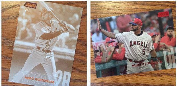
I like the parallels that Stadium Club does a lot. Yes, some are simply black, red, etc., but the Sepia can be cool and the Chrome is pretty dope. I think some work wit different cards better than others though. Take the Pujols for instance, that is made for the red parallel.
Overall this was a fun blaster to open, but I found some fat packs at the same time that I found this blaster. With some coupons out of Series 2 blasters, the four fat packs I found were the same price as a blaster. I actually found two other blasters. So here’s what I found inside:
Blasters:
- Blaster 1: 35 base, 3 inserts, 2 parallels (this is in the post above)
- Blaster 2: 33 base, 5 inserts, 2 parallels
- Blaster 3: 36 base, 4 inserts, 0 parallels
Fat Packs:
- Fat Pack 1: 10 base, 2 inserts, 0 parallels
- Fat Pack 2: 11 base, 1 insert, 0 parallels
- Fat Pack 3: 11 base, 0 inserts, 1 parallel
- Fat Pack 4: 11 base, 0 inserts, 1 parallel