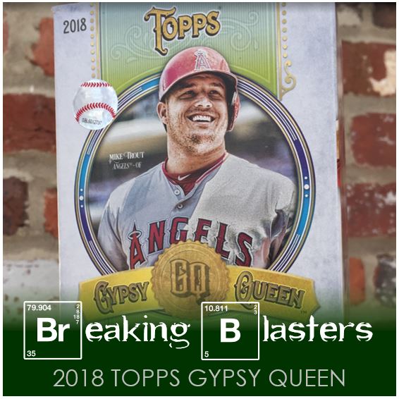
In this iteration of Breaking Blasters I’m going to look at Gypsy Queen. I’m a total mark for Gypsy Queen. I love the weight and the finish of the cards and I love the “art” style picture effects.
Last year I missed the boat a bit on this set. By the time I went out to get it there was barely anything left. That said, I got lucky last year and it one of those multi-pack hanging packs I opened up a Francisco Lindor autograph. That was a great hit if I wasn’t going to get to open much. That was really the first sign that last year was going to mean shortages on the card aisle.
This year was different though, I think I was the first person to get the Target. There were a bunch of blasters (I should have gotten another while I was there), a bunch of hanging multi-packs, and then the box of single packs had not-a-one taken out of it. So it was a better sign this year.
2018 Topps Gypsy Queen Base

I’m not a fan of this year’s cards overall. There are parts I like, but then there’s this one big thing that ruins it all for me. I like all the text and I like the way the colors work and most of the design. But what ruins it for me is the graphic in the top with the team and the position. To me it’s just this big block. I really feel like that information could have been placed below the player name in a small font.
The card backs are find. They seem a bit light on the text. But the worst part about the card backs for me are the card number size and placement. I feel like this is a consistent problem with Gypsy Queen though. So compared to other years its fine.
But like I said, I’m a sucker for GQ.
Just something I noticed about the Arrietta card, the way his jersey shows his sweat it look s like he spilled his lunch on himself.
No York Mets

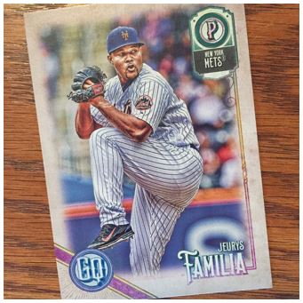
Well, not none, but it was close. This Jeurys Familia card is the only Met I received in the whole blaster. I didn’t think about what the percentages should be in this box, but GQ is light on the cards so one may be lucky, who knows.
Gypsy Queen Makes for Good TTMS

Gypsy Queen are some of my favorite cards for TTMs. Like Heritage, they have a good finish on them to take an autograph. Also, they are a good weight of card. You can’t put as many of them in an envelope, but they feel pretty sturdy in there. These are three guys that I know are pretty good signers. All three of these guys will look great on these cards and I hope I get some doubles for them.
Indians Hit AGAIN

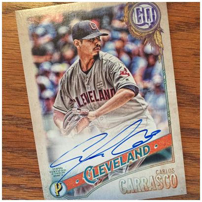
So as I said, last year I got a Francisco Lindor auto. This year the Indians came through again with a Carlos Carrasco auto. The auto is pretty good. It’s a little light in some places (like his “C” in Carlos).
What’s funny is I almost like the layout for the autos better than the base layout. Yeah they have that graphic up at the top still, but that’s the set logo so for some reason I don’t mind it as much.
Judge Insert Jackpot

I got three other “this” in these packs. The best by far is the Judge Fortune Teller card. On the back it gives a little prediction about the coming year. The trick on this one was I wonder when it was written. This says Judge will lead the Yankees in HRs, runs, BBs and OPS for the second straight year. But now with Giancarlo Stanton on the team, that prediction might not be so attainable.
The Jonathan Schoop card is a blue parallel (I think). It’s numbered to 250. I don’t know what other colored parallels they have (if they have them), but I like the blue. The last card I think is a Short Print but I’m not sure. I have the Jackson and another old player from another pack and they have different codes on their cards so I think they are Short Prints.
I didn’t get any of the Tarot cards in this blaster and they look pretty cool.
A Pack of Parrallels

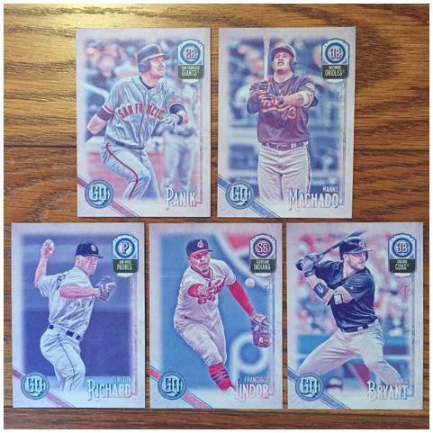
Blasters come with an extra pack of unnumbered parallels. I think these are like a “no black” effect of some kind. I’m not a huge fan of these. But I will say that this is a pretty strong pack with Machado, Bryant, Lindor, and even Panik.
Overall GQ is OK. I’m still going to see how far I can get to completing the set. But I’m not going for all those “capless” and non-error “error” Short Prints you’ve been seeing around. Those are just ridiculous to me and even more than that they are just impossible to complete.