Oh the things you can find in your card stash… or mine anyway.
Would you believe I’ve gone a couple of months not knowing that I had an unopened blaster? Probably not if you saw how I store some of my stuff. Now I try to save packs here and there and I have quite a large stash of unopened packs, but this is different.
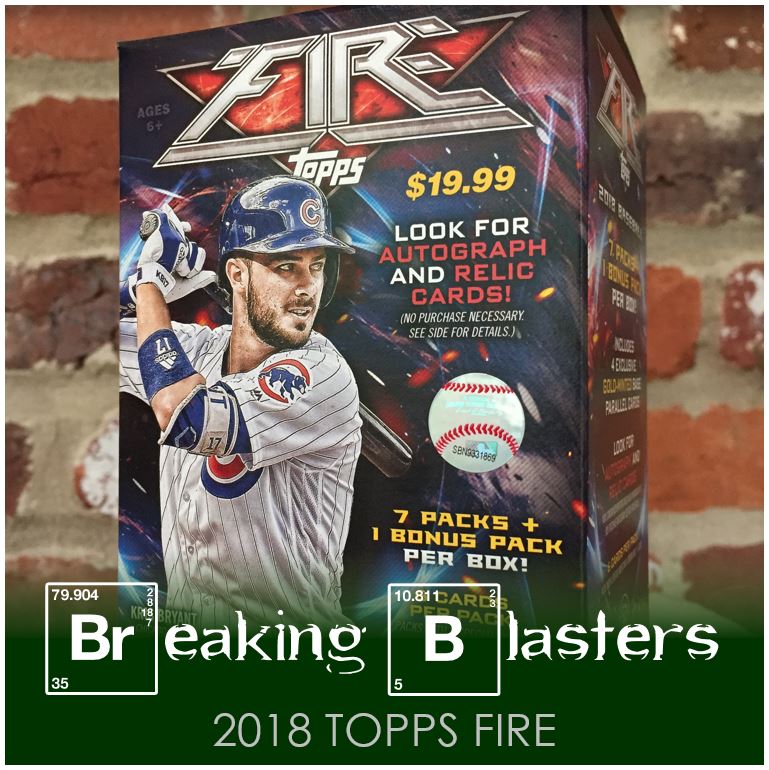
In poking through some stuff I had forgotten about I found two blasters (the other one you’ll see in a later post) that I meant to open up when I got them. So since I can’t let some free content for the site die on the vine, I’m posting. The first blaster that tried to escape my opening it was 2018 Topps Fire.
2018 Topps Fire

These are what I think the three versions of design are in 2018 Fire. Each has a different background and then a different font for the name of the player and the team.
While I’d like to say it helps provide some differences in the cards, does it really? They kind of run together in the end. Actually you could probably say they even run together from the year before as well. It’s a nice card from a quality perspective and I’m not saying it’s a bad design. I just think it ends up being a lot on the card and it all kind of seems the same after a while. I do like modern players with modern card design, but this might be too far.
I think a better idea, and maybe it would just cause too much clashing is to focus on what is going on with the Chapman card. I like these when the uniform is the most colorful. With the Fulmer and Bellinger being home whites and away grays, I don’t know if it works as well for me. I could see someone argue that the other way though…. That there is so much going on in the card they want the uniform in the photo to be more plain.
Rooks

I guess I only have so much to choose from in a blaster, but how did I end up choosing two Cardinals and a Yankee? I chose them so I should probably answer that for myself.
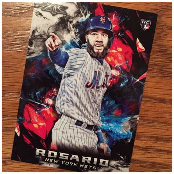
Rosey
Ah, but a Rosey card saves the day. I’m digging the photo they used and the way it sits on the card in this design. Probably would look pretty cool in a parallel that goes with a team color.
Old Guys, New Style

I’ve seen some tweets with questions around cards like this recently. Do you like old players on new cards?
My view… in general, no. There is a place for them maybe (for me that’s Allen & Ginter or maybe Archives). But overall this, along with the over done new-players-in-old-card-styles-outside-of Heritage, is getting old and over done to me. In general I don’t like the look of the old picture on the new card. Simple as that.
That said, I don’t have many Willie McCovey cards so I liked seeing him because it made me get curious about him. And I don’t have many Dave Winfield cards with him in a Padres uniform so that made it an interesting card to me. But interesting because I like baseball and interesting because I like the card are two different things.
There’s Gold in Them Thar Hills

You can always get an “extra pack” of gold in Fire. The Gold parallels of the base are fine. But they are so much better for parallels of the inserts. I’m not a fan of parallels of inserts though.
Take that Verlander though. I think that looks pretty sweet in gold.
Christmas-themed Parallels

The parallels are pretty interesting to me. There are red and green parallels that make up the Christmas-themed idea here, but even more is the Red, on a green parallel card in Joe Morgan.
2018 Topps Fire was fun to open. It gave me some things to think about, as I would hope opening packs does, but I have a feeling I won’t be dabbling with it again. I picked it up (at least a little of it the last two years) but I think I’m going to stay away from it this year.