
I came up with a scoring system (just for fun it’s the BraveSTARR Score) for my autographs to have a little more fun with it. Keep in mind it’s completely subjective. It has nothing to do with how I feel about the person providing the autograph or the fact that they were nice enough to autograph my item. I always appreciate someone who takes time for their fans – in-person or through the mail. In fact, I think better of the people that do sign.
While it’s nothing formal, there are certain things I think about when scoring an autograph. I score on a 10-point scale (with halves) and this is what I’m evaluating:
Quality of the Autograph
Quality of the autograph can be impacted by a lot of things and it isn’t always the signer’s fault if the quality is bad. First of all, with TTM autographs you are always subject to the mail process where items can be bent and they can be on top of each other in the return envelope. Sometimes the item doesn’t allow for a good autograph. For instance, a very shiny card can make it so that a Sharpie bubbles up and doesn’t get absorbed by the card. Some old cards can also absorb to much and then run. Other times, putting cards together can make a signature run.
I think we all know what a good quality autograph is. The lines of the signature should be clean and even with no smudges. From there you have to nitpick and find the flaws. Below are some examples of smudges, ink not absorbing, ink over absorbing (or possibly a stamp), etc..
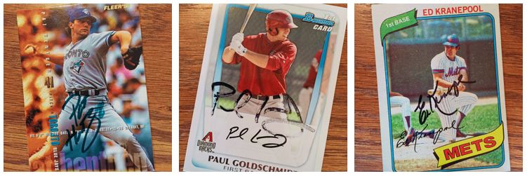
Smudges and issues with how cards take the ink can hurt the quality of an autograph.
Size of the Autograph
Size really has to be judged relative to the item. You can’t sign a 6 inch long signature on a 3 1/2 in card. What I’m looking for here is that the autograph fits on the item appropriately (not too big, not too small – the Goldilocks rule) and uses the space well. This part of the evaluation really compliments the placement of the autograph as well. If the autograph is small so that it fits in a good spot on the item, that’s fine. But for the most part I find that signers use the space they are going to use regardless.
Below are some examples of the size of an autograph from both bad and good sides.
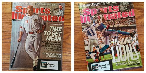
The size of the autograph compared to the item impacts my score.
Placement of the Autograph
The placement of the autograph is a little bit on me, or the person providing the item. If I give someone a magazine without a great place to sign, then it’s just as much my issue as it is the signer’s. As long as the signer worked with the space they have well then any signature can come off successfully. This can also be impacted by the medium of the signature too. Many times the signer is looking for a good evenly colored space without too much business to sign over.
Here are some examples of placement, both good and bad.
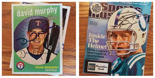
The placement of the autograph is important to how it looks in the end.
Medium of the Autograph
This is actually one of my favorite parts of an autograph. I even keep track of things like the color, the type of marker or pen, etc.. I love it when someone puts thought into the color or size of the marker they use. Does someone on the Mets sign with blue? What about the signer that uses black because it fits with the overall item? I don’t think signers think about this all the time, but I like to think they do.
These are some of my favorite choices that signers used (some theirs, some mine).
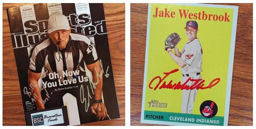
A little color goes a long way toward making an interesting autograph.
Peripherals to the Autograph
I consider peripherals things like inscriptions, bible verses, personalization, jersey numbers, etc.. I really don’t mind personalization at all, even if it’s just a “To Bill” or something like that. I appreciate the effort and time taken. But inscriptions and things can really make an item unique. Some of my favorite peripherals have been sayings or comments put on an item.
Sometimes this can get taken too far though. I find this happens normally with regard to personalization. I get the reasoning behind personalization (not wanting me to turn the item around for money), but it doesn’t always add to the beauty of the item.
Some of my favorite items that fall under this topic are below.
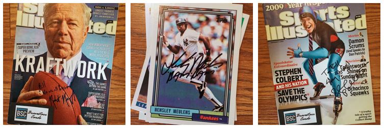
“We are all patriots!” – “Bam Bam” – “Stay Strong”
Overall Uniqueness of the Autograph
This has the most to do with the signer. Many athletes and celebrities have experimented with how they like to sign their name with short and long versions to accommodate different items. I mean, didn’t you do that when you were in school and dreamed of being famous?
Some people have sharp signatures, some are bubbly, and there are certain letters that bring out a unique quality. For instance, I love a really interesting lower case “g.” It doesn’t mean the autograph has to be completely legible either. To me this really means it sticks out.
Below are some examples of my favorite unique signatures.

Loopy, smooth, angular,… there are many ways to make an unique signature.
Story of the Autograph
The story of the autograph is probably most impactful for an in-person autograph (I waited for 3 hours, I met them on the street, etc.). But I have found that TTM autographs can have their own story. Many times that comes from what someone might throw in the envelope. Some signers will throw in an extra card or item, some will send a note. I really like the stories that show that people care about their fans.
Anyone who does something like this is going to have a different opinion than mine and everyone picks out something different about what they see. If you find something interesting, beautiful, ugly or annoying that I didn’t, please comment and let me know what you see. But the key is to keep it about the autograph, the item, the medium, and the story – not the person.
>>> READ MORE ABOUT COLLECTING AUTOGRAPHS THROUGH THE MAIL <<<
>>> READ MORE ABOUT COLLECTING AUTOGRAPHS IN-PERSON <<<
Thanks for visiting BravestarrCards.com: Card Collecting and TTM Autographs.