And so I’m back…
Back again with 1994 Stadium Club, but Series 2 this time. Both the Series 1 box and the Series 2 box were Christmas presents. I’ve been trying to get boxes from some of the years that I have bigger holes in my colletion. That would be from about ’93 through ’06.
This definitely fits the bill. I’m also trying to use it as a way to get more TTM cards from these years. I have a specific reason I’m working on that but I’m not letting that one out yet because I don’t know if I’ll get far enough with it very soon.
So let’s dig into Series 2 and see what comes out of this box.
Other related posts: Card Thoughts: 1994 Topps Stadium Club Series 1 – Super Color
More of the Best

There’s not too much to say about the design of Series 2 as compared to Series 2. Of course it’s the same. Although you can see on the Joe Carter card there there’s a little more too some of the cards in this series. I guess they couldn’t really help themselves to tweak things they already started. Just can wait for next year I guess.
Damage, Inc.

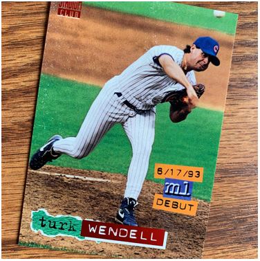
So I mentioned in my Series 1 post that sometimes cards from these days can be damaged as you open that packs. This one is a great example. The cards stick together and I haven’t found a great way to pull them apart without this happening once in a while. You can see the white spots on the card in the picture.
Well, if you can’t, trust me. They are there.
Back To Not So Basics

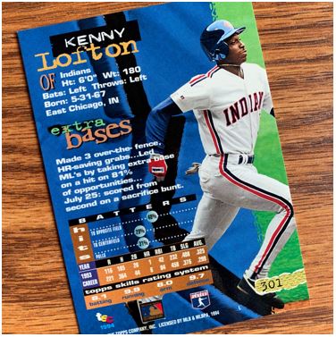
As if the fronts weren’t 90’s enough. Egad the backs!
Again we have the sort of MTV themes going here. Was there a contest for to see how many fonts they could get onto a card? It actually reminds me of the Brian Regan bit about food labels and serving sizes. It like there was a guys say, “check out how many fonts I got on there… heh, yeah… it’s going out like that.”
I do love the stats though. That’s what we should come to card backs for.
Other Sparkles

We have the sparkly, rainbow cards again. They aren’t necessarily exciting in the grand scheme but they probably were then when you were getting at least one per pack. I do like this better than the red as a standard but that’s usually my preference as I said with the Series 1 post.
So you know most of these guys but not the last right. Yeah, me too. I just had to include a guy named Jayhawk. Rock! Chalk!
Info Cards

The Divisional Alignments Info Card I found kind of interesting. It was definitely a whole lot more involved than the other info cards you find. Heck, this one has color. But this was just after the Marlins and Rockies came into the league the year prior so maybe they had alignment on the Brain. I totally didn’t pick up on the colors on the cards. Not that it was obvious or anything.
Being in a band, I love the Jack McDowell cartoon card though. I never thought of his music like how that cartoon looks, but I can’t say I really listened to it either. Still, I like the cartoon as a music guy.
Other Finds

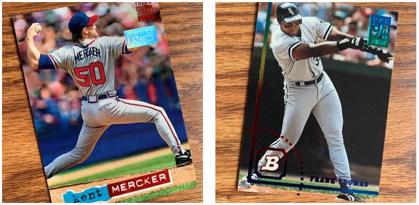
One First Day Issue card was in the box again. Unfortunately I liked the one I got last time a little better as far as the player goes (David Justice). But it is interesting that I got two Braves.
Now the other, the “Preview” of Bowman, that is a great player. I love seeing The Big Hurt on cards from his younger days. I know he got big at the end of his career, you know like real big. But these old pictures make you realize what a monster he was when he was really fit.
The TTM Piles

So you can see that I had another good lot of TTMs come out of this one. Some of them will be better than others for how an autograph will come out on them, but I don’t mind sending anything out to try.
This was another fun box to open. I don’t have a Series 3 box or anything like that so this is the end of the set. I have plenty more boxes to dig into but I just not sure which one I’ll be opening next. I think I will stick with post ’93 for now though.