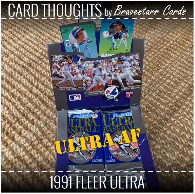
This Spring I opened some 1992 Fleer Ultra and while opening this box it made me think, has there been a bigger difference between two years of a product?
While that might be a bit of hyperbole, it did get me thinking. 1991 Fleer Ultra was the first foray for Fleer into what was supposed to be a higher quality or a higher end card. Was it though? It’s card stick is thin and it’s design isn’t particularly exciting. That said, the pictures were great quality and the overall feel seems like an upgrade over some of the previous normal Fleer sets. At least the way Fleer was headed anyway.
But then in 1992 it really made a jump with GOLD and COLOR and SHINE and FLASH. It was such a difference from this first effort. I’m definitely not someone who has every design in their head, especially as the 90’s got to us having a billion sets, but the difference between 1991 and 1992 for this set is so great.
And after saying all that, I do really like this set. It might be boring, but somehow it isn’t 1991 Leaf. And it’s even the same color scheme pretty much. Sure, it’s not super fun and colorful, but it’s business-like in a way that starts to feel a little bit fancy. I mean, a tux is black and white right? Unless you are from Dumb and Dumber.
Let’s see what’s in this box.
1991 Fleer Ultra

As I said earlier, I get that some might consider this design boring. There’s no color to it and there’s no special design element at all except for two gray/silver lines. But I would rather classify it as refined. It’s boiled down to all that you need: picture, player name, team name, position. But for some reason this works overall for me.
There are two things that I’ve never liked about it though: the size of the logo and the font choice/combo. The Ultra logo is not exciting itself and it’s huge compared to the card. Somehow they find a way to get it on there and not mess with the photos. The other thing I find odd are the fonts they chose and the way they use them. I like the font for the name and I would guess it didn’t work for the other elements for legibility. But the way they lay out the info and the font they chose just never works for me.
You can see the pictures pop though and I think a lot of that is that the devoted so much of the card to the images. That’s really the best part of the card is that it’s so much of the picture.
Back to Back
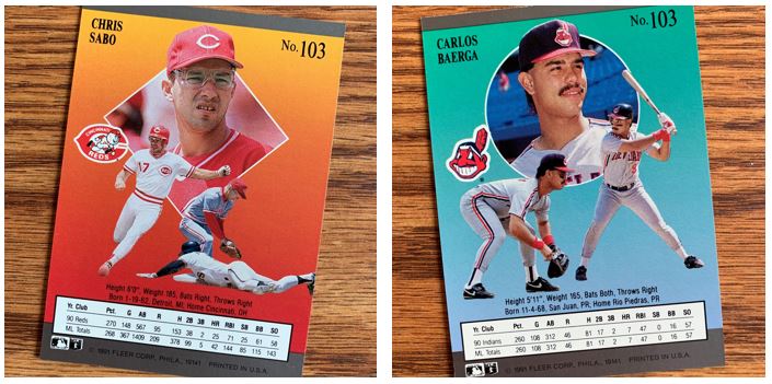
The card back as compared to the front is night and day. While there’s no color for the front, it’s all color on the back. I don’t always get why they chose the colors they did on the back, but they are pretty vibrant choices. I can see orange/red to yellow for the Reds for instance, but baby blue to teal for the Indians is odd.
The three pictures on the back is definitely different, but you can tell it’s that Upper Deck influence. They are devoting the back to more images and logos rather than stats. This is he first time four player images appeared on one card. I personally am on the fence about both of these ideas. I love the pictures on the back, but I am a stats man. To you go exciting or informative? It’s hard to go both. Just having one year is a little disappointing.
I never knew about this and just noticed it as I was opening these cards, but these are both #103. After reading a little bit, Sabo is supposed to be 103 and Baerga should be 106. There were a few cards in this range that were misnumbered. I’m not entirely sure how you do that when you are going in alphabetical order by team.
Jump, Jive and Wail


I try to find themes when I open a bunch of cards like this from one set and what jumped (lol, get it?) out at me this time were the number of cards that featured jumping. The majority of these cards would appear to be related to turning a double play as there are three shortstops and two second basemen. However, one of those is just a jumping play.
I went ahead and ranked them for how exciting or interesting they were:
- #1 – Shawon Dunston: I mean he is basically perpendicular with the ground. I’m not sure how that happens but any card that allows me to write perpendicular, I’m all in.
- #2 – Gary Sheffield: At first I pulled the card and wasn’t sure this was Gary because he looks so different. It lists him as third base but I’m not quite sure this is him playing third, so I gave this a little extra.
- #3 – Ozzie Smith: The wizard just looks to be making a great play. Probably old hat for him though.
- Honorable Mentions:
- Mike Fitzgerald: I thought about ranking a little higher because when do you get to see a catcher jumping on a card?
- Jay Bell, Jose Lind, Bill Ripken: Pretty much listed in order of the height off the ground.
My Mets

I got a bunch of Mets in this box and these were my favorites of the bunch. I was always a huge HoJo fan. He did some pretty exciting things back in those days. I don’t think it hurts that I have a tendency to like Mets third basemen, and maybe he started me thinking on that.
Doc and Darling are just some of the best guys I had in the box. Ron was never really a favorite of mine as a Met but I wouldn’t say I disliked him at all. I am a huge fan of him these days but that’s because I love the Mets TV booth of Gary, Keith and Ron. It’s so funny too because Ron was a broadcaster for the Nationals and the Nats fans I knew at the time hated him. I can’t remember why exactly. Maybe for the same reasons I hate the current Nats booth.
Little Weirdsies

I was a little desperate for something weird, funny or interesting to pick out when I found these. One of the things about these though, among other things was how big their heads appeared to be on these cards.
Ivan Calderon has a plastic undershirt on and you know I love those things. I always remembered my Dad having one and I never got it. But the fact that Ivan has his sleeves cut off is even better. I’m not sure how that makes sense with why you are wearing it to begin with though.
Jose Offerman and Mickey Morandini are definitely the leaders of the big head club on their cards within this group. Jose though is more for the size of that helmet. That thing is huge! I think it’s the angle that accentuates it. It not only looks big but it looks like it was put on funny. Mickey, in addition to looking like he has a big head, also looks like he has a block head. That’s brought out by his neck and the shape of his hat.
Alex Cole just has the “coolest” glasses in the world. I can’t imagine he played in those though.
Rook-heeeeys

Technically these are prospects cards and not rookie cards. At least as how they are labelled. Knoblauch played in most of 1991, Vaughn about half, and Karros only just a handful of games. But that’s not the reason they make these cards as they don’t know that when they make them.
One of my favorite things about these sets are the subset ideas like this. These guys aren’t mixed into the main numbering scheme and instead are collected together at the end. While I only really show you what I got out of the box, I think these guys were probably among the best of that subset in this year except for maybe 1-2 other guys.
Great Performances
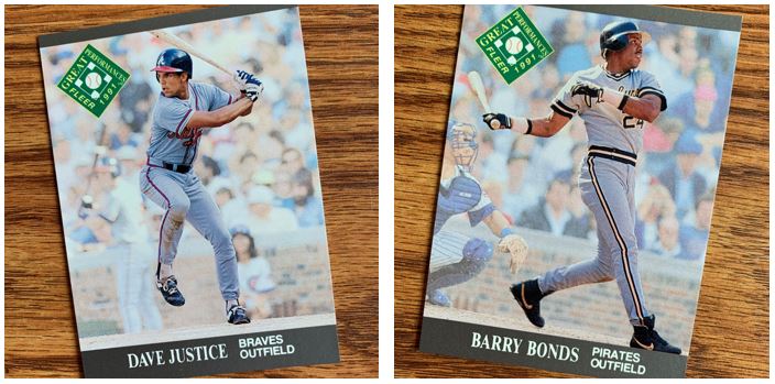
The next subset was related to “Great Performances.” There are only six cards in this section and I only got a few in this box. The other names besides Justice and Bonds above were Fielder, Henderson, Ryan and Thigpen. The back is basically a story about what they did the year prior and what accomplishments that amounted to.
I am always a big fan of the faded or black and white background with the player featured. I think on a card like this that is for a special subset that really works.
Argh!
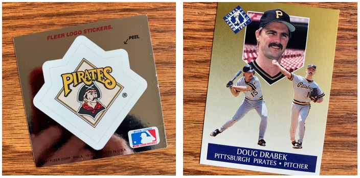
As for “inserts”, Fleer continues including stickers even with Ultra and then they created an “Ultra Team” of gold cards. Well, colored gold cards. What I find interesting is the front of the cards are really what would be on the backs of the standard cards. There are eight in this insert set and the backs are similar to the Great Performances in that they are a write up.
The TTM Stack
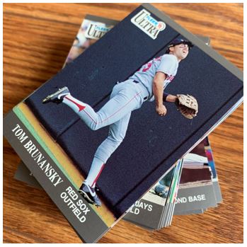
As always I try to pull out a stack of TTM cards that I can use later. This time it was a pretty good stack, but I think this is also an era of good TTM signers. The other thing I normally do is to save a few unopened packs. I didn’t have to do that this time because I already have a good amount in my collection. I imaging they are from repacks I’ve gotten with packs in them.
This was a good box opening. I think the images to most of the heavy lifting on making this set interesting. But overall it was a good time to open them.
I’m not sure where this got me to completing the set based on what I already had, but would imagine I still have a ways to go because I don’t think I had a lot of this set in general. Plus given that I pull those TTM cards I wonder if that stopped me from filling those spaced.
For more about 1991 Fleer Ultra, check out BaseballCardPedia.com.