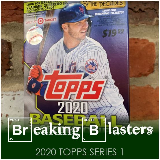
I wanted to start by saying that 2020 Topps Series 1 snuck up on me this year, but that’s not really true. Maybe it’s not that it’s not true, I just can’t think of a better way to put it. No release can ever sneak up on anyone. We see it several months in advance so it’s not like the design or anything like that is a surprise.
I’ve just had so much going on in the last few weeks at work and in my personal life that I had to google “2020 Topps Series 1 release date” to find out that it was only days away from doing that search. We all know about when it’s going to come out. I kept thinking I had missed it but then there was no way that would happen because I would have seen it on Twitter.
It seems that giving my brain only those few days to think about it as amped me up for it a bit more than I think I would be normally. Sometimes when you do think about something for months you start out psyched and then it fades and ultimately is a disappointment. I think right now Series 1 is benefiting from the positives of a short wait instead of the negatives of a long one… at least for me.
2020 Topps Series 1

The design didn’t excite me when it first came out. It’s way to “Bowman” for me. But I think beyond that it almost has a Bowman/cartoon element to it which sounds even worse. It is. But really it’s not worse its just… meh. I would say right now it’s just neutral for me. (If you want to feel more of that feeling you can turn the cards over. I’m not even going to get into that.)
But that’s not to say that there aren’t things I like about this set. First, the photography, or maybe just the choice of images is better. There’s some standard stuff, like LeMahieu up there. But then there’s Harper and Dietrich right next to him. Tell me those aren’t images that capture those players, and moments they were a part of last season. Not everything is like that, but there’s a good chunk that make it fun to see what you’ll find.
Wait, let’s get back to D.J…. Look a that glove. Just like last year they have some players appearing to have the design as part of their photo. I love it. It doesn’t happen all over the place, but I like when it happens.
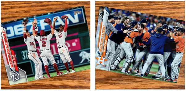
Speaking of what I found, I found these two teams one right after the other in one of the packs in this blaster. Serendipity maybe, or clever collation? Just seemed kind of funny in that they ended the season together and now they were in my first blaster together.
Checking Out the Landscape

This was another positive of the set. I think that this design works best in landscape format. The chances of the pictures being cooler seemed to escalate with the change in orientation too. That Yadi is sweet!
I did get a feeling that home run trots dominated the landscape cards though. The Segura is really cool but it kind of gets deadened when you see how many others are a home run trot kind of picture.
The one thing I don’t think you see when it’s in landscape is the player showing up over the design. I think that’s because there less of the design that is “extra”. I think you have more of a chance to block a name in the design or something like that. But usually the designs don’t really require that effect when they are in landscape.
My Amazins

Four Mets seems OK for a blaster I guess. Conforto and Cano are pretty standard. But there’s Dom rockin’ the landscape orientation. The quality on that image and the angle looks pretty sweet.
My favorite of these might be the team card though. That was a great moment from the second half of the season and was really a time when J.D. Davis started to break out and the clubhouse started showing their attitude. Definitely made me get the PMA feeling.
Almost Noobs

I didn’t really get any interesting rookies in my packs. I had to “settle” for Future Stars and Rookie Cups. But these aren’t too bad. I kind of wondered what the difference was though. Could you be both?
The Future Stars design was cool and seemed to be an evolution from how it was in recent years. Does it go with the design completely though? It feels a little bit off.
I actually don’t think I have any Paddack or Chavis cards at all until now.
But They Aren’t on the…

This is the part of these Series 1 and 2 sets that’s starting to kill me. I know it’s my thinking and not Topps’ thinking and that they have to make money so I get it. I always want to think of Series 1 and 2, and even Update for that matter, as a chronicle of baseball for that year. When a good 10-15 cards, maybe more are just not right it rubs me the wrong way.
Trades are one thing you can’t predict. We can knock criticism of that off the table, but it still makes it feel weird. But free agents who kind of know aren’t going to be back on a team, or are very likely not going to be on a team kill me. Can’t we wait for Series 2 for that. Kinsler retired, did we really need a card for him.
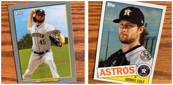
And to top all that Cole gets inserts for a team he is no longer on. This is the business side of things though. It’s hard to say not to include Cole in a set when he is the biggest pitching name in the game maybe.
Inserts (No Parallels?)
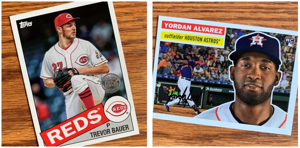
I got a bunch of inserts in this blaster and no parallels. Well, not exactly true because after I took these pictures and went through the cards again I did find one gold parallel. At least I think I did. Maybe it was brown, but it wasn’t normal.
Yes, it’s cool to see current guys in old designs. Yes, it’s killing the feeling of Heritage and Archives for me.
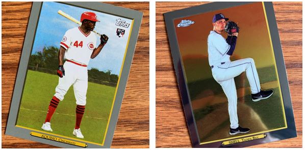
I picked to show that Aquino because of how awkward that card is. It’s an odd stance and he just seems so out of place on that card. I do like his Big Red Machine throwback though.
Snell is on my first insert parallel. I actually prefer this Chrome version of the Turkey Red to the standard. So I like that Snell is on this one.
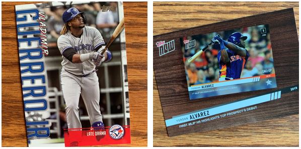
I’m getting tired of these two types of inserts. The individual player “highlights” are OK when it’s Jeter in the year he retired or just after. Or Ichiro or something like that. But these have been filled with rookies or younger players. They get enough cards in these sets anyway.
And then we have another version of cardboard inception. Cards based on cards and the release of cards. And is the most ironic of that scenario… a card of a Topps Now card, which is not “now” anymore, it’s then?
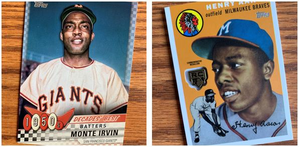
These decades cards are a little more standard fair. But I will say that these rookie card shields as the “special” cards in blasters are the first of these that I’ve like in a while. I’m not saying “go out and collect them all” special. But at least worth seeing something interesting in the blaster.
Overall, I’m glad I was busy lately because I think I found more fun in opening this blaster because of it. I think it helps too that I didn’t let everyone get too far ahead of me before I started opening some packs. I feel like I did that last year. While the design was “meh” the photos were great and it’s fun to look at.