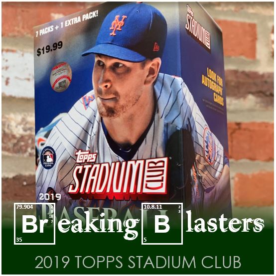
I was pretty much behind a release when it came to me getting some 2019 Topps Stadium Club. I was on the lookout for Series 2, which I was not finding blasters of, by the time this was out. This is always a pretty good product from year to year, but there are things you need to look out for.
The images are amazing, the cards are high quality, the inserts are pretty cool. Everything is rosy so far. The problem is there are some quality issues. I opened a single pack that had two cards without the silver on the names. I opened another blaster and some of the backs were scratched around the numbers of the cards. And I think one of the cards I found in another pack (a Jorge Alfaro I think) had these lines across it. And no, they didn’t appear to be part of the picture.
So while I like this product, you have to be watchful as you are opening it. It gets to be a lot to spend on cards that look good… until you run into an issue.
This blaster didn’t have any issues that I saw though. So let’s get into it.
2019 Topps Stadium Club

Warning: Some of my pictures came out like crap. These things are so shiny!
The pictures are great. The Gerrit Cole is pretty damn cool because of the shadow of the netting that’s on him. It’s this little thing that makes it so cool. The two other cards feel like throwbacks to one old and another recent card.
Trevor Richards reminds me of those Upper Deck cards where they used to try the triple exposed photo. Those were great. This one, while cool, is a bit less effective. The background just eats him up and kind of buries him with that dark uniform top. My picture doesn’t help it. And then the Shin-soo Choo reminds me of the Ian Desmond Stadium Club card from a year or two ago.
I love the font combo they used this year.
Throwbacks

I am normally not fond of the old players on the new cards, but these are just to purty!
I especially love the Murphy and the Martinez in the posed pictures. It’s funny to me because while Edgar’s bats are on fire, the bats around Dale look as if they are as little as match sticks. And isn’t that Eddie Murray pretty damn awesome. I try to make the O’s my AL team and seeing those old caps in action is cool.
Inserting Standards

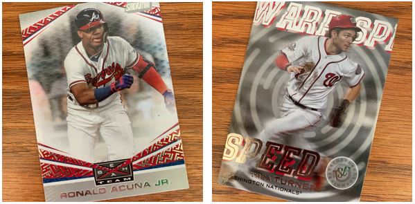
Stadium Club usually has some consistent inserts and this year isn’t too different. Beam Team is one of the standard inserts I can remember. I think Warped Speed might be new.
And it’s happened again where I have to post great cards of other players on teams I hate from the NL East. No slight on the players, gotta have respect for them because they are freakin’ good. But I just want to get my Mets and there weren’t any in this blaster. I like both of these cards because the colors of the card go with the colors of on the players uniforms.
Empty Space

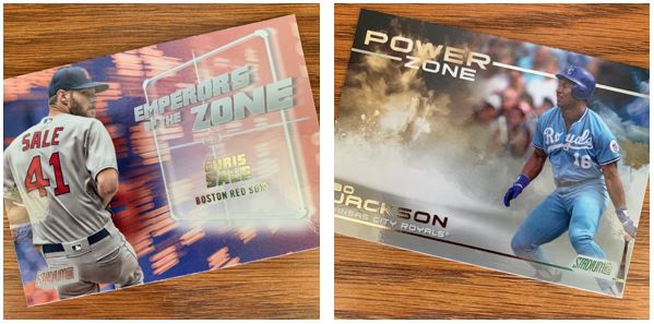
Sometimes in design you have to leave empty space. These seem to have a lot of it. The Jackson seems to be craving a signature and unfortunately I’m not getting that (I don’t know if it’s even something you can get in the set). The Sale is a little less so though. You would just think you’d put a little more into the card if you just have that little picture on the side.
Maybe My Favorites

These parallels are probably my favorites of the whole box. First up is the Tanaka chrome parallel. The picture doesn’t do it justice. It’s a cool card when it’s not in chrome but it’s even better with it.
The Realmuto parallel is perfect in red. Again, I love that the red goes with the team colors. Conversely I don’t like it when it’s a team like the A’s because it just doesn’t go. As for the Williams, if I am going to get a parallel for the old players, let it be in the sepia tone.
This was a very fun box to open. I’m actually thinking I am going to pick up a big box which I usually don’t do. But there’s some Amazon gift cards eating a hole in my pocket.