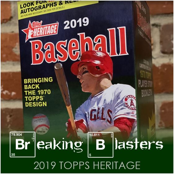
The last few Topps releases that weren’t flagship never seemed to reach the shelves on time around me. But with 2019 Topps Heritage things have been a little different. First, there were definitely cards out on the day it came out. It was only a little bit though. Now a little more than a week out and it already feels like there’s more Heritage on Target selves than there was last year.
I’m definitely a mark for Heritage (as I’m sure I’ve said in the past), but it does feel like it’s getting hard to like. All these are points that either I’ve made or others have, mostly on Twitter, but there’s certain things that tend to make me down on it.
First, there’s a ton of “throwback” stuff in sets these days (like those inserts in flagship), plus there’s Archives. I’m wondering if were getting overloaded with it. Second, the SPs kind of throw a monkey wrench in the works a bit. Third, it feels so gimmicky. I love it when they do things that go with the way the original set went, but then sometimes the “forced error” type of thing just gets carried away.
All that said, I’m back for more. I’m not a huge fan of the 1970 design, but I like these in general. Plus there’s a lot to like about this blaster (I’ve already posted it on Twitter so you can always skip to the end to see it). Let’s dig in!
NL East Mixer

So I always try to pick out a few stars to post first, or maybe just cool pictures that I like. But then sometimes I’m surprised at what I actually end up picking to put here. How the heck did I end up mixing up Phillies and Mets? The NL East should be good, or 80% of it should I hope, so that makes sense, but it seems odd that I picked two Phillies to go with a Met.
The Neshek card is great. If I get a dupe (which I think I have already – thanks Topps collation!) it’s definitely going out for TTM. The Todd Frazier card is a cool pick as I always love guys signing autographs on cards. But the interesting thing there is that is not something that would ever appear back then that I can think of.
That last one of Scott Kingery I liked because there are a bunch of headshots in this set. Plus they all have a really cool throwback effect on them that really makes it look like the ’70 set. I think add onto that with Scott’s coif and I think it fits the theme.
#LGM
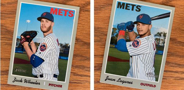
This wasn’t a Mets box but I feel like I got more of my favorite team than I normally do. So add this to the Frazier above and a Mets insert later and I’m pretty happy.
I don’t have a lot of cards for either of these guys. I don’t know that they both have a ton of cards, but they seem like guys that I always miss in a set. It wasn’t only good to see Mets, but also good to see these two Mets specifically for me.
Short Print
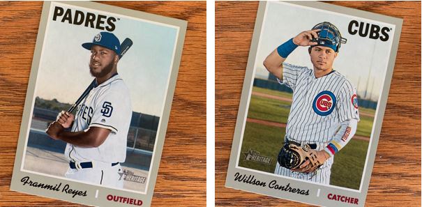
The two short prints are welcome, but nothing that I’m dying for. Contreras has a somewhat classic kind of catcher pose, but that “Venezuela” arm sock is definitely out of place. But at least he’s on a field.
The Padres appear to have taken their pictures at some kind of industrial park. Maybe it’s a skate park. I have no idea, but that doesn’t look like baseball field to me.
Throw ‘Em All On There

I always used to like the rookies with multiple guys on there. Those were simply times I guess. This is one of the things about the 1970 set that I really like now. I like the way they did the boxes for these. The Braves rookies are my favorite because I like the two-rookie layout better than the three. That kind of made me think what makes them choose two over three. I wonder if that goes with the original set somehow.
About Last Year
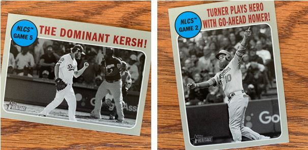
I love these cards from the old set two. There a “When Puigs Fly” card or something like that out there that I would love to pull. I do love the idea that a set chronicles a year whether that is the current year or a recap of the previous. They do it in flagship, just not like they used to.
Breaking Out The Paper

This All-Star card design has always been one of my favorites. I actually don’t have many of them in my collection, but I love the newspaper theme. It’s actually a little funny that they did this kind of themed card back then. When you think about it there weren’t really a lot of things like this in card design back then. It almost feels like an insert we would have today.
Oh Lordy, What’s This?
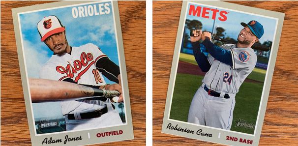
So these are the things that I don’t like about card sets in general these days. That’s not specific to Heritage, but since that’s what I’m opening.
First, with Adam Jones, I love the guy. I think its pretty stupid that no ones has signed the guy. I love the way he plays and what he’s done in Baltimore off the field. This is not a knock on him. But why does he have to have a card? He hasn’t been signed and he probably wasn’t going to be an Oriole if he did sign. YOU’RE GOING TO HAVE A HIGH NUMBER SET RIGHT? If so, can’t we put him in there if he plays?
My reaction is similar for Cano. Do you realize the set came out a couple days before he even played his first game of the Spring for the Mets. I realize that airbrushing a card was a thing in these old sets, and maybe this is a throwback to that. I still don’t like it. What about doing what they did for Scott Kingery (at the top) and putting more of a headshot without having to show a logo or team colors?
Halfway Groovy Inserts

I like the idea of the “Flashbacks” inserts. I actually can’t wait to get to my birth year set because I’m interested in seeing what those will be. That is if I make it that far with Heritage. I just think these are a little week in design.
The New Age Performers are awesome though. Last year when my brother and I went on a little baseball road trip, we stopped in Cleveland at the Rock n’ Roll Hall of Fame. There was a room that had all these old school posters with this type of letter on it. I could stare at those things for days. This reminds me of that. Not that I’m staring at it, but I like it.
Ride the Bench
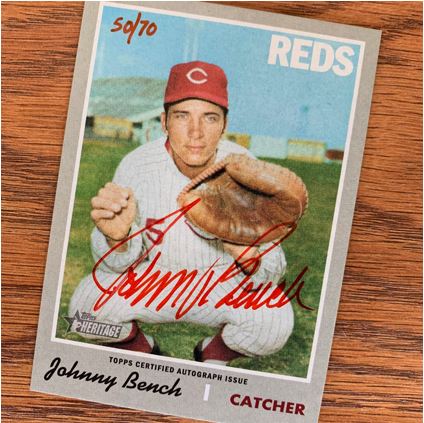
And of course, the bench. What’s funny is that since I’ve pulled it I think I’ve seen #’s 40, 36 and maybe another pop-up on different social media sites. I love the Red signing in red. I also like that when you take a look at it live, you can see how he really signed the card. You can see how he put pressure on the card.
This is probably in my Top 3 pulls of all time. I say that and then actually have trouble of thinking of all three I would put there. I have a printing plate of a Randy Johnson card, but that’s more interesting than anything else. This feels more…, historical is maybe the word.
It seems like the small stuff in Heritage really might be where it’s at this year. Lucky for me I guess because I don’t normally by a whole box or anything. But in the end, it is just luck and I just don’t usually risk the money.
Congrats on the Bench…that’s an incredible card to pull, especially from retail!
The Todd Frazier is directly based on the Bud Harrelson from the original 1970 Topps set, which indeed had him signing autographs. https://www.tradingcarddb.com/ViewCard.cfm/sid/70/cid/15469/1970-Topps-634-Bud-Harrelson
Thanks!
And thanks for letting me know about the Frazier card. I do love it when they tie it back to the old set, like the Neshek too. Sometimes they take it a little too far, but not in the case of that Frazier.