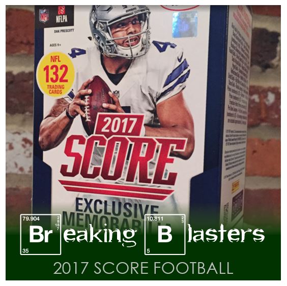
Today we’re taking a look at a blaster of 2017 Score Football. When you buy a blaster like this, your going to get a hit, but it probably won’t be a good one. I think the real reason to get this type of box, for me anyway, is more about volume of cards. I’m really looking for some cards I can use for TTMs more than building a set or anything. That said, if the cards look good I can get into them. Let’s see what we find.
Base, How Low Can You Go?

I think the point on these is that they can’t go low for some reason…
First, the positives. I always like team colors. The team loco is there with the name, position and team pretty clear (we’ll ignore the white on gray). The picture quality is good… yeah, so…. While those are all positives, it’s 2017, you better get those right. The design is fine and I don’t hate these cards.
Now the negatives. My biggest issue is what the hell is going on at the bottom of the card. There is way too much white space. It almost looks as it these were miscut that lower boarder is so big. I feel like a bigger percentage of the card should be taken up with a picture. And while it has team colors, there is a whole lot of white on this card. Lastly, I know I bought Score, at least this hides on the card a little more than Donruss Football for this year.
Something I really like about these cards is they will work great for TTMs.
2017 Score Rookies

Rookie cards in this set are completely college-based. To be honest I like that sooo much better than how it is in Donruss. The have manufactured pictures. And the team colors for the schools are there. You can tell the difference in the rookie cards while sorting because the rookie card logo is off to the other side of the card.
These particular four cards are my favorites from the box I got. Not too shabby.
Landscape Inserts Galore
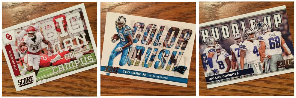
I really don’t mind inserts. Sometimes I like them even better for a TTM because then I don’t have to give up a base if I am trying to get the set. They can be busier for that though. But I think this set has some really well done base cards. I love that the college theme keeps going through the set on score even through the inserts. For the BMOC and Huddle Up cards I am really digging the “words inside the picture” feel.
More Good Looking Inserts
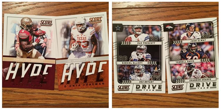
Wow! More great looking inserts! I actually got a JuJu Smith-Schuster Hype card and that’s going out to him. I like the idea of the Drive Team cards and I like how they snuck in the old timers on that one.
Past and Present Inserts
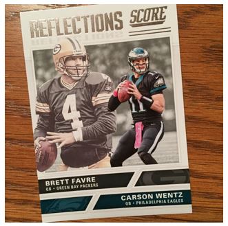
This one might be one of my favorites. I really like pictures with color that stands out over black and white or sepia tone. Plus, like a lot of inserts this brings in a little silver to it. Maybe I am just a sucker for the “old and new” type of cards.
Jersey Hit?
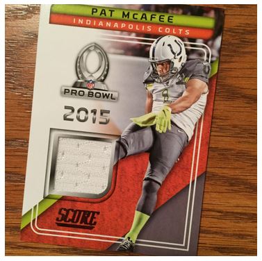
OK, first, this is a punter. I can deal with that, but not the most exciting thing (that said, I like Pat McAfee and I think he’s pretty funny). Second, it’s a punter in the Pro Bowl. And lastly, and really my biggest issue, this is a 2017 set so why are we putting in memorabilia from a 2015 game? Nice “hit.”
Parallels Looking Better Than Base
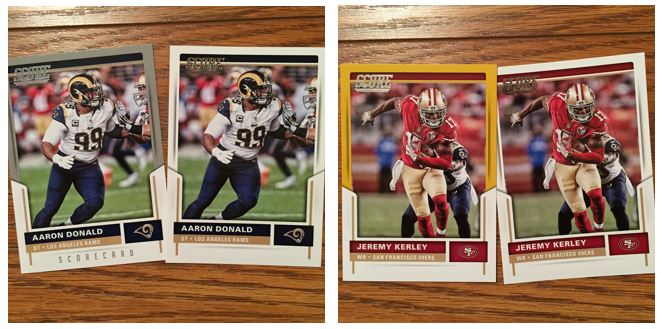
I like these colored parallels better than the base set. I think these happened to work a little bit with the colors and maybe I wouldn’t like them for some other teams. I just think that extra color on the top would have been great for the base in general. I guess white is more exciting to Score.