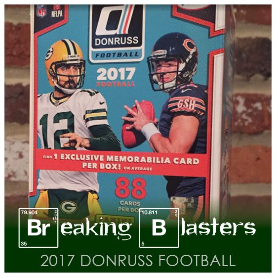
Not only did a I pick up a blaster box of 2017 Donruss Football, I also picked up a hanger box. I figured we could see if there are any major differences between the two. We’ll get an idea of this years card design, what Donruss like to do with their football cards, look at the inserts and parallels and a little more. First I think we should get an idea of what’s in each offering:
Blaster Box (88 Total Cards):
- 72 Base Cards, including…
- 6 Rookies
- 5 Rated Rookie
- 1 Press Proof (Parallel)
- 3 Inserts
- 1 Jersey Hit
Hanger Box (50 Total Cards):
- 31 Base Cards, including…
- 2 Rookies
- 2 Rated Rookies
- 4 Press Proofs (Parallel)
- 10 Inserts
Of course the blaster has more cards. But I think what you are seeing is that the blaster is made up of packs, and in general, those eight-card packs are… well, they’re packs. So the parallels and inserts are really available in a higher proportion in the hangar box. Also, the blaster is $19.99 and I think the hanger is $9.99 so if you wanted more volume for your money, two hangers might be the way to go. But balancing that is the hit I found in the blaster. I would base it on what you are really after.
Let’s take a look at the cards…
Let’s See What We Got in 2017 Donruss Football
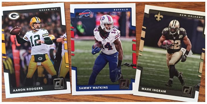
The cards looks good overall. I like the way the design is partly full bleed and partly bordered. I love that they keep to the team colors. There’s no throwback to a specific design or anything that I know of with this one but I like it.
I always feel like Donruss make their logo pretty big on their cards and this year is the same with it being basically the same size as the team logo, but silver. The card includes the team’s city and the logo and I always like a log on the cards. The players names is prominent enough and its not in a metallic treatment which is great. That makes it impossible to read when going through them.
From a TTM perspective the only thing I don’t like is that the bottoms of the cards (where I think you would sign) is dark. It’s actually darker than what you see in the pictures. I don’t know how these will pull off a signature very well. That’s too bad because I think these have some natural spots for it.
Is This Last Year?
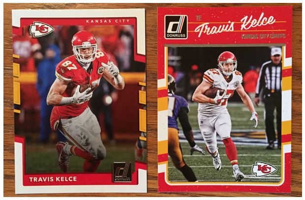
I happened to have last year’s cards handy and while they aren’t the same, they aren’t that big a departure. Can you believe the Donruss logo was bigger? I did like the throwback to ’90 Donruss baseball last year with the player’s name text and the colors with the kind of texture to it. Of course this Chiefs card is read so you really see the comparison. I think I like this years cards a lot better though. The full bleed/border mix really does it for me on this years cards.
Rating Rookies in 2017 Donruss Football
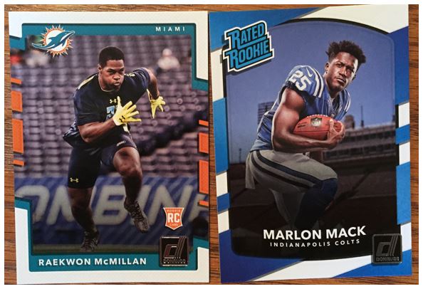
Donruss gives you a rookie card and a Rated Rookie card (with that same old logo). I’m honestly not sure if they do both for rookies (at least some of them) or if they choose some to be rated. I wouldn’t put it past a card company to do that though. I don’t like the Rated Rookie cards. The look different than the base but are numbered within the base scheme. That’s fine I guess, but I’m not big on the design. The colors are only blue and it doesn’t even match the Rated Rookie logo color. I like the combine pictures for the rookies. While I would love to see them in uniforms, I get how that works out. The other thing… so Marlon Mack is in a home uniform, but that ain’t Lucas Oil Stadium.
How Does Donruss Deal with Trades and Changes
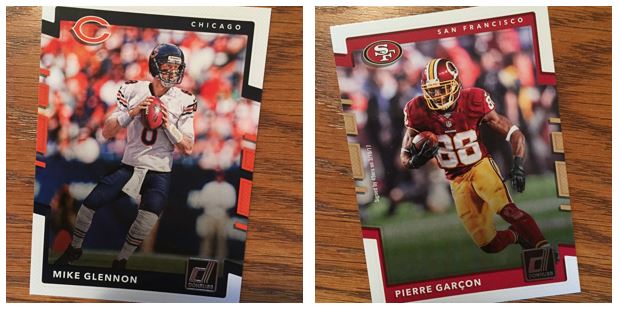
There are two ways that Donruss looks like they deal with trades and moving players. I think the Mike Glennon is an airbrush job. That stuff is getting better but it’s harder and harder to tell. I just can’t think of when they would have gotten him in a Bears uni. But then instead of airbrushing Pierre Garcon, they just put that really small text stating “Signed by 49ers on 3/10/17.” That makes the uniform colors different from the card colors. I’m torn on this one, but I can’t figure out the rhyme or reason behind doing one or the other. The one thing I will say is that if they did airbrush Peirre, his number would have changed to 15. I hate it when the airbrushing assumes the same number and then it REALLY obvious.
Press Passes
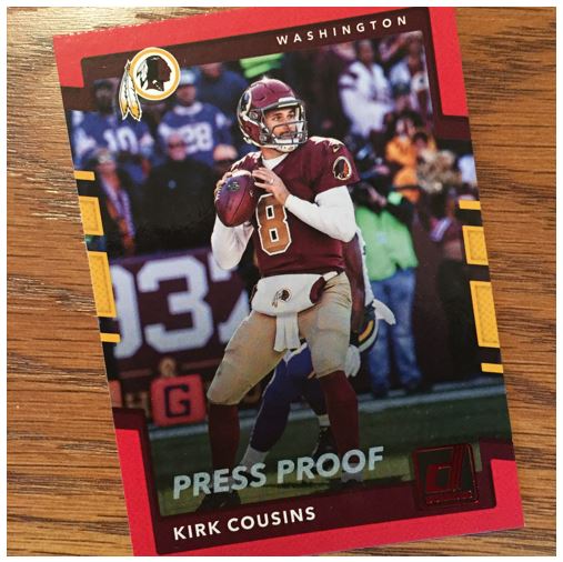
The Press Proof parallel cards are different based on where you get the cards I think. I can’t remember where I got these, but I would have to guess Target. I also have a bright blue version of these. The concept is just like any gold or silver (or whatever) parallel other companies do. I’m not a huge fan of when they do the colors that clash with the actual design. So my review is a general “meh” on these.
Is This a Steelers Blaster Box?
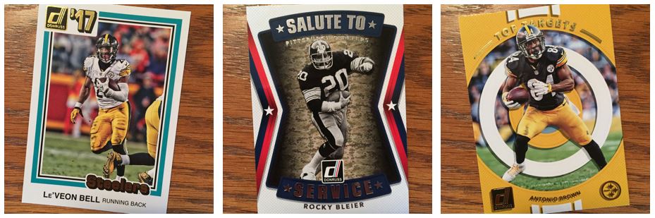
Did I move to Pittsburgh and get a regional box. And these aren’t all, I got one more in the same box (see below). If you’re a Steelers fan I’m sure you would love this. I actually like all these parallels in concept. The Top Targets card is great. I feel like it stick with the team of the general cards actually and it’s team colors. Plus there’s a little gold treatment to it.
Salute to Service is another great one and you get to find out a little more about the players. I don’t like the background really, but I can deal with that. Now for the ’81 Donruss baseball throwback… I like it in theory. I think they did a good job and I can even deal with the gold treatment on the card. However, going back to the Donruss logo being huge, let’s just add “’17” to that and make it even bigger. That is a HUGE percentage of the card for what it is. This could really have been a good idea, but I don’t think it’s been pulled off well. The numbering on these actually appears to go with their uniform numbers and the backs have the same throwback theme.
Other 2017 Donruss Inserts
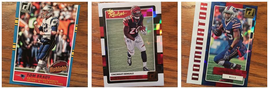
These are a few more inserts. Let’s start with the Brady card. I like using the throwback Highlights logo. And I really like a little humor on the card. I’m not sure if that is on all of these. The text says, “QB stockpiles favorite letter – W – for 200th time.” I like it. Throwing a little shade at Pats opponents. Maybe a Pats fan worked this one up.
The other two are fine for inserts. There a little boxy, rainbow effect on them. The “The Rookies” is OK. Again, they brought back the “The Rookies” font as a throwback. The Dominator card is really a classic insert style you see. I think I like that card better.
When Donruss Inserts Go Wrong
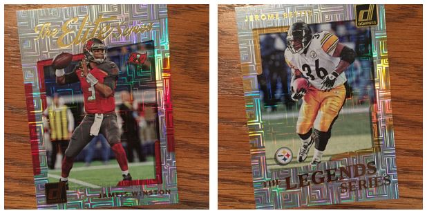
These might be the most disgusting cards I have ever seen. You can’t read them (you can actually read them better in this picture) and I swear I’m going to have seizure or something when I look at them. I want NOTHING to do with these cards. Moving on…
Hunting for a Rated Rookie
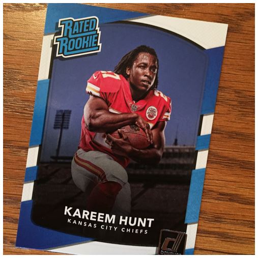
Not that I would have known this prior to the season, but the first couple weeks were good for this guy. Well, aside from the first play of the season. But it seems like he made up for the first fumble in his career. He seems to have slowed down a bit, which is expected. I hope he finishes the season strong.
HIT: Rookie Phenom Jersey Swatch
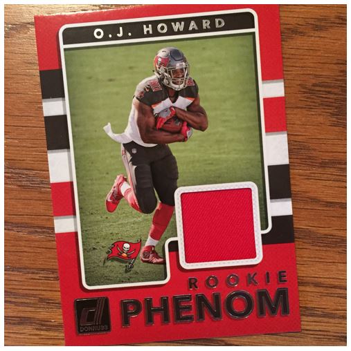
It’s always nice to get a jersey I guess, but I’m not necessarily out for that. I don this this is an amazing hit per say, but I’ll guess we’ll see how this kid does. The part I hate about the NFL hits, really for rookies, is that they are “event” worn. If you’ve ever seen the pictures of Mark Ingram in “event worn” gear you’ll know what I mean. Go ahead and Google it.
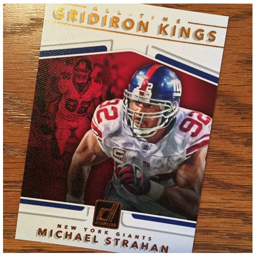
Donruss Gridiron Kings Gold
This to me is the best card in the box. I love the Gridiron Kings design this year and it’s one of my favorite players on my favorite team. This is the “All-Time” version of Gridiron Kings, but they also have Rookie and then regular (with current players) versions of them. I love the texture on the card, and yes, it’s a texture and not a paint image on the card. Love it all around.