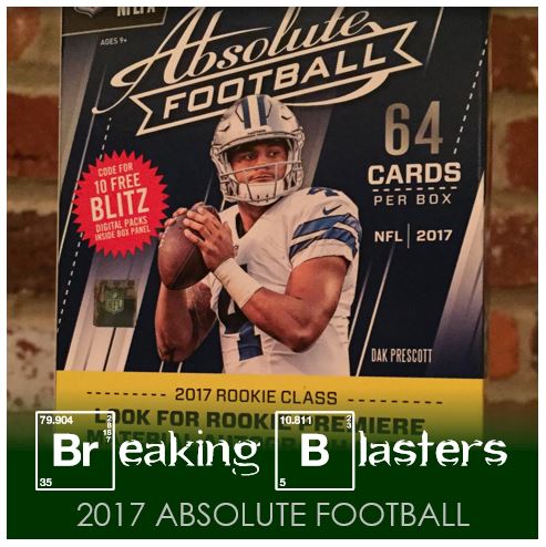
Today’s blaster break is from 2017 Absolute Football. Let me tell you, they ain’t dull. These are some of the shiniest cards I’ve seen in a long time. And shiny in a lot of different ways too. And everything is shiny from the base to the inserts.
2017 Absolute Football Base: Base, Not Basic
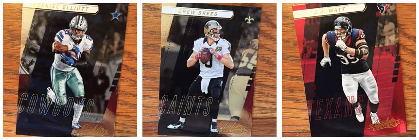
The base card gloss doesn’t even comp across effectively in these pictures. I like most of what I see here: team logo, team colors, etc. I’m not a fan of the gold for the name and then branding, but at least it’s consistent. It just doesn’t come off with the colors for every team, but it’s not like it covers a ton of the card. The only normal piece of information that’s missing here is position. Not that you need it because you know all these players, but I like that to be par of what’s on the card.
I’m pretty much a sucker for a color picture being set on top of the background and then doing other things to the background. I’ve always like when people make the player in normal color and make the background black and white and other effects along those lines. These definitely fit into that scenario.
From a TTM perspective, these won’t work well. First, the gloss is probably going to be a problem. Two, they are sooo dark. There’s no way an autograph would cut through on that. Not that it will stop me from trying though.
Slightly Parallel, not Absolutely Parallel
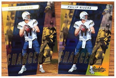
OK, yes, they are parallel. What’s the difference though?
The color of the name and logo. In this case it works for Philip Rivers (or the Andrew Luck card) because the team is blue. But how does this work for the Chiefs or the Raiders? It doesn’t. I’m not usually a fan of when they make parallels that clash with team colors. I don’t mind these as much thought because it’s only a small percentage of the card that’s impacted. And when the color works like these, it’s pretty sharp.
Round Up ‘Dem Rookies
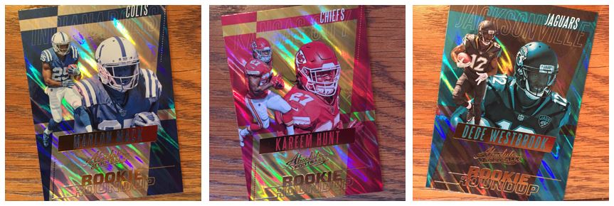
Now we not only have shine, but we have some effect on the shine. It’s cool but it makes for a really busy card. I like the rookies called out on an insert like this. And with the way they do these, if these pictures are from a photo shoot rather than a game, you’d never know. This is again where the team colors running through works for me. If you had one color running through all these it wouldn’t work as well.
I got two of those Kareem Hunt cards and I might have to test out a TTM to him. I haven’t seen him sign yet though.
Landscape Inserts – Love ‘Em
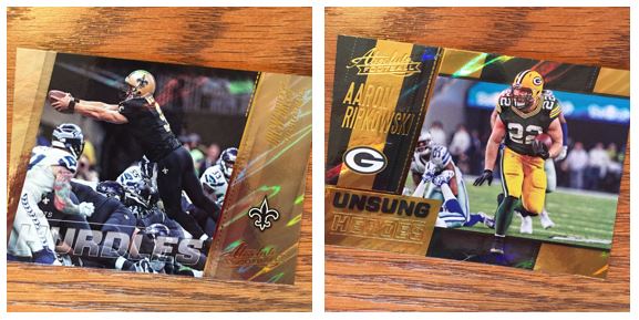
I LOVE LANDSCAPE INSERTS! I don’t know why it’s so special to me but it is.
The Hurdles card is pretty cool. I’m wondering how far it goes. I got a WR or a TE with the other one (Maybe Ebron?). It’s difficult to read the name but you see it in the upper right a little on the Brees card. It’s gold on gold though which is why its rough.
I’m digging the Unsung Heroes idea. I would hope that those guys might be easier to work with for TTMs. Maybe I’ll have to find some more of those. And look at that, not only is the player in color but he’s set out from the background. I also wonder how these change with team colors. This was the only one I pulled.
Meh, Jets Stuff
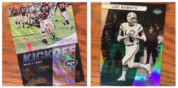
Not much doing for the Jets these days, so throwbacks are what you find. I like the Kickoff card. I got a Michael Irvin version of that too. I love an insert that calls out an achievement. I find that an acceptable reason for an insert.
The Namath card I like, but I think the black and white over what looks like it might have been color is a little off. I which Broadway Joe was in color. This is the only one I pulled like this. Not sure if all the “old folk” in the set are in black and white or not.
Overall I like this set. I don’t think I went in thinking I would like it. Yeah, it’s gawdy. Yeah, it’s shiny. Maybe I was just in the mood for that. I’d grab another blaster.